
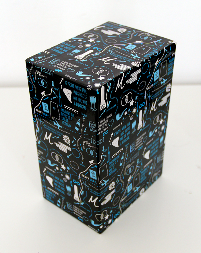
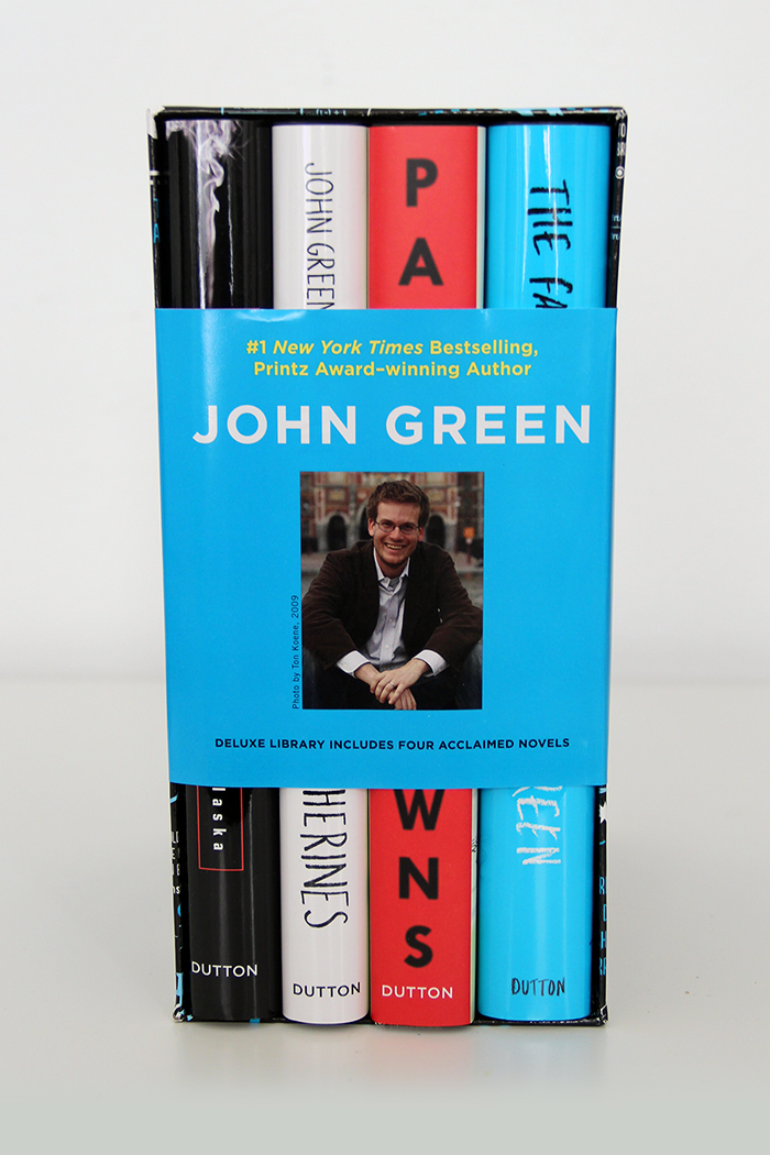
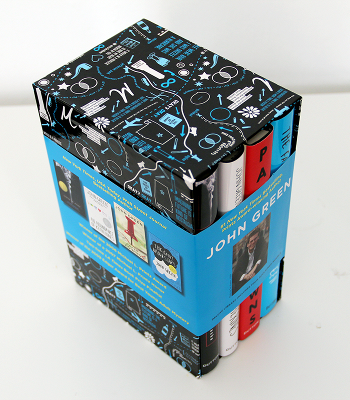
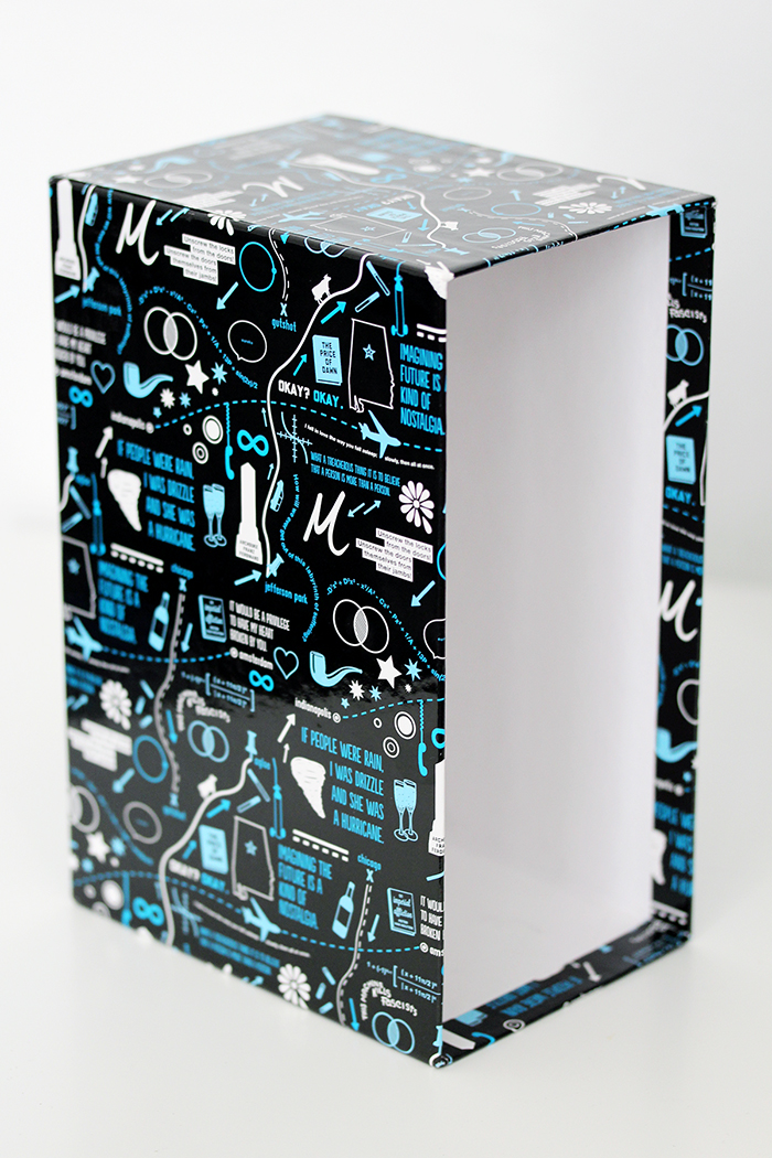
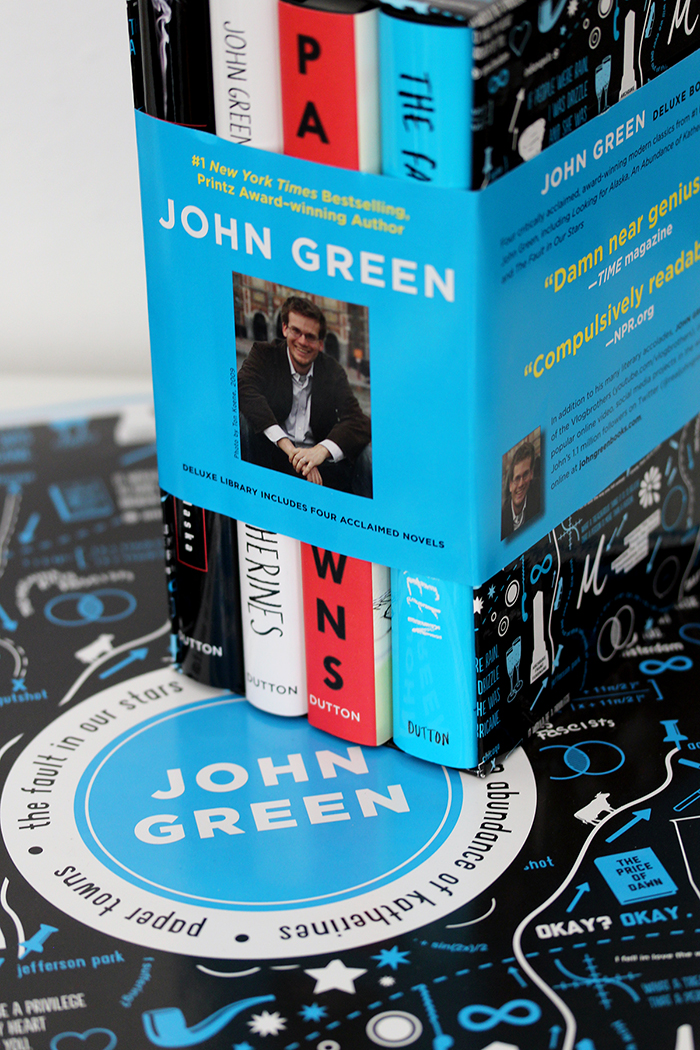
A few weeks ago, the new box set of John Green’s books was released, which features an illustration on the box designed by yours truly. I think the box set turned out great, and you can see my live reaction as I see it in person for the first time in the video below. Keep reading below the jump for more details about how I created the design!
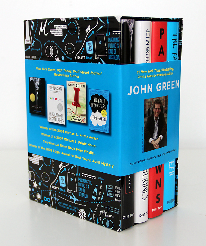
Keep in mind that I did not design the wraparound band – just the illustration on the box. It all started in May when I got an email from Julie Strauss-Gabel, John Green’s publisher, who told me that they were creating a box set of his books, and asked if I would be interested in designing the box. I’ve done a lot of work with John in the past for his YouTube videos and charity novellas, but this was the first time I’d be designing officially for his published novels, making something that you can actually buy in a store.
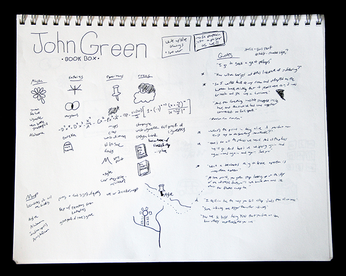
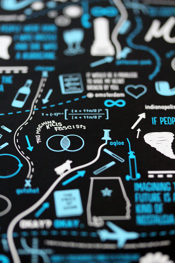
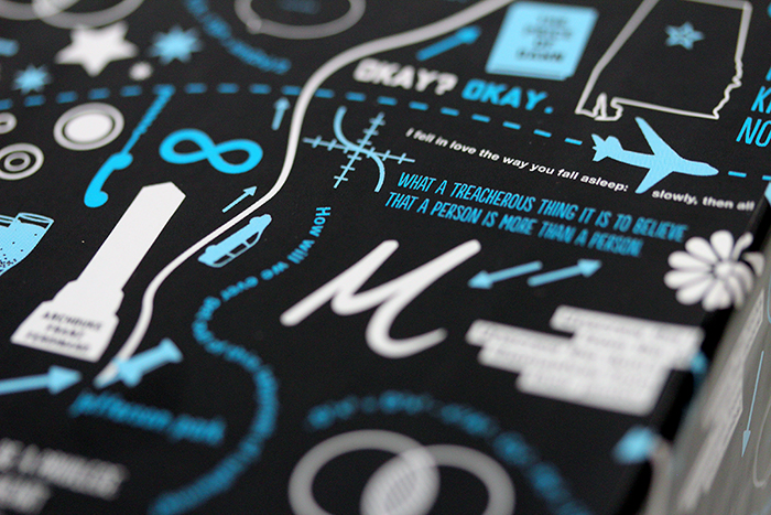
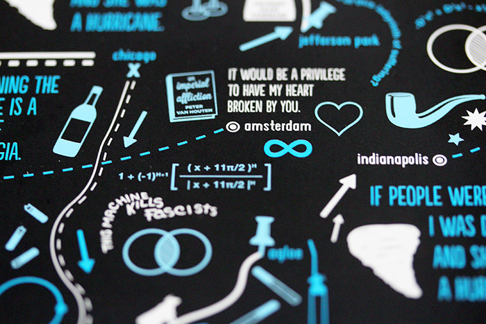
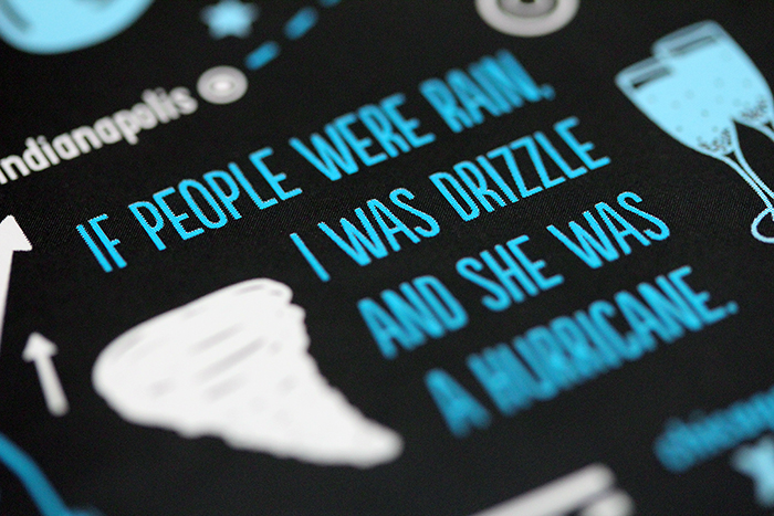
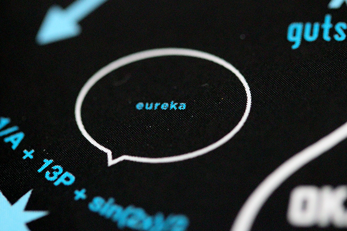
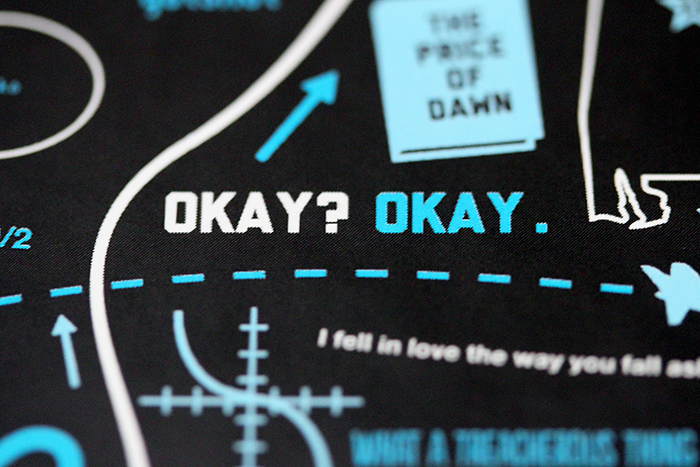
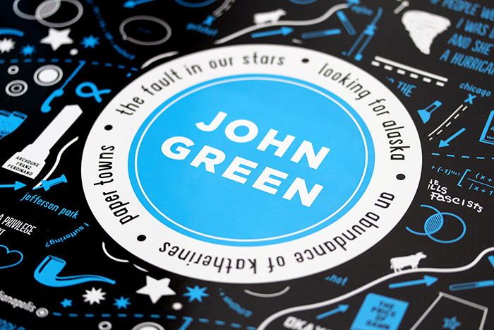
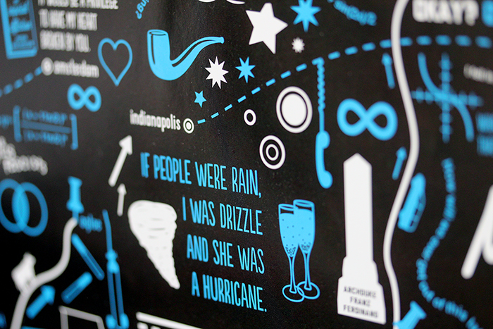
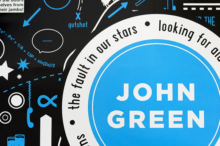
The type of design they were looking for was a repeating pattern with symbols and quotes from John’s books. And so, I took my trusty sketchbook to the park one day and sat and brainstormed for a few hours all of the biggest symbols and best quotes I could remember. So much of the books has to do with road trips or travel, so from the beginning, I really wanted to incorporate a lot of map elements.
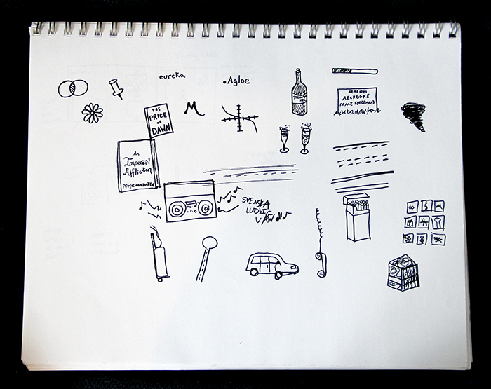
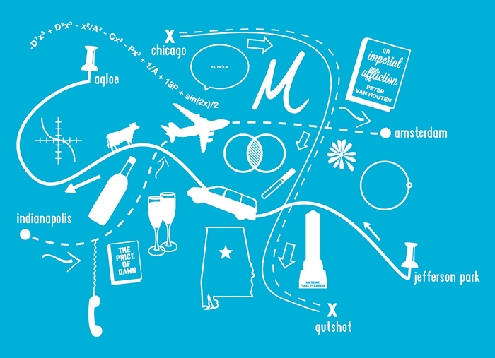
This was my first version of the pattern, which I sent to Julie to make sure I was on the right track for what they were looking for. It doesn’t interlock seamlessly, but it gave me a chance to see how all of the different elements would start to fit together.
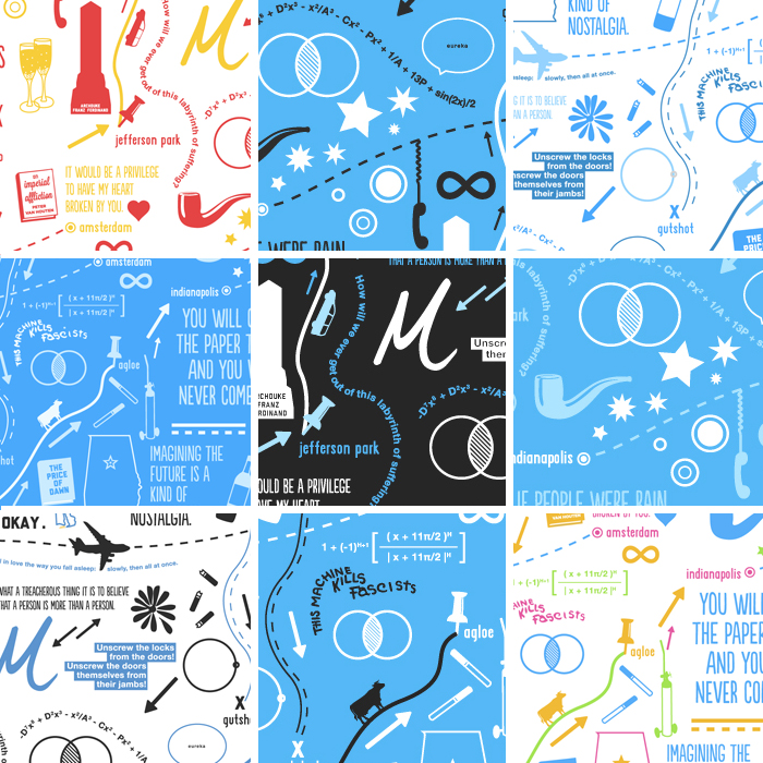
As the design progressed, I tried a lot of different color options before we decided on the white and two shades of blue on dark gray.
So that’s the story of the actual illustration. See if you can figure out the line around each block of the pattern – none of the elements in it are a uniform size, so I spent quite a bit of time pushing things around to make it completely seamless.
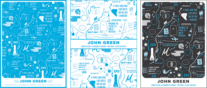
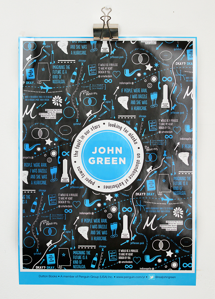
After we had pretty much finalized the box design, I couldn’t stop thinking that the design was something I might also want to hang on my wall. I wasn’t asked to, but I decided to mock up a few poster designs and send them along. Above are the three alternate versions I sent, and below is the one that they decided to print.
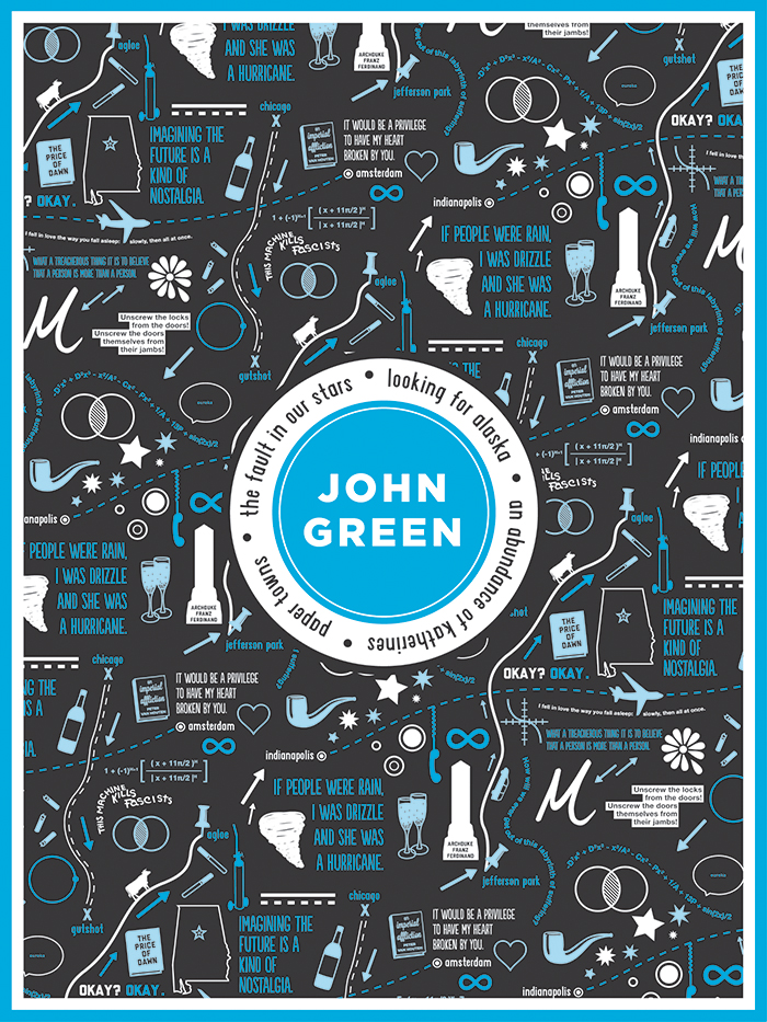
I don’t know what they’re going to do with this poster design or if there will be any way for you to buy one, but I’ll be sure to let you know on my Twitter if anything comes of it!
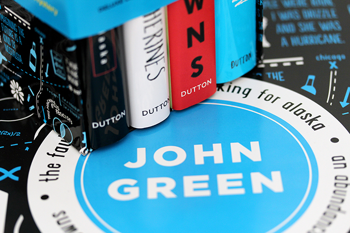
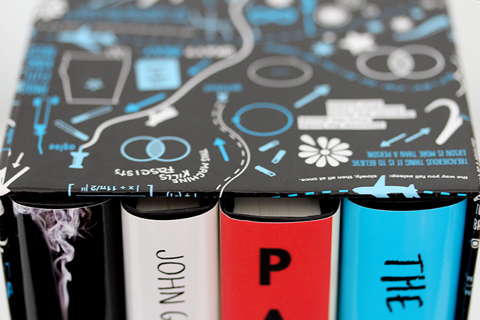
So that was the story of the John Green box set design. This is one of my biggest and most visible freelance projects to date, and I’m so happy it came out as well as it did! I’ve been hearing tons of positive feedback online, which is always nice when it’s a thing people have had to actually spend money on. Keep reading for more gratuitous photos of the box set – I was so excited to finally have one that I just had to document it from every angle.
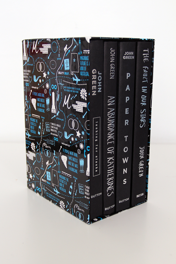
I love how the box set looks when you take all of the book jackets off and just have the black spines with silver type.
The box set is available on Amazon or in your local independent book store. Also, if you haven’t been on my website since I launched the new redesign, you can check out this blog post for all the details on that. Thank you so much for reading!