I’ve been a supporter of the Harry Potter Alliance for many years now, and when they called on me for help with their Equality FTW campaign, of course I said yes. To start off the campaign, the HPA had a fundraiser in which you could get certain rewards depending on how much you donated. Two of those rewards were exclusive novellas by popular YA authors John Green and Maureen Johnson. My role in all of this was laying out the novellas into PDFs so they could be distributed to everyone who donated.
While the cause is a fantastic one, the levels of communication between all of the stakeholders in this project have been less than ideal, so I’m not sure if the PDFs have been sent out yet. If not, you should hopefully be receiving them soon, but in the meantime you can get a preview in the rest of this blog post under the jump.
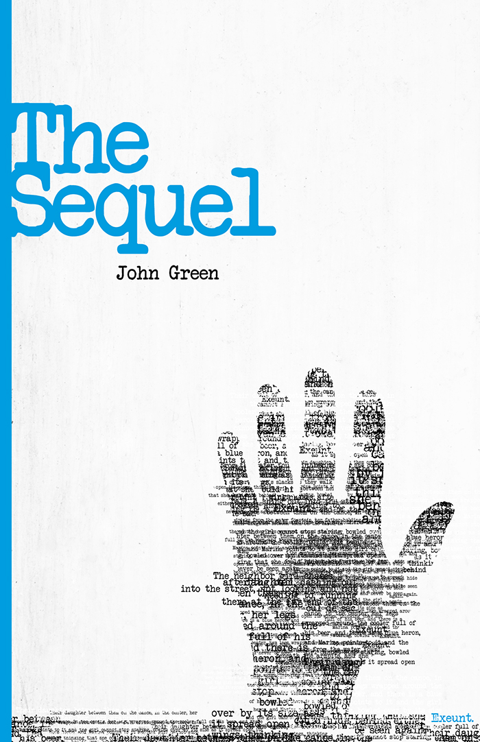
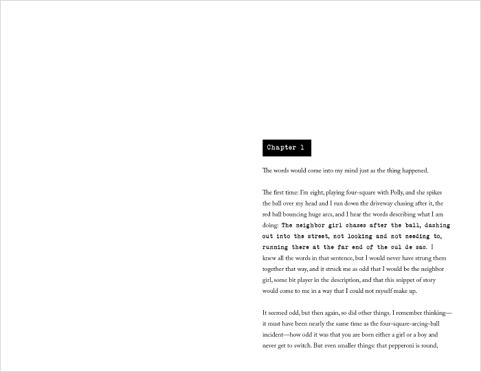
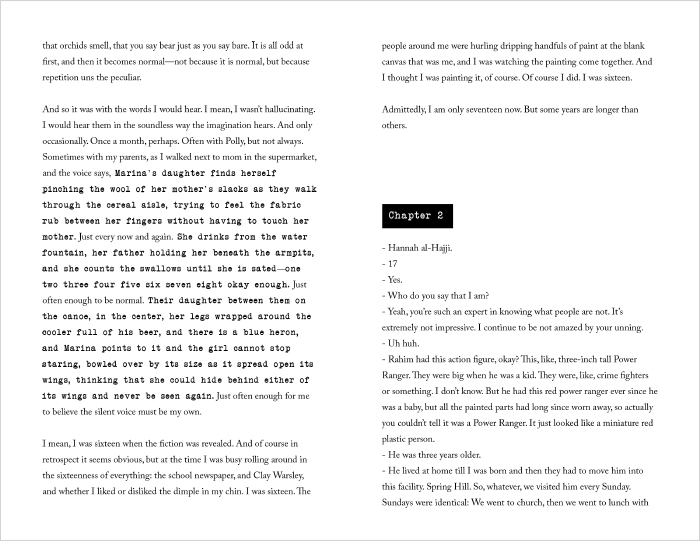
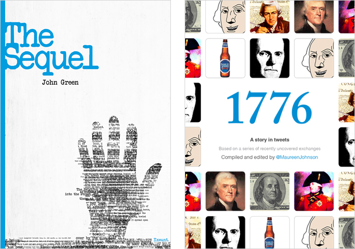
John Green’s novella is called The Sequel, and is the beginning of a novel about a girl who discovers she is a character in a published book. The story is surreal and complex, so I wanted the cover and the layout to represent that. One of the most interesting parts of the novel is when the story shifts over to the third-person narration the main character hears in her mind about her own life. To emphasize that in the design, I switched from the main serif font to a typewriter font reminiscent of old manuscripts. I echoed this typewriter font in the chapter titles and on the cover.
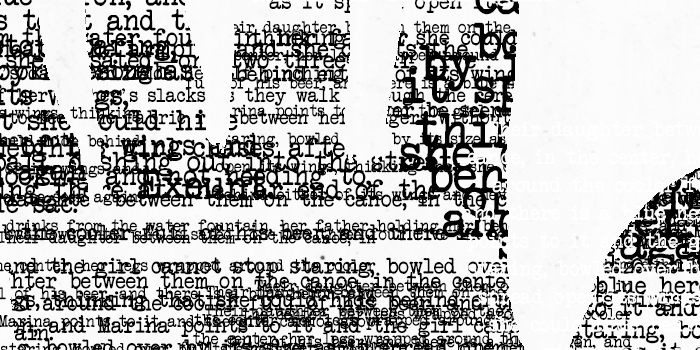
In terms of the cover, the catalyst of the plot of the book is the main character raising her hand up out a ditch after she has been in a car accident. I thought this was a striking image for the cover, but I took it a step further by creating her hand out of the typography of the snippets of narration she hears in her head. I think it actually turned out to produce a really beautiful texture, and I feel so lucky to have had the chance to design another John Green novella after the previous two I’ve worked on, Zombicorns and The War for Banks Island.
Pages 4 – 5
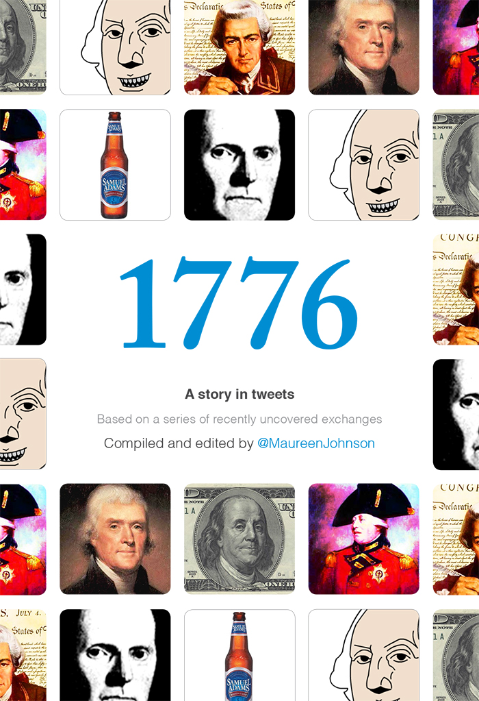
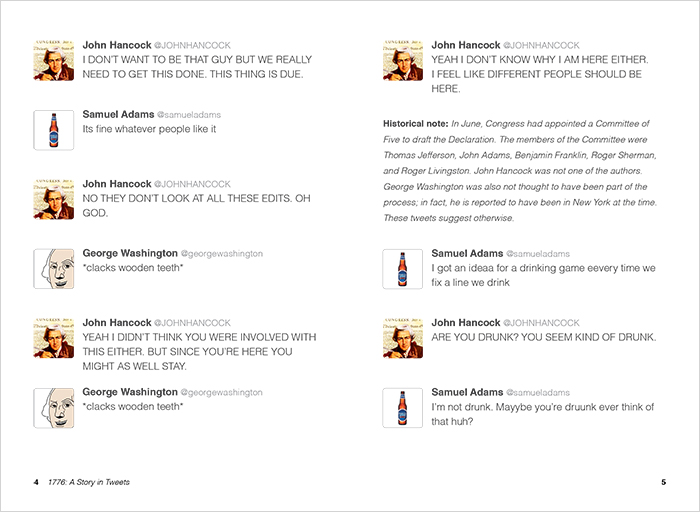
Moving on to Maureen Johnson’s book, this one wasn’t quite as straightforward to design. The book is called 1776: A Story in Tweets, so rather then being made up of paragraphs and chapters, it’s a Twitter conversation, almost like a movie script. I debated trying to make the design feel like it could have been created in 1776 by using parchment textures and old-time calligraphy fonts, but in the end, I thought the Twitter UI would feel too out of place in that design scheme, so I decided to keep it modern and simple.
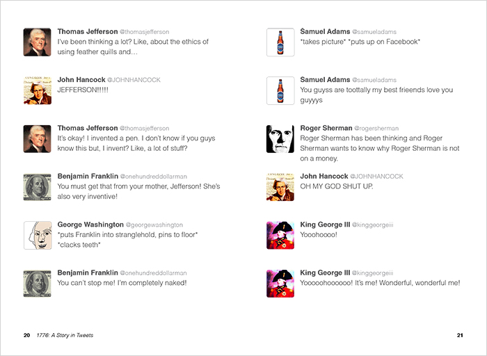
Pages 20 – 21
Maureen’s writing is very funny and a bit crazy, so I had some freedom choosing avatars for each of the characters, and I had fun trying to make them match the personalities Maureen had written for these historical characters. I kept all of the typography to a simple Helvetica and tried to make the design mimic the actual UI of Twitter, adjusting it just a bit to better fit in a book-sized PDF.
I had a lot of fun laying out these novellas, and I hope you guys enjoy them as well. Thanks so much for reading!