We’ve come to end of the 6th annual Project for Awesome, so I thought I would make a video with my thoughts on the whole event and some highlights (including Wil Wheaton watching my video on the livestream!). This was the biggest Project for Awesome yet, raising over $440,000 in just 48 hours! Over 700,000 comments were left on over 1,300 videos from people all over the world. My video about charity: water was one of those, so you can check it out here if you missed it. I feel so lucky to be able to be involved in this event, so keep reading to learn about all the design work I did this year!
The Project for Awesome began in 2007 when John and Hank Green had the idea to take over YouTube for a day by having all their viewers make videos about charities. It’s just gotten bigger and bigger since then, and is one of the biggest annual events on YouTube. I’ve been doing all the graphic design for the event since 2010, so this is my third year in charge of it all, and I like to think that the design has gotten better each year. We’re still using the logo I designed in 2010, but this year I decided to put all the official branding in different weights of Gotham and include a subtle gray striped background to tie all the branding together.
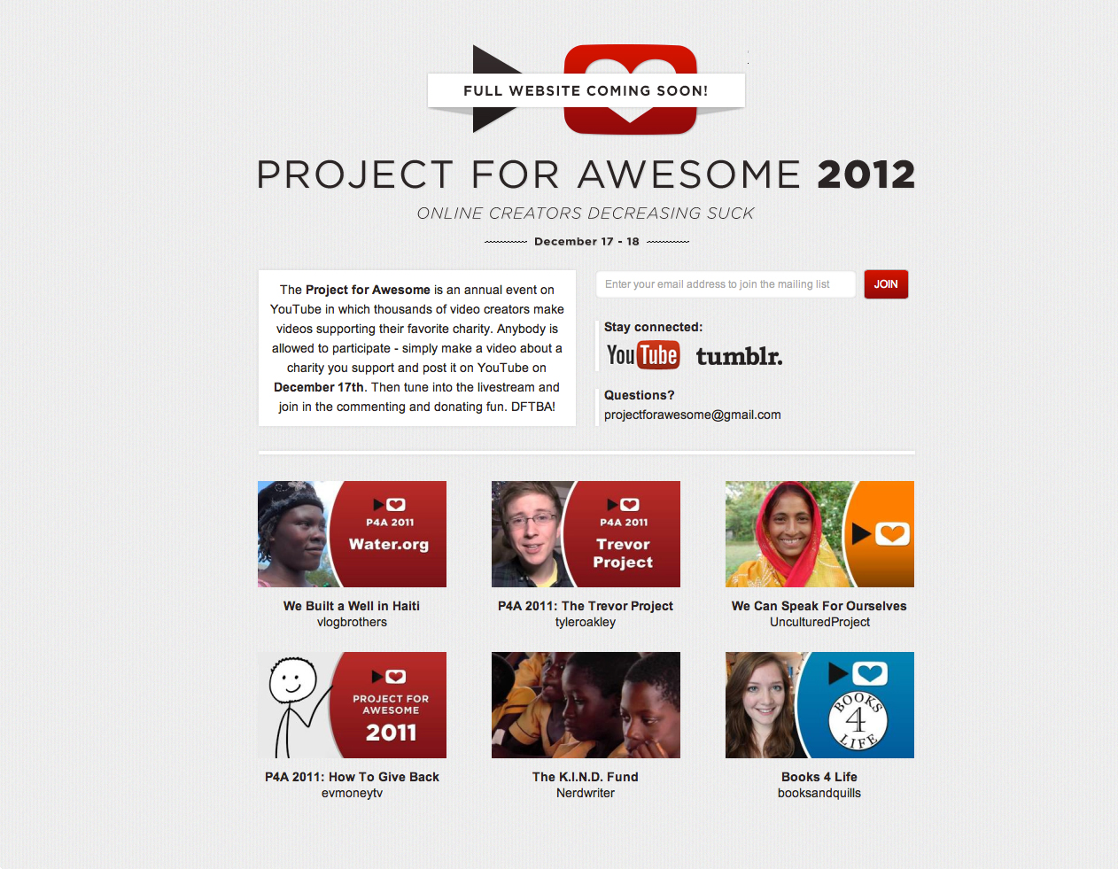
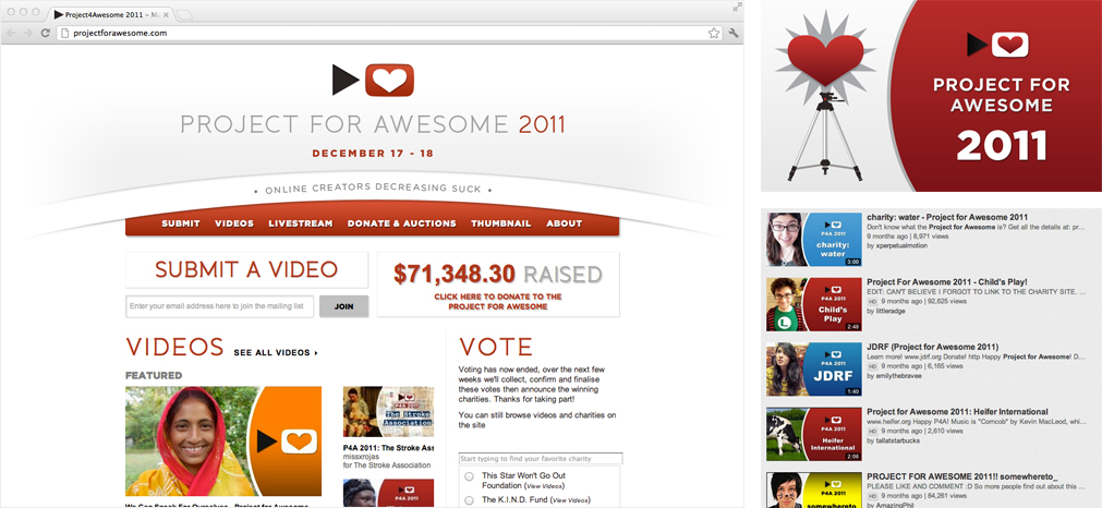
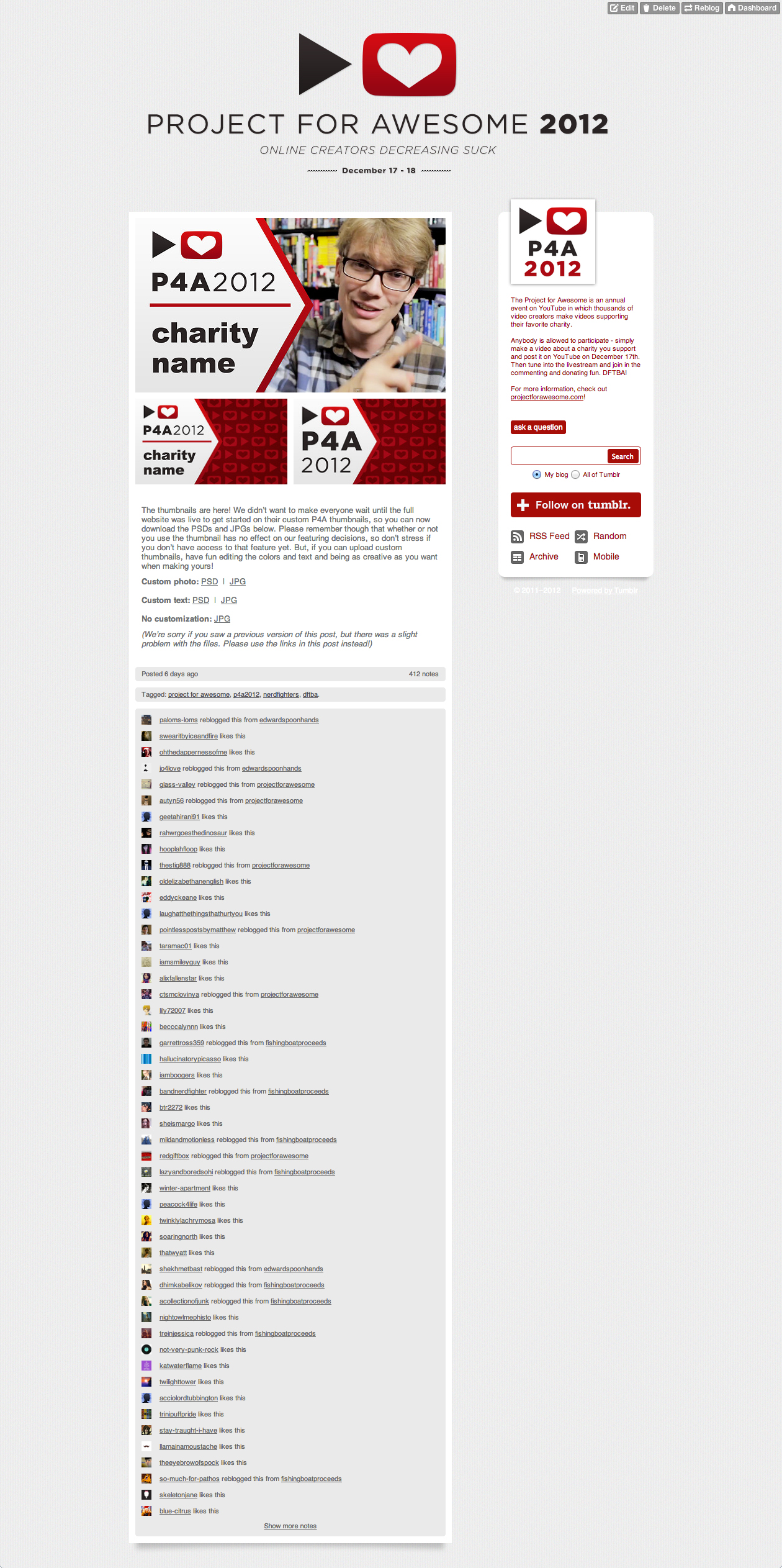
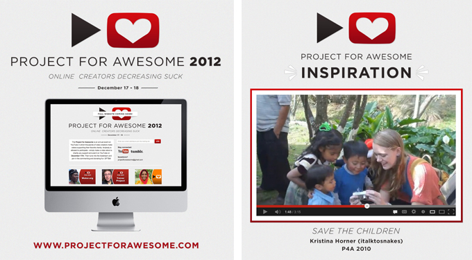
A few weeks before we launched the full site, we put up this teaser site to get everyone excited and thinking about the P4A. This is where most of the visuals for this year were solidified, and it gave me a chance to design the visuals without being weighed down by figuring out any complicated UI at the same time.
(Screenshot taken about 12 hours before the end of the P4A)
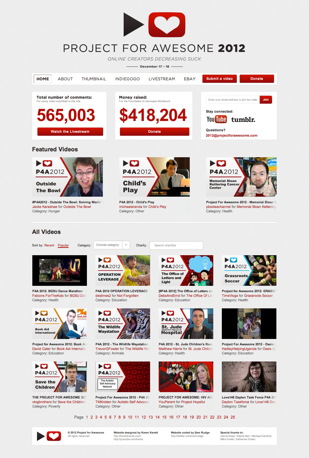
The website is the main hub of the Project for Awesome. It’s where we gather all the videos, share the official thumbnail, and link to the livestream and fundraising pages. Besides updating the visuals, the main difference with this year’s site is that I decided to put all the videos on the homepage rather than including a separate videos page. This really highlights them as the main component of the Project, and it was easy to stay updated on what video everyone was commenting on by including larger featured video spots. It’s a lot of work to put into a site that is only heavily used for 48 hours and then pretty much ignored for the rest of the year, but it was vital to make to keep all the thousands of people participating in the Project organized.
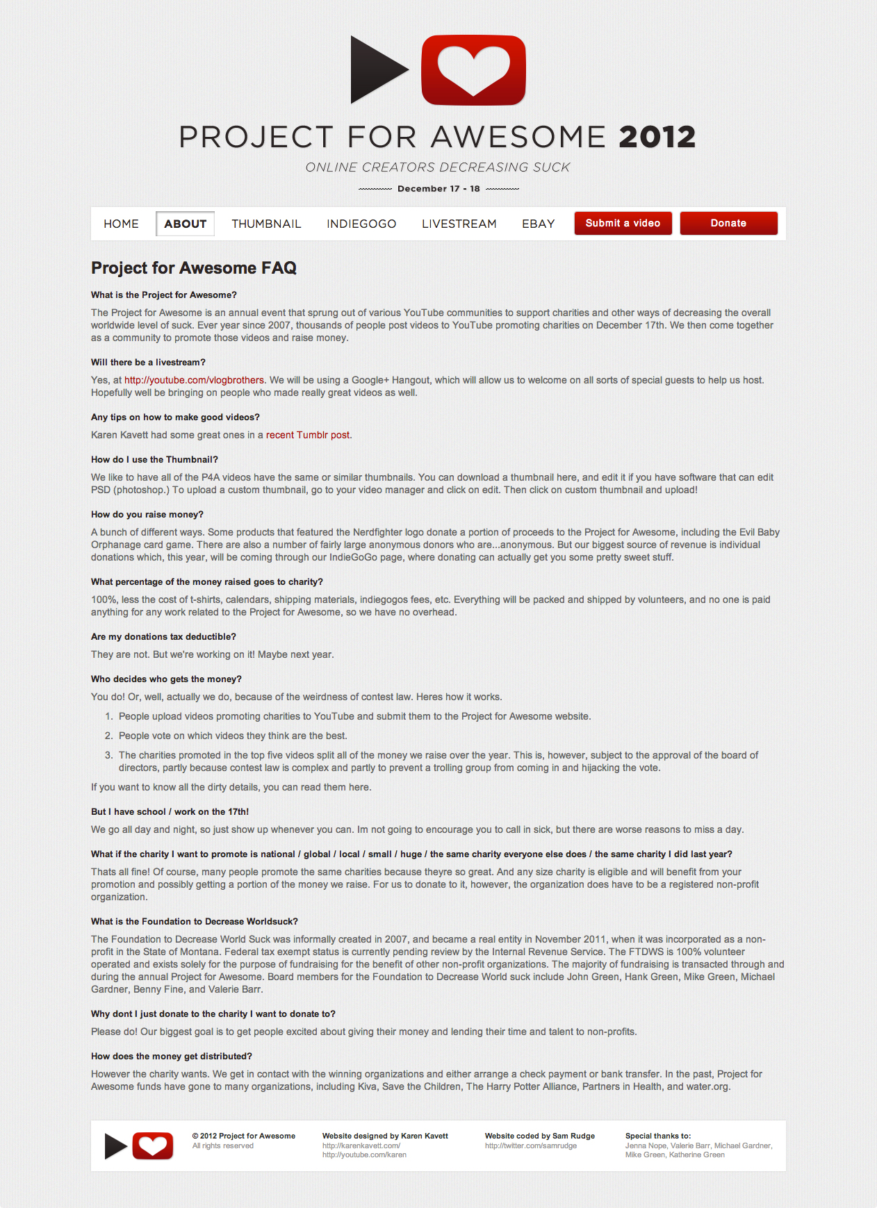
The About page on the P4A site is pretty simple since we didn’t get the text of the FAQ until about two days before the P4A. I never even made a mock of it, Sam just dropped the text into a blank page and I gave him a few adjustments from there.
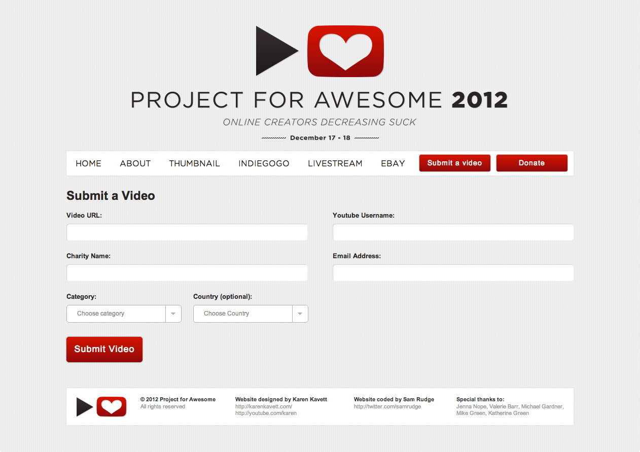
Forms are always fun to design, and this submit form is fairly straightforward.
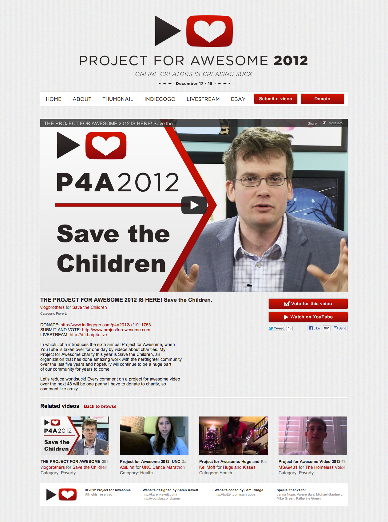
Originally I had wanted to put the embedded videos into a popup overlay, but since we needed unique URLs for everyone to share so people could vote for their video, we ended up giving each video its own separate page.
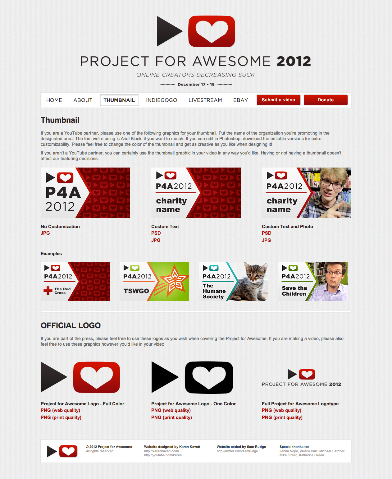
After seeing people kind of hack the 2010 thumbnail template to include photos when I didn’t really design it with that in mind, I had the idea last year to design a few different thumbnail templates depending on how much customization everyone wanted to do. There are three versions – one that gives you space to include a custom photo and charity name, one where you only edit the charity name, and one that needs no customization. And below that I included links to high quality downloads of the Project for Awesome logos for people to use in their videos however they wanted.
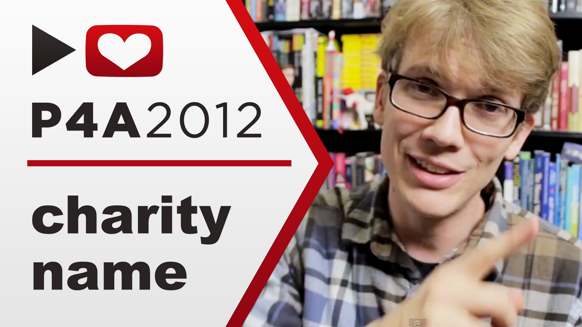
I tried a lot of different designs for this year’s thumbnail before settling on an overlay of this shape. It’s quite difficult to come up with a design that leaves room for a photo, the P4A logo and text, and the charity name, which can be anywhere from a few letters to several words long.
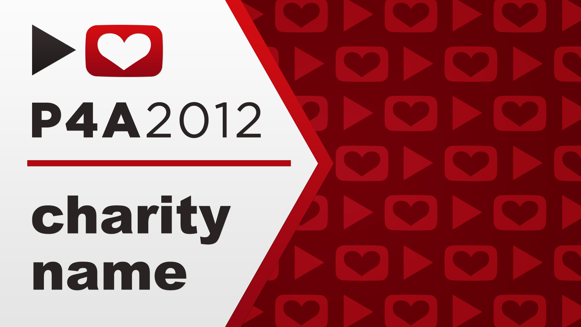
I didn’t want the thumbnail to be too similar to last year’s thumbnail with the rounded overlay, so I decided to make it more angular, which ended up looking a bit like a flag (I actually checked a list of every country’s flag to make sure I wasn’t accidentally stealing the design!). I had been wanting to find a place to use this repeating pattern of the P4A logo ever since I designed it two years ago, so I’m so glad I finally found a way to.
Fun fact that’s a bit embarrassing – the text and logo in the version of this thumbnail that we distributed are a few pixels off from being vertically centered. It was too late to fix by the time I noticed, but it still bugs me every time I see it (I fixed it for this archive post).
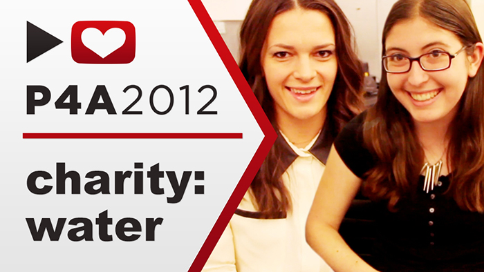
Another fun fact: charity: water, which is the charity that I always support, has a medium-length name, so I always design the thumbnail around that length of charity name. It’s impossible to design a thumbnail that works perfectly for every possible length of letters and words, but at least my thumbnail always looks great!
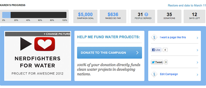
I also made a small graphic for the mycharity: water page that I set up for this year, Nerdfighters for Water. I didn’t promote this page too much since I didn’t want to distract from the main IndieGoGo page, but it is live until December 31st (my birthday!) so please feel free to continue donating over there.
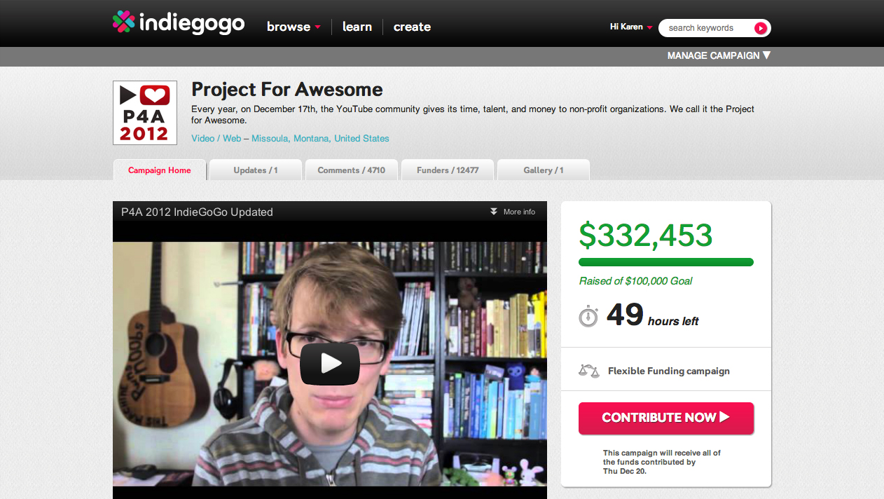
Speaking of the IndieGoGo page, that is still live for about another day as of when I’m writing this, so head on over to donate and get fabulous rewards, including…
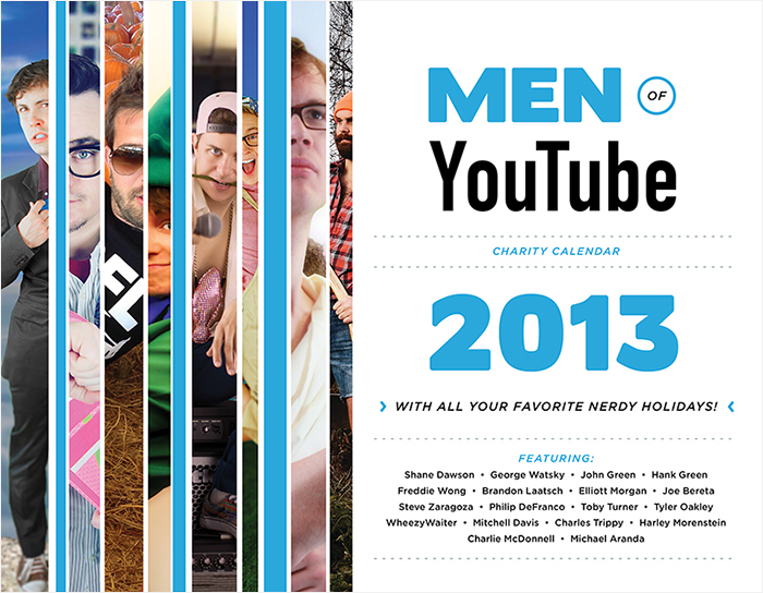
…The Men of YouTube Calendar! I’ve been working with Hank Green and Jenni Powell on this calendar for a while now, and trust me that it is fantastic. When I get a physical copy in the mail, I’ll do a whole blog post about it, but for now, enjoy these little snippets of sexy YouTubers on the cover. If you want to get one, they’re only available for 24 more hours over on IndieGoGo!
But back to the P4A, I insisted from the beginning that we utilize Tumblr this year a lot more than we have in the past. We used it to announce the teaser site, to distribute the thumbnails before the full site was ready to launch, to share some inspiration from the best videos of previous years, and to share videos during the P4A itself.
I had so much fun working on the Project for Awesome designs this year, and I’m already starting to brainstorm where we can go with it next year. Again, if you missed my P4A video, you can watch it right here, and if you want to check out the actual site, you can see it at www.projectforawesome.com.
This post is part of my 12 Days of Christmas series, where I’m posting new content every day for the 12 days leasing up to Christmas Eve. Thanks so much for reading, and if you missed the previous days, you can check them out below!
Previous 12 Days entries:
Day 1 – Intro video and Reddit Secret Santa vlog
Day 2 – Homemade Christmas Ornaments video and blog post
Day 3 – Graphic Design Holiday Gift Guide Part 2
Day 4 – Christmas Survey Tag Video
Day 5 – Project for Awesome video about charity: water
Day 6 – FakeJohnGreen photo archive