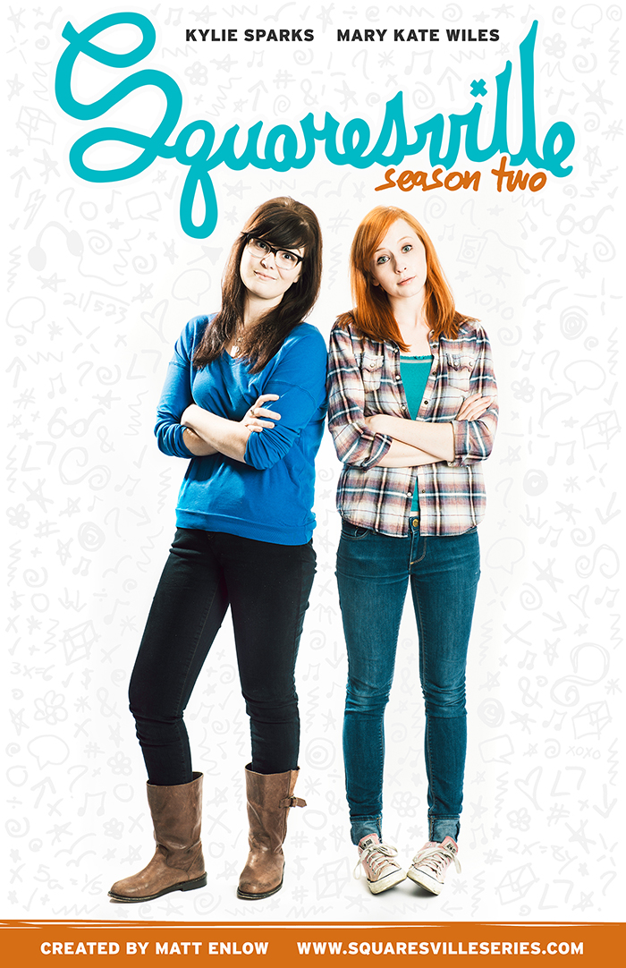
If you haven’t been watching the web series Squaresville, you are seriously missing out. Season 2 is airing now, and I had the opportunity to redesign all of their branding, including the poster above which is available for sale on DFTBA! Keep reading to see all of the different elements that went into this rebranding project.
If you’re not familiar with Squaresville, you can watch the Season 2 premiere above. It’s a web series about Zelda and Esther, two girls in high school in a small town, and the drama and adventures they get up to. It starts Kylie Sparks as Esther and Mary Kate Wiles as Zelda, who you may recognize as Lydia from The Lizzie Bennet Diaries!
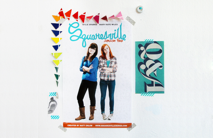
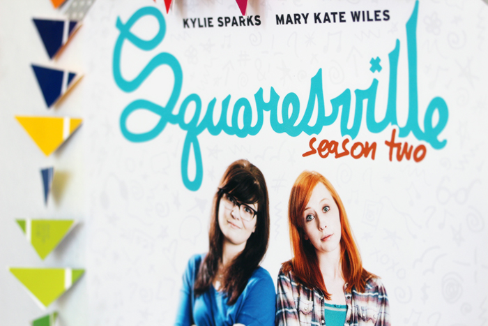
The poster was printed as an 11×17 print and is available for sale right now on DFTBA. I’m really happy with how the print version came out. I don’t usually put my own designs on my walls but I’m considering keeping this one up there.
![]()
The first step to this rebranding project was cleaning up the logo. The old logo was a good foundation to work from, but it was so detailed that it became hard to read at small sizes, so I adjusted some of the tight letterforms and colored it in to be one solid shape that’s much more recognizable from a distance.
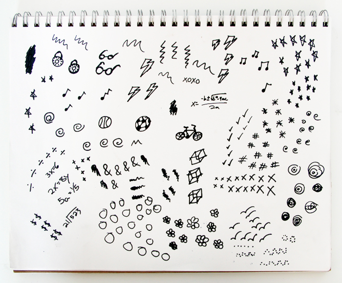

The other big element to the project was the doodled background. I actually pieced it together in Photoshop from doodles I did in Sharpie in my sketchbook. It was quite a lot of work making the whole texture look uniform without repeating images too many times, and making a big enough texture that it could repeat without being obvious where the seams were. But even though the Photoshop file ended up having approximately one million layers and took 20 minutes just to open while I was piecing it all together, I’m really happy with how it came out.
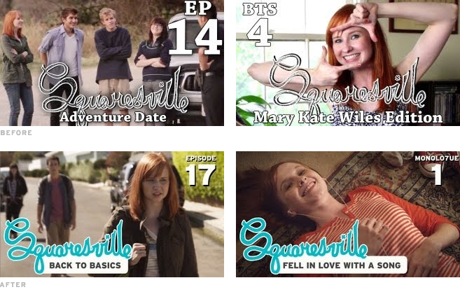
I wanted to make the thumbnails easier to read and more visually striking, so I brought in the blue logo and put the episode title on a white background in Interstate Bold to make one easily recognizable unit. The layout is flexible enough to work on almost any screenshot, but if you look at the thumbnails in a group, they’re still similar enough to look like a series.
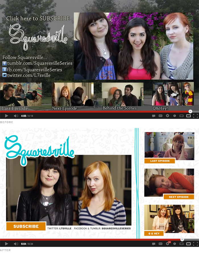
I was really excited to clean up the end screen, since the old one was pretty dark and cluttered. I replaced the photo background with the doodled texture and replaced the white serif text with bright orange buttons that look a lot more friendly. And finally, I removed the social media links and just included the usernames. Since they’re not clickable links, the usernames are all that are really necessary, and they look much cleaner and less cluttered than a full link.
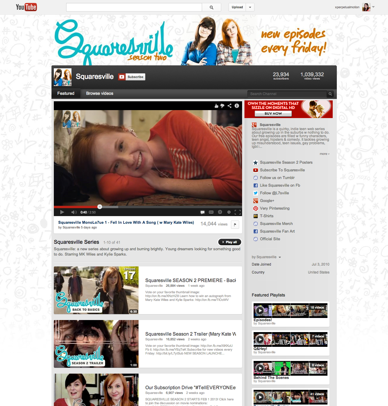
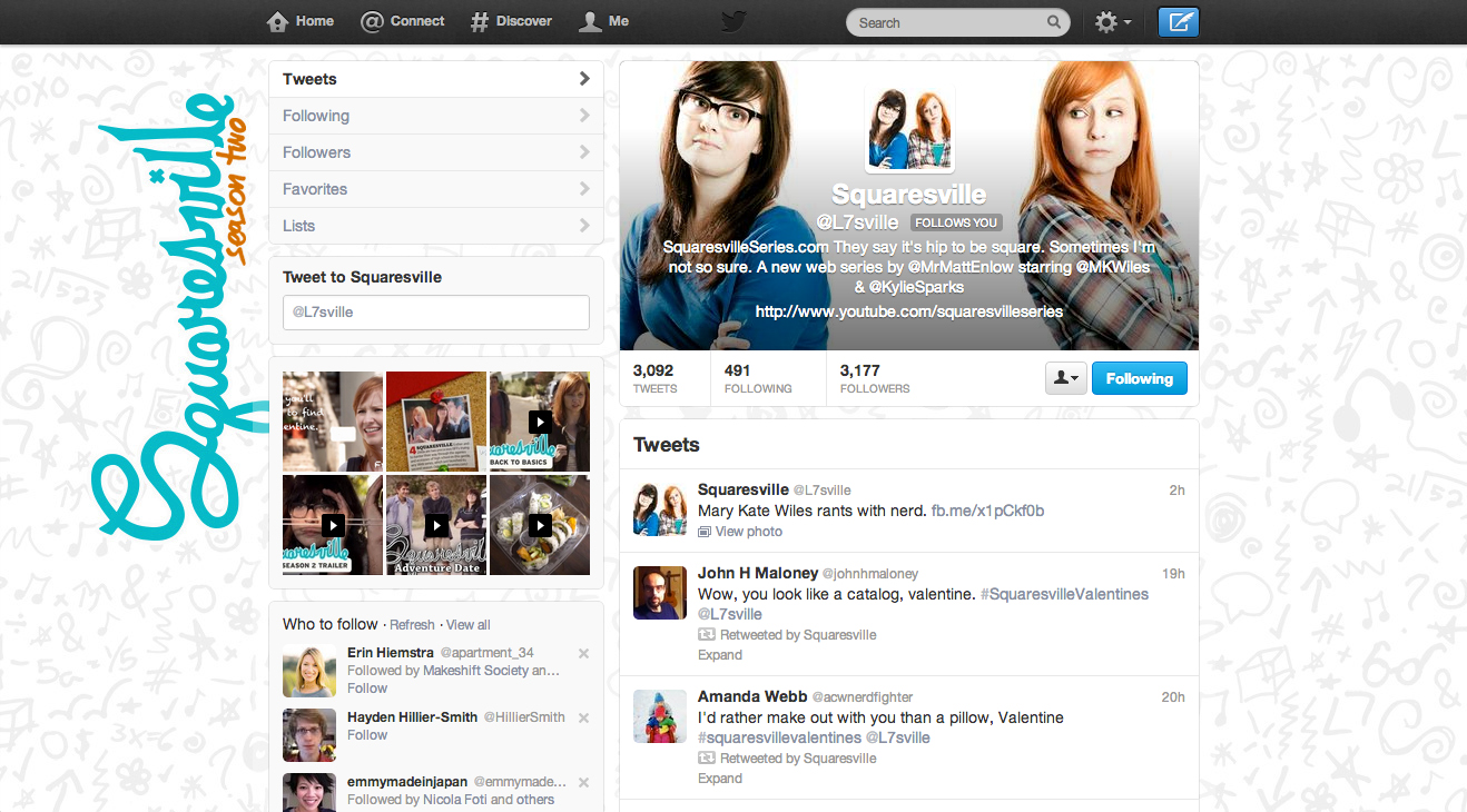
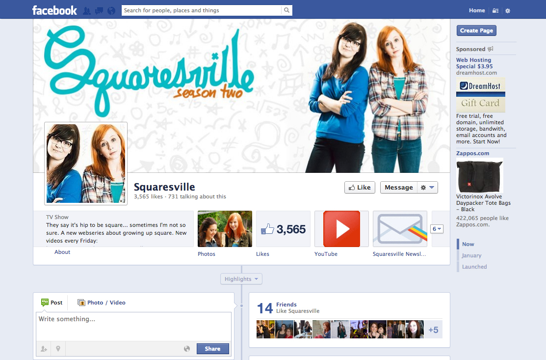
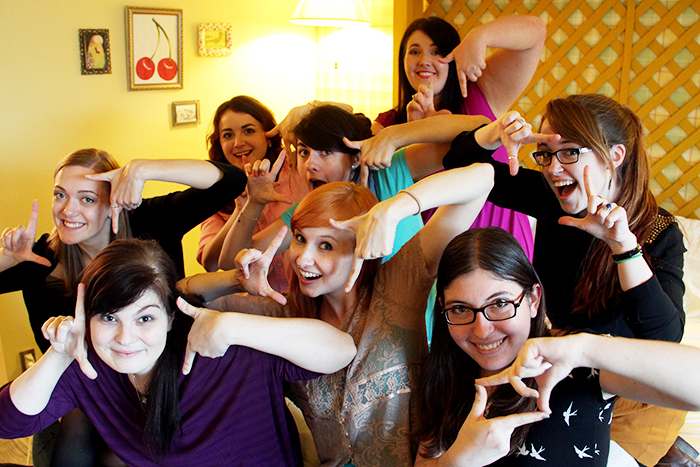
All of the other social media pages use the same branding elements that I developed in the poster and the great photo of the girls which was taken by Melly Lee. You can see their YouTube channel design above (before the new channel redesigns) and Twitter and Facebook below.
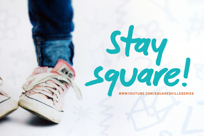
I hope you guys like my take on the Squaresville visual designs, and be sure to check out the show if you havn’t been watching it already. Remember that the poster is available on DFTBA, and new episodes are posted on their channel every two weeks. Thanks for reading, and stay square!