Once again it’s taken me far too long to write this blog post, but a month after it’s over, let’s take a look at the Project for Awesome 2014! This year we raised over $1.2 million dollars, which is so incredible I can’t even wrap my mind around it. But before we got there, we had to put together the website, so this post is all about how I went about designing it. And made sure to click the images to see full-size screenshots of each page of the site.
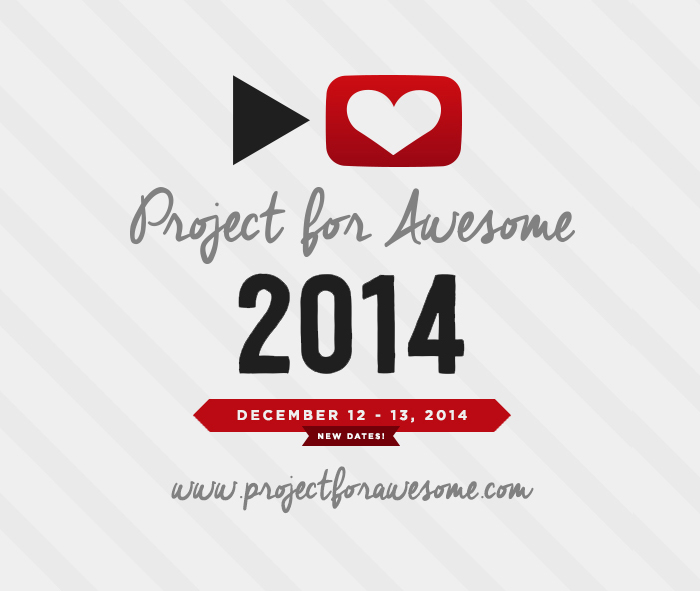
The website pretty much only got a visual facelift from last year, since all of the functionality was the same as in 2013. The biggest change was adding a countdown to the header, so that people would know exactly when the P4A was starting and ending, no matter what time zone they were in.
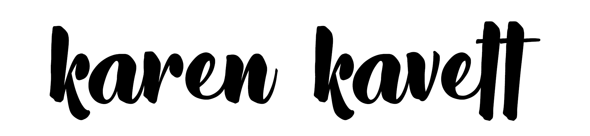
The visual redesign was so much fun to do, since I think my design skills improve every year. This year I brought in a script font for the logo, which softened the look of the entire page. We also used webfonts for the first time, rather than the standard Arial we’ve been using every year until now. I wanted to use the Gotham webfont for the body text, but it was a bit too expensive to justify for a charity project, so instead we went with the free lookalike Montserrat from Google Fonts. I just think using a font besides Arial makes the entire site look way more professional and put together, and I’m so thankful to Sam Rudge for having the coding ability to implement it seamlessly.
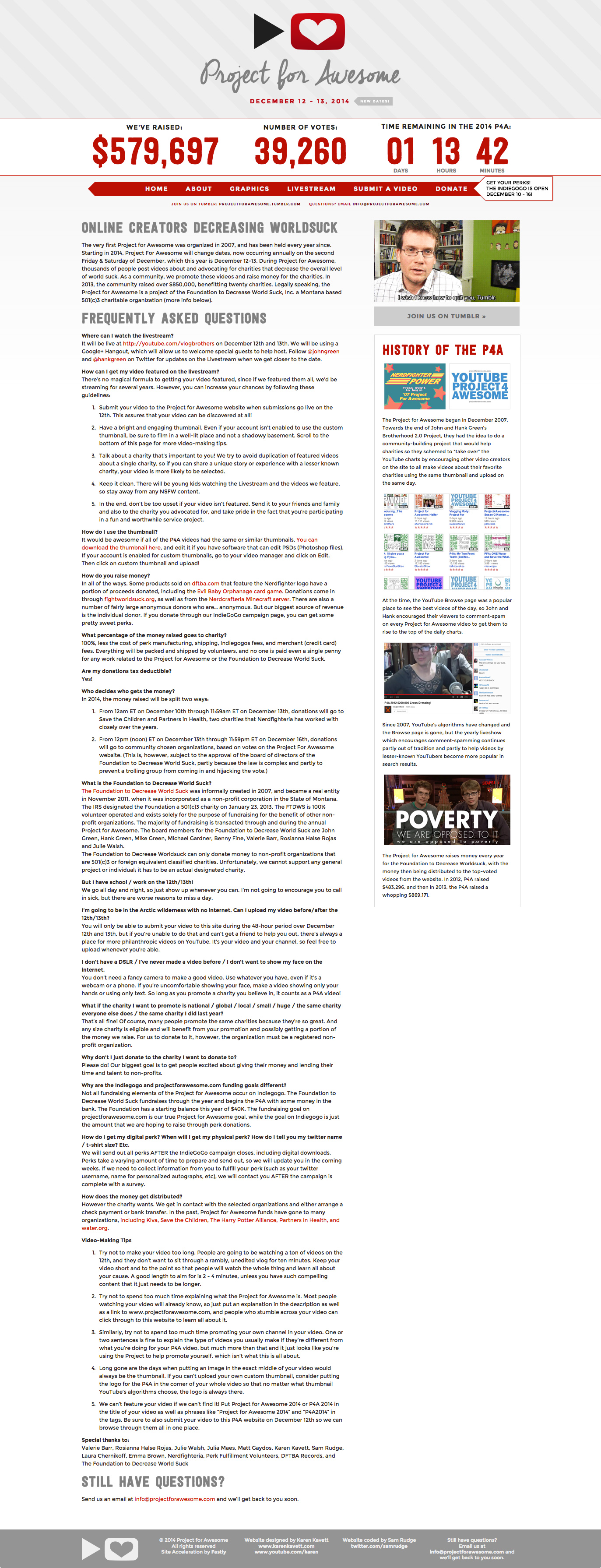
The About Page was essentially just a visual facelift of last year’s page, just changing a bit of the text for updates this year. The biggest change was the date, which is also highlighted in the header. We moved the P4A from December 17-18 to now the second Friday and Saturday in December, to accommodate John Green’s schedule on the Paper Towns movie and also to make it easier for more people to participate since it will always be on a weekend.
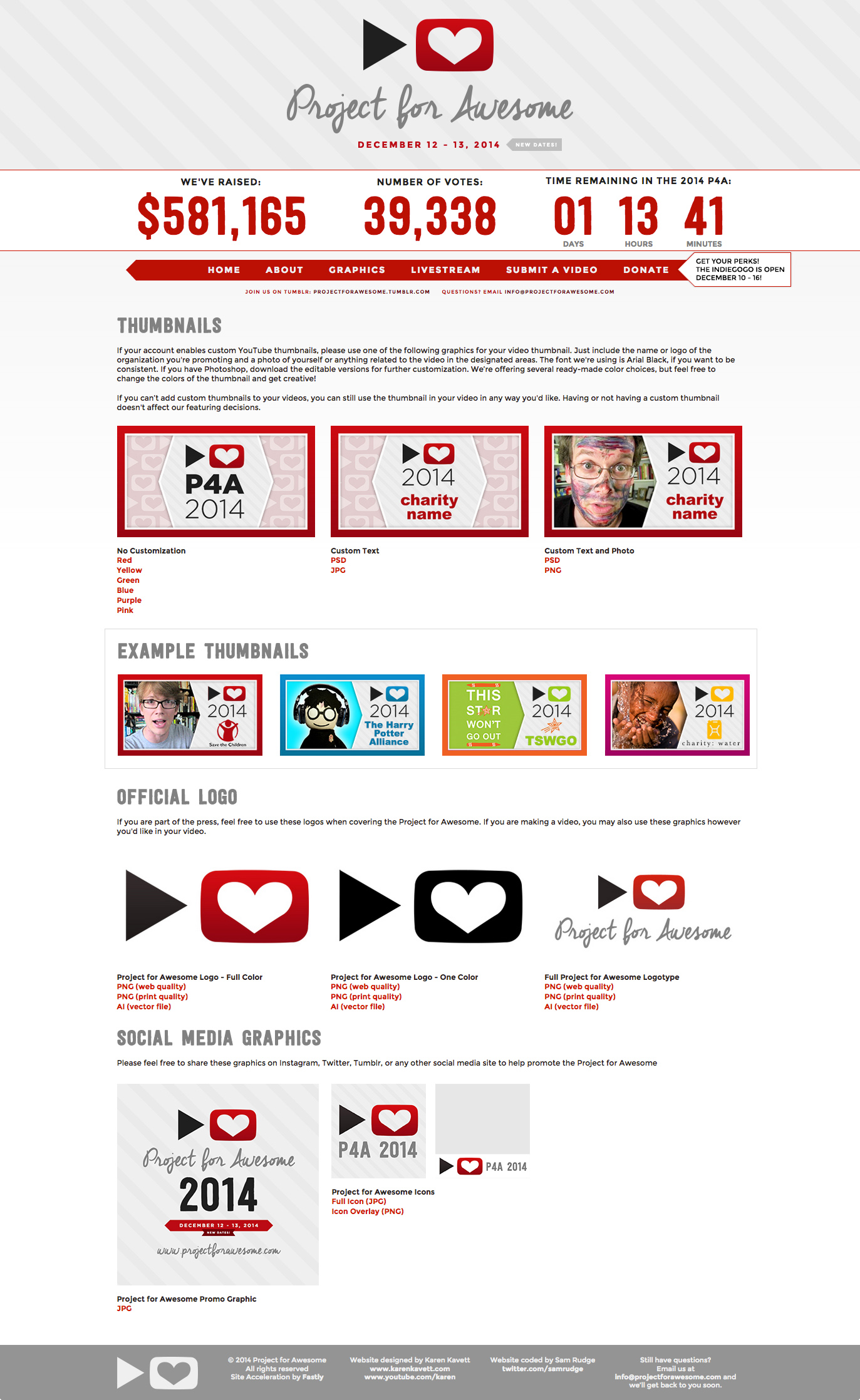
I always say that the thumbnail gets harder and harder to design every year, since there’s so much information that needs to be shared, and only so many ways to divide the space in such a small thumbnail. This year I decided to add a thick border, since it’s been a feature I’ve been utilizing in my own thumbnails, and I think a bright border helps videos stick out in the subscription box. I love seeing how people customize the thumbnail design every year, and you can see every thumbnail in this poster put together by Matthew Tole.
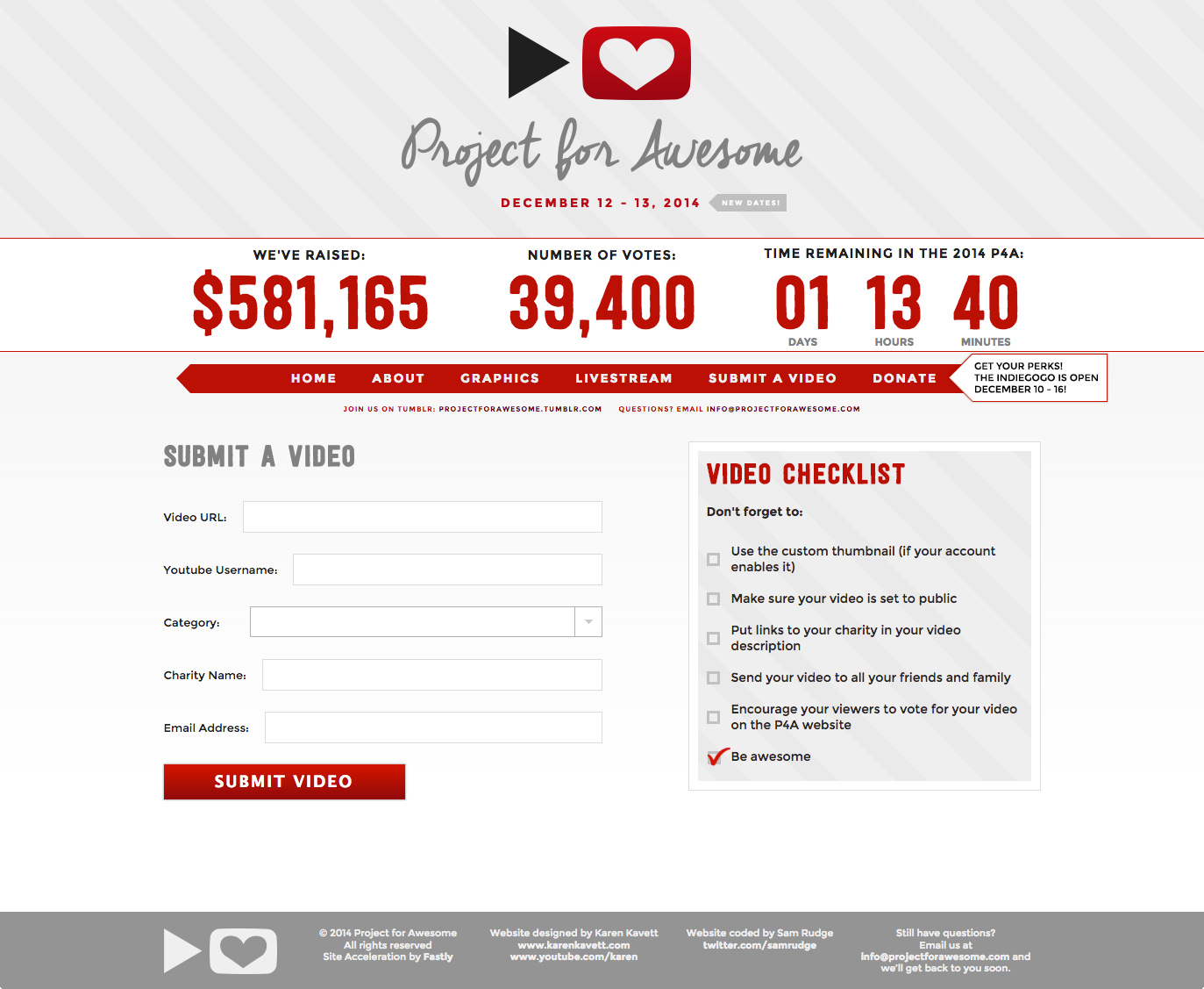
Just like the About page, the submit page was essentially the same as last year. There isn’t much information that needs to be submitted, so a simple form is all that we need.
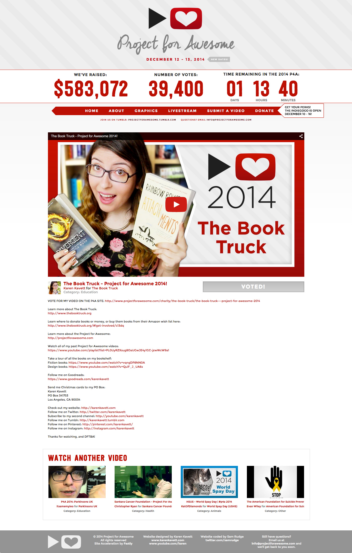
The video page is also pretty similar to last year, only I decided to remove the Twitter and Facebook sharing widgets, because I didn’t think most people used them, and they only seemed to clutter up the page. This year, it was just about the embedded video, the description, and the Vote button, which was removed after voting was over.
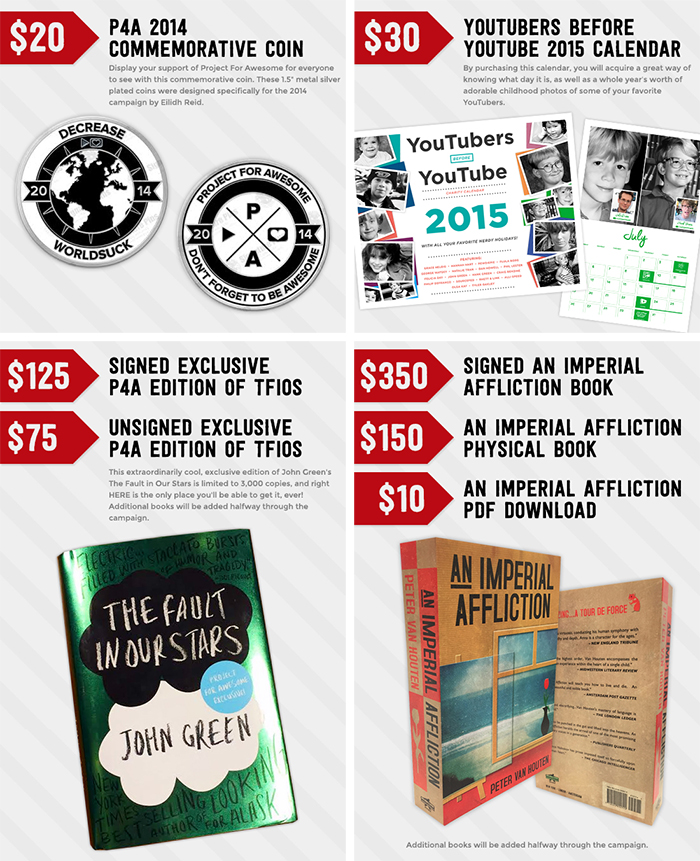
Besides the site, I also put together the graphics for all the perks we wanted to feature on the Indiegogo page. These just needed to highlight the price, the description, and a picture of the item, so I kept it pretty simple and reused elements from the website.
But in terms of the perks themselves, the P4A team did an amazing job this year gathering them, and I picked up an Imperial Affliction book and the special P4A edition of The Fault in Our Stars. I also designed the YouTubers Before YouTube 2015 calendar as well as Josh Sundquist’s e-book, and blog posts about both of those will be coming soon.
I also wanted to highlight my own P4A video, which this year was about The Book Truck, an LA-based charity that brings YA books to teenagers in foster care or otherwise “in the system,” who don’t have access to a lot of books in their daily lives. I think spreading literacy is such a great cause, so I hope you guys check out the video and donate books or money if you’re able!
I have to say that this year’s P4A designs probably came together more easily than any in the past, and I think it’s my favorite site design yet. But of course, the entire project wouldn’t be possible without the project manager Laura Chernikoff, the webdev Sam Rudge, the creators of the entire thing John and Hank Green, and the rest of the incredible team who organized perks, presented on the livestream, picked videos to feature, and everything else that goes into this event. I cannot believe that with donation matching we raised over $1.2 million dollars, and once the top voted charities are verified, tons of people all over the world will be helped with all of that money. If you made a video, watched and commented on videos, or donated to the P4A, thank you so much for participating, and I can’t wait to see what we do next year!
In the meantime, if you want to see how the P4A designs have evolved over the years, you can still check out my blog posts from 2013 and 2012. Happy P4A and Happy 2015!