Thanks everyone for all the great feedback about the intro yesterday! I won’t be posting another video until Friday, so I’ll have time to take into consideration your thoughts and tweak it before then.
Today’s post is about some graphics I designed for a few little-known video bloggers named John and Hank Green. They have this channel called the VlogBrothers which I’m sure is going to be huge someday, if they can just manage to build some sort of following…
Ok, enough joking around. I was so excited to do graphics for John and Hank’s series of educational videos. Obviously the videos would be great on their own, but having good graphics really makes the learning easier and more fun for the viewers. Plus, I learned a lot about subjects I haven’t even thought about since high school.
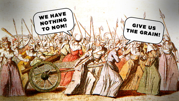
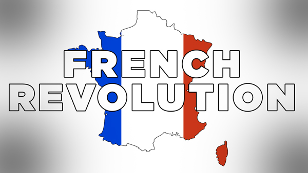
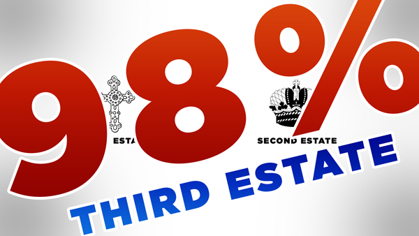
John’s video about the French Revolution was the first one I designed graphics for, so I was still developing the visual style and there were a few problems that will hopefully not happen again. I was designing from a script, not from the video itself, so there were some points where I would design the graphic to live in one part on the screen and then John would film that line in a spot where the graphic would cover his face. So he would have to move the image, and then it would end up weirdly cut off in the middle (like in that thumbnail above).
However, I think that overall the graphics were a success. Judging from the comments, everyone loved the “We have nothing to nom!” graphic that I came up with at about 2am while trying to get the project finished so I could go to sleep. Below are some of the other images that I made that I quite liked and spent a fair amount of time on, even though they were only on screen for a couple seconds.


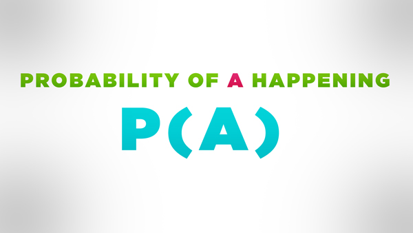
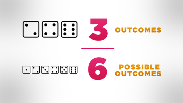
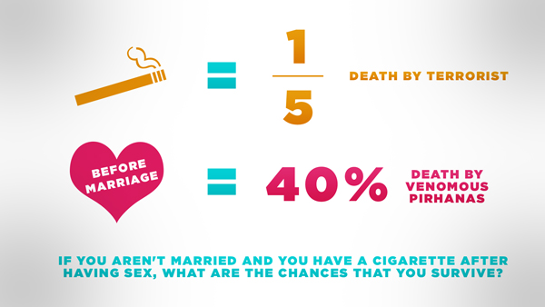
Hank’s video about probability required a slightly different sort of imagery. Since it is mostly explaining equations, I couldn’t make as many jokes and funny images as in John’s, so I tried to use bright colors to make the equations visually interesting and easy to understand.
This video was a lot more about information graphics, so there are far fewer overlays on top of the video of Hank talking (sorry you don’t get to see his face more). But I thought it was important to give the equations room to breathe, so they’re not competing with Hank’s face for attention. There’s not a whole lot else I can say here, except that I hope the images served their purpose and made probability easier to understand for the viewers.
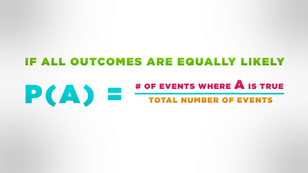
[Edited to remove the slide where the math was wrong. It’ll be fixed in an annotation soon.]
Expect another blog post this weekend about the graphics I’m about to make for the final two videos in their educational series!