In the first of a bunch of posts documenting the graphic design work I did while on that two-month hiatus from blogging, I’m going to talk about the Triple Rainbow Awesome Tour poster and the Skyway Flyer shirt I designed.
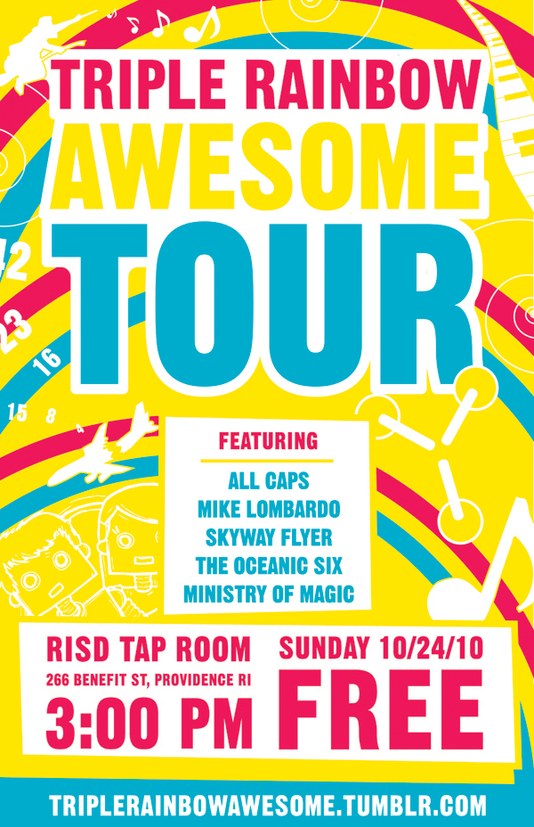
Mike Lombardo asked me if I would design the Triple Rainbow Awesome Tour poster, which was really fun since I had been brainstorming some ideas for it anyway, and so I had an excuse to actually flesh them out. I wanted the poster to be happy and eye-catching, so I stuck to a simple color scheme of yellow, pink, and blue, with white highlights. I used the typeface Gothic 13, since it’s bold and eye-catching, without being the obvious Helvetica or Univers.
The imagery of the three rainbows kind of fell to the background as I began layering musician-specific illustrations on top of them. I wanted the poster to explain the type of music that would be played at the show, so people who may not have heard of them but saw the poster would still want to attend.
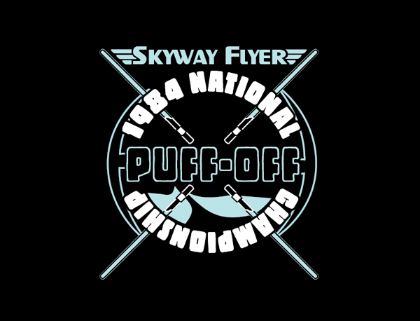
I also designed a shirt for Jason Munday’s music project Skyway Flyer, in exchange for him creating the new intro music for my videos. He gave me a basic sketch of what he wanted, which was a promotional image for a fake event called the Puff-Off, referencing his and John Green’s hair puff. I’m awful at drawing hair, so I instead used imagery that related to his music. Originally I put a flux capacitor in the center of the shirt, but that was very similar to his previous shirt design, so we decided to change it to lightsabers.
Leave any comments below – I read them all!