Crafter & Designer
DIY Projects
Graphic Design
Other
Press
Contact
Graphic Design
Check out all of my Graphic Design projects!
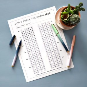
Don’t Break the Chain Calendar 2020
VIEW POST
karen
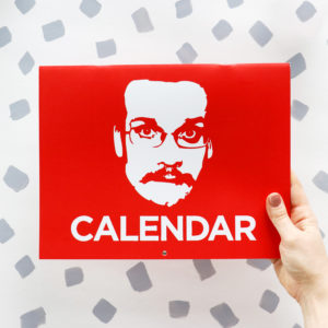
Pizza John Calendar Design 2019
VIEW POST
karen
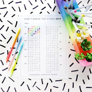
Don’t Break the Chain Calendar 2019
VIEW POST
karen
Introducing Karen Kavett Puzzles
VIEW POST
karen
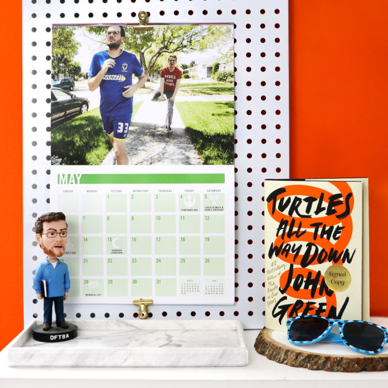
John & Hank Green 2018 Calendar Design
VIEW POST
karen
Don’t Break the Chain Calendar 2018 + My Annual …
VIEW POST
karen
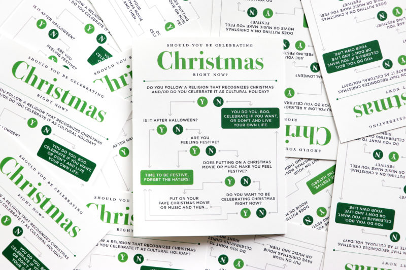
Should You Be Celebrating Christmas Flowchart – Christmas Cards 2016
VIEW POST
karen
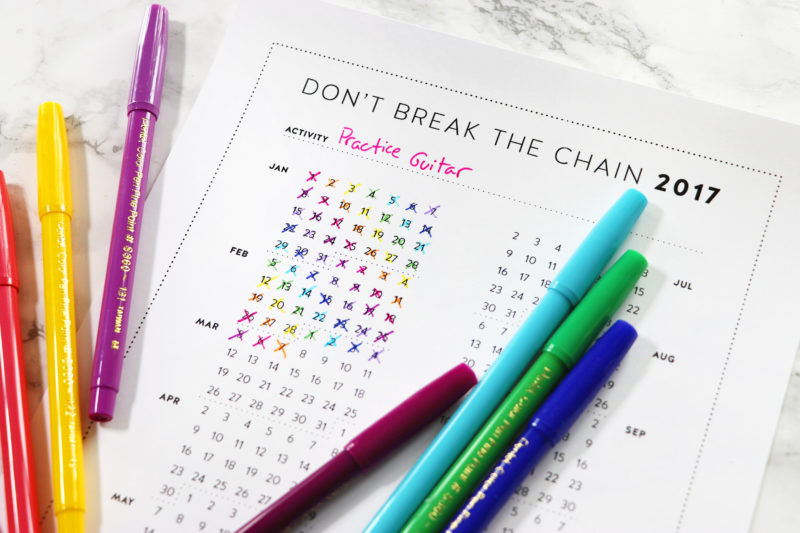
Don’t Break the Chain Calendar 2017 ~ Free Motivational …
VIEW POST
karen
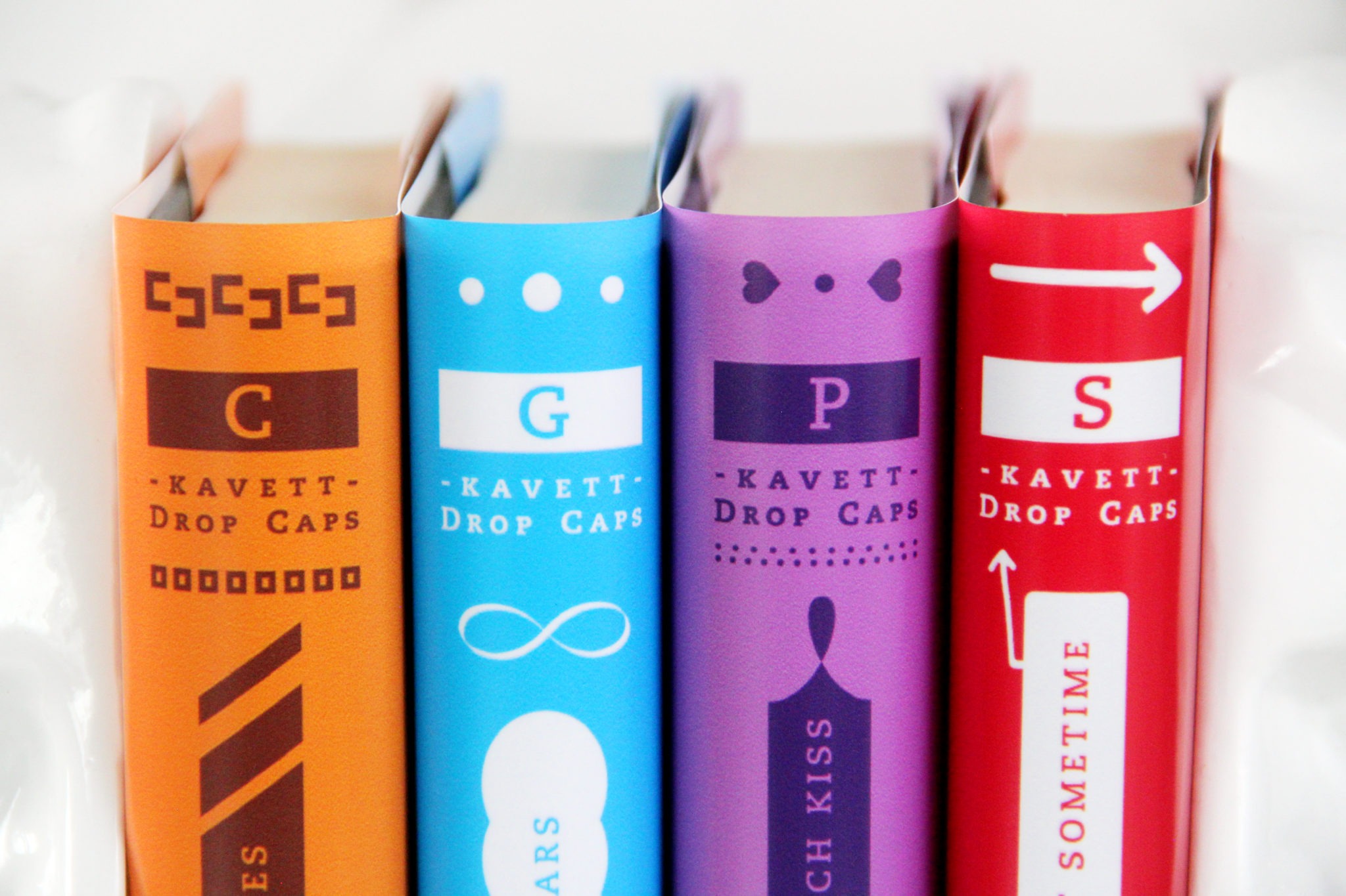
DIY Penguin Drop Cap Book Covers
VIEW POST
karen
Older Posts
×