Crafter & Designer
DIY Projects
Graphic Design
Other
Press
Contact
Other
Check out all of my Other projects!
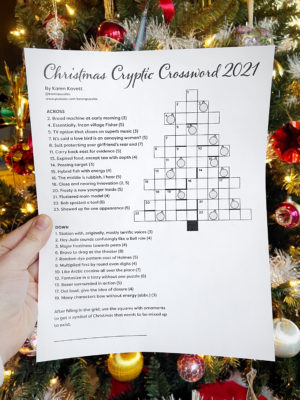
Christmas Cryptic Crossword 2021
VIEW POST
karen
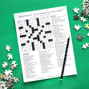
2020 Christmas Crossword
VIEW POST
karen
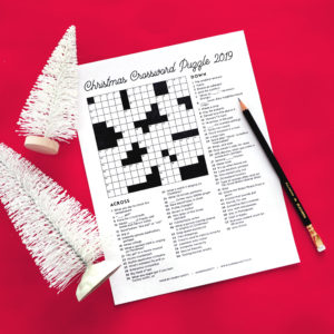
Christmas Crossword Puzzle 2019
VIEW POST
karen
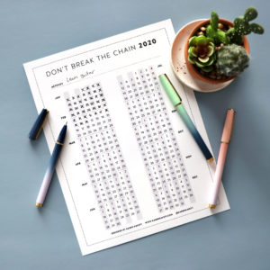
Don’t Break the Chain Calendar 2020
VIEW POST
karen
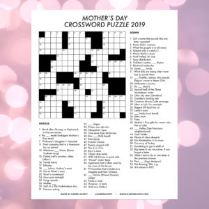
Mother’s Day Crossword Puzzle 2019
VIEW POST
karen
Christmas Crossword Puzzle 2018
VIEW POST
karen
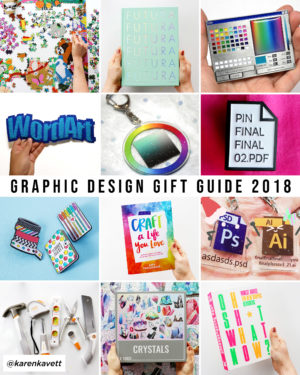
Gift Guide for Crafters and Graphic Designers 2018
VIEW POST
karen
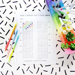
Don’t Break the Chain Calendar 2019
VIEW POST
karen
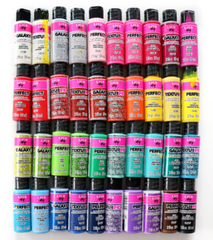
Full Review of LaurDIY’s Craft Line
VIEW POST
karen
Older Posts
×