Spring Photoshoot – Blog Post
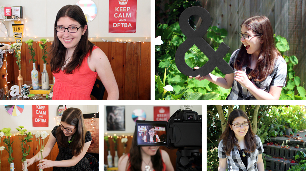
In Spring 2012, I needed some new promotional photos, so I enlisted my friend Alex to take these, which I then edited and retouched.

Halloween Photoshoot – Blog Post
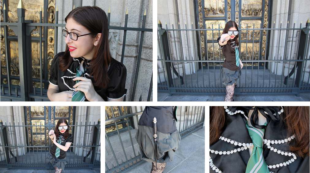
To document my 2011 Halloween costume of a Lady GaGa-inspired Slytherin student, I once again got my friend Alex to take some photos of me, which I then edited and retouched.
Visual Playlists of Books – Blog Post
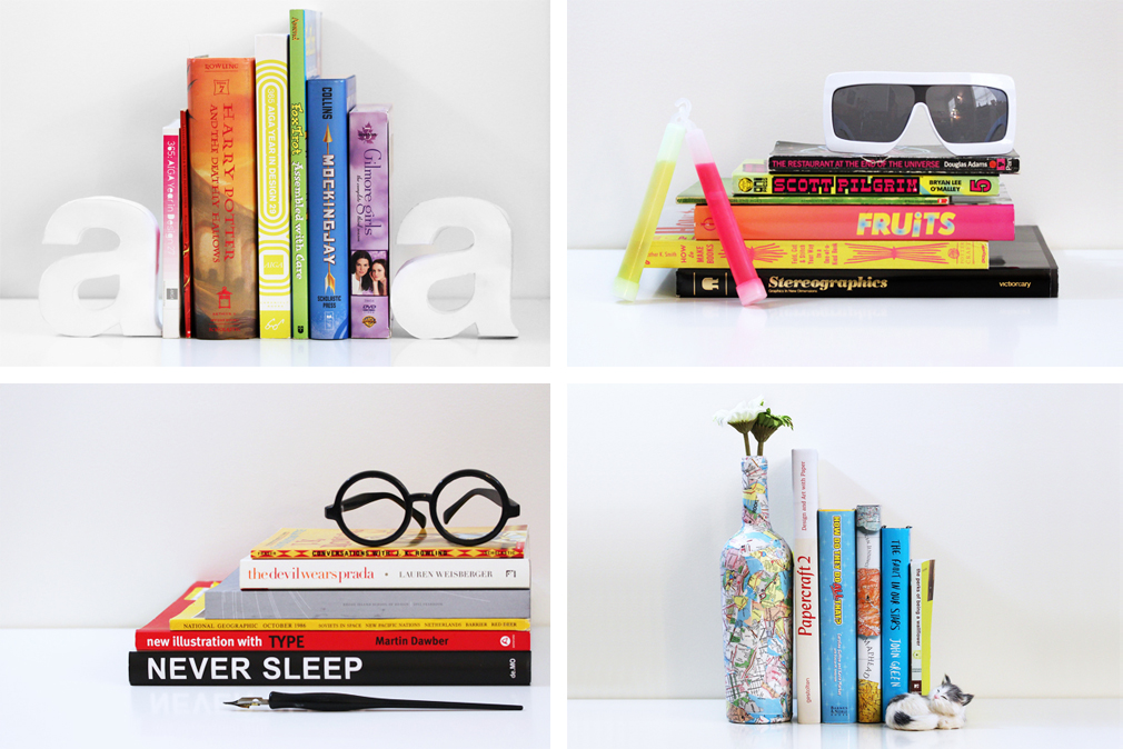
One day I had the idea to group books not by their content but by their spine designs, which I called “visual playlists.” I made a couple different versions and asked my Tumblr audience to submit their own as well.
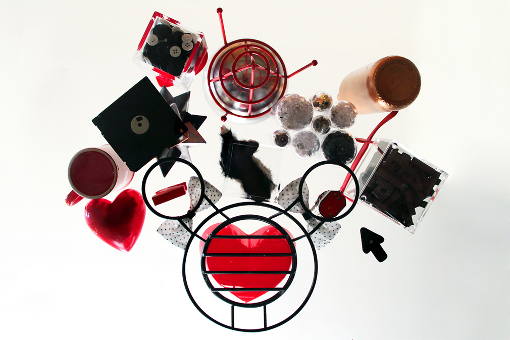
Craft Haul – Blog Post
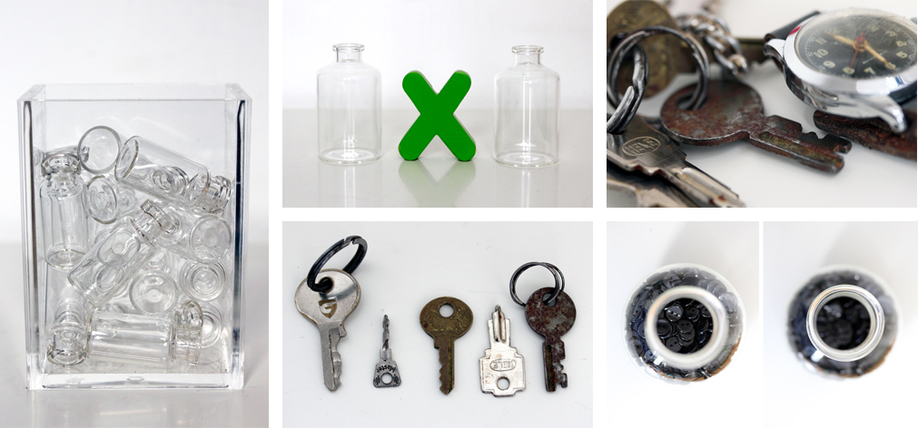
After shopping at SCRAP, a recycled craft supply store in San Francisco, I made a video about the trip and photographed everything I bought.
Parking Meter Body – Blog Post
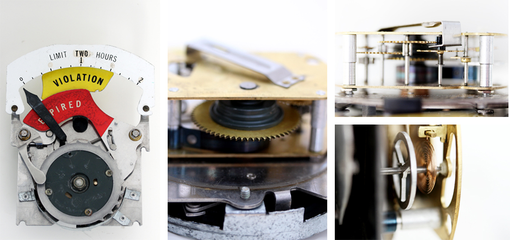
Macro photos of the vintage parking meter body I bought at SCRAP, a recycled craft supply store in San Francisco.
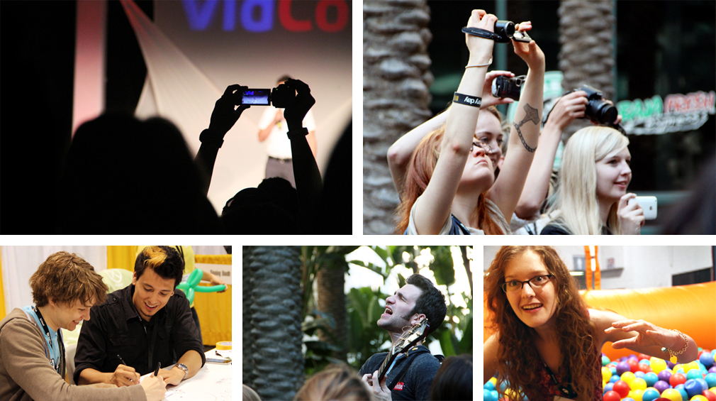
VidCon 2012 – Blog Post • Thoughts on the Cameras Photo
Some of my favorite photos that I took at VidCon 2012, an annual YouTube conference. You can also watch the video that I made about the conference.
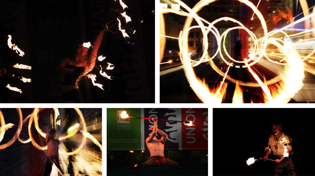
Fire Poi Show – Blog Post
Some of the best photos I took at a fire poi show in Union Square in San Francisco. You can also watch a video I edited with footage I took of the show.
Glass Table Photo – Blog Post
A photo I took from underneath my glass table at my old apartment.
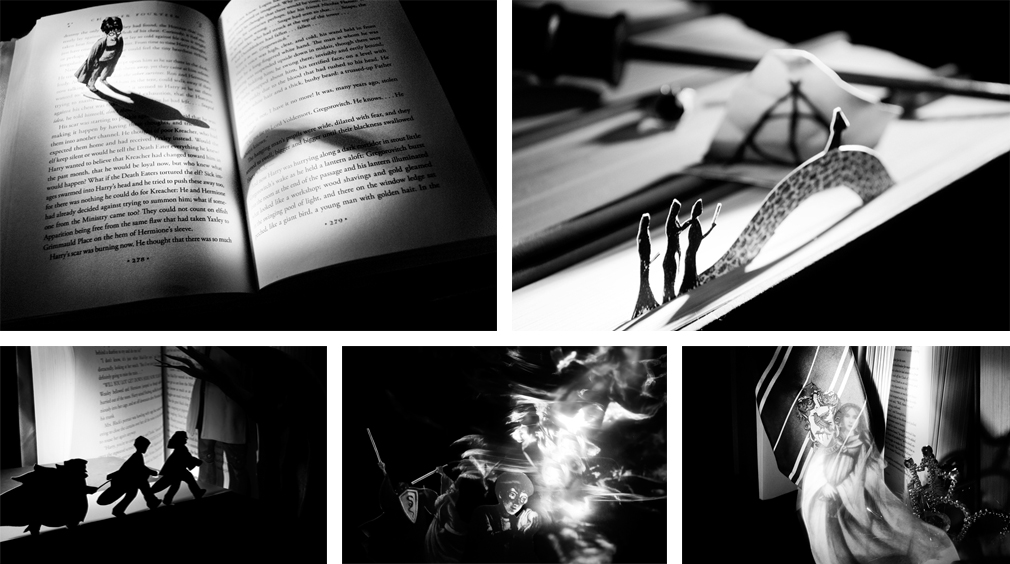
Harry Potter Paper Photos – Blog Post
Photos inspired by the Harry Potter books, using the illustrations as real-life elements.
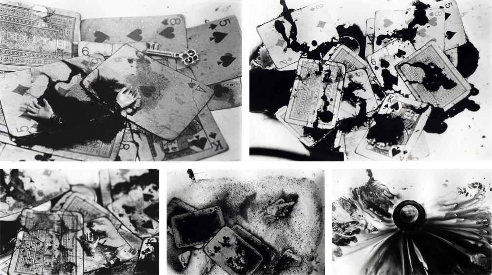
Cards and Ink Photo Series – Blog Post
Photo series taken for my analog photography class at RISD.
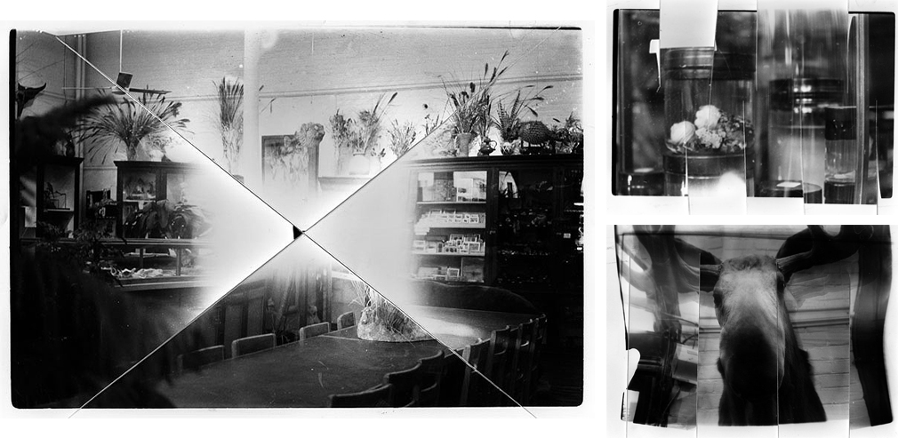
Experimental Analog Photography – Blog Post
During the analog photography class I took at RISD, I enjoyed experimenting with the chemicals and bending the paper to get different effects on the photos that I printed.