Crafter & Designer
DIY Projects
Graphic Design
Other
Press
Contact
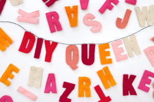
DIY Customizable Letter Banner
View Post
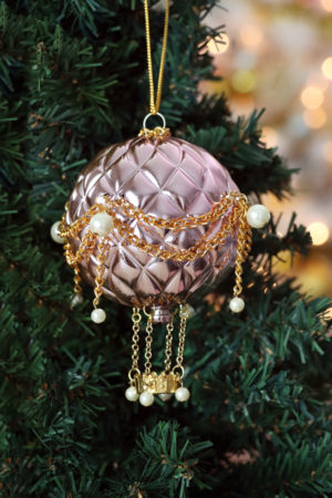
DIY Hot Air Balloon Christmas Ornament
View Post
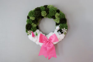
DIY Pom Pom Christmas Wreath
View Post
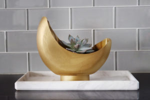
DIY Moon Planter from a Tide Pod Container
View Post
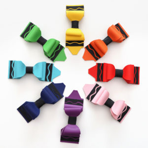
DIY Crayon Hair Bows
View Post
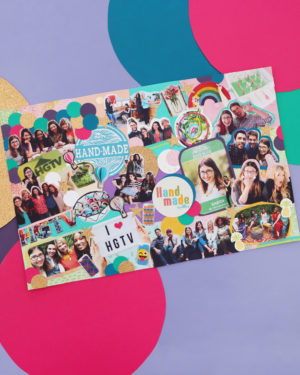
I’m Quitting DIY
VIEW POST
karen
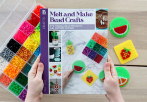
I Wrote a Book About Perler Beads
VIEW POST
karen
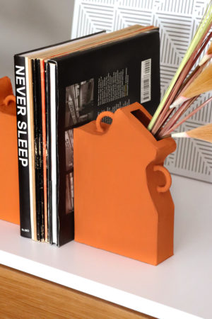
DIY Faux Ceramic Bookend Vase
VIEW POST
karen
DIY Customizable Letter Banner
VIEW POST
karen
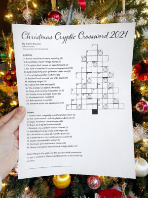
Christmas Cryptic Crossword 2021
VIEW POST
karen
DIY Hot Air Balloon Christmas Ornament
VIEW POST
karen
DIY Pom Pom Christmas Wreath
VIEW POST
karen
DIY Moon Planter from a Tide Pod Container
VIEW POST
karen
DIY Crayon Hair Bows
VIEW POST
karen
Older Posts
×