Crafter & Designer
DIY Projects
Graphic Design
Other
Press
Contact
DIY Customizable Letter Banner
View Post
DIY Hot Air Balloon Christmas Ornament
View Post
DIY Pom Pom Christmas Wreath
View Post
DIY Moon Planter from a Tide Pod Container
View Post
DIY Crayon Hair Bows
View Post
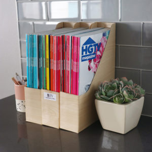
How to Revamp Old Magazine Holders
VIEW POST
karen
DIY Cards from Christmas Scraps
VIEW POST
karen
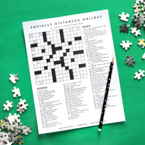
2020 Christmas Crossword
VIEW POST
karen
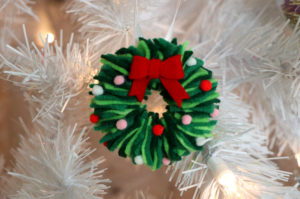
DIY Christmas Ornaments from Felt Scraps
VIEW POST
karen
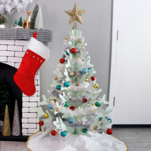
DIY Cardboard Christmas Tree
VIEW POST
karen
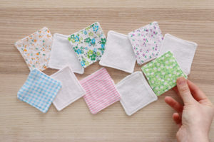
DIY Reusable Makeup Pads
VIEW POST
karen
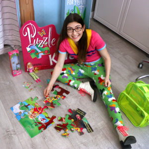
DIY Puzzle Craze Barbie Costume
VIEW POST
karen
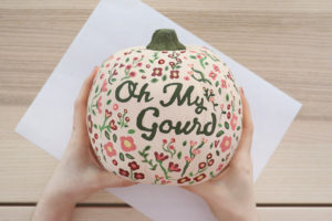
DIY Farmhouse Pumpkins
VIEW POST
karen
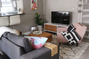
My Apartment Tour 2020
VIEW POST
karen
Older Posts
Newer Posts
×