I haven’t been posting the work I’ve been doing for the Visiting Designers workshops I’m in this semester, because we only have about two days for each of the projects and I never got my projects to a point of completion where I was satisfied enough to share them. However, I do want to share the results of the first workshop, from all the way back in September. This one I didn’t share because there was a chance the website might actually become a reality. However, that doesn’t really seem to be a possibility anymore, so I can finally show you guys what it’s all about.
The assignment was to in some way re-imagine the news. This could be a newspaper, magazine, website, even Facebook – we had to really think about the kinds of news we digest every day and how they are delivered to us. I chose to focus on news about the YouTube community. I wanted to combine the plethora of information from VidStatsX with the headline news from the YouTube Blog and videos from TheWillofDC. The best way I thought to do this was through a separate website which would really be geared toward very involved members of the YouTube community.
*Quick disclaimer: While most of the statistics below were real at the time I designed this, some of them I had to make up due to time constraints. Don’t take any stats below as absolute fact.*
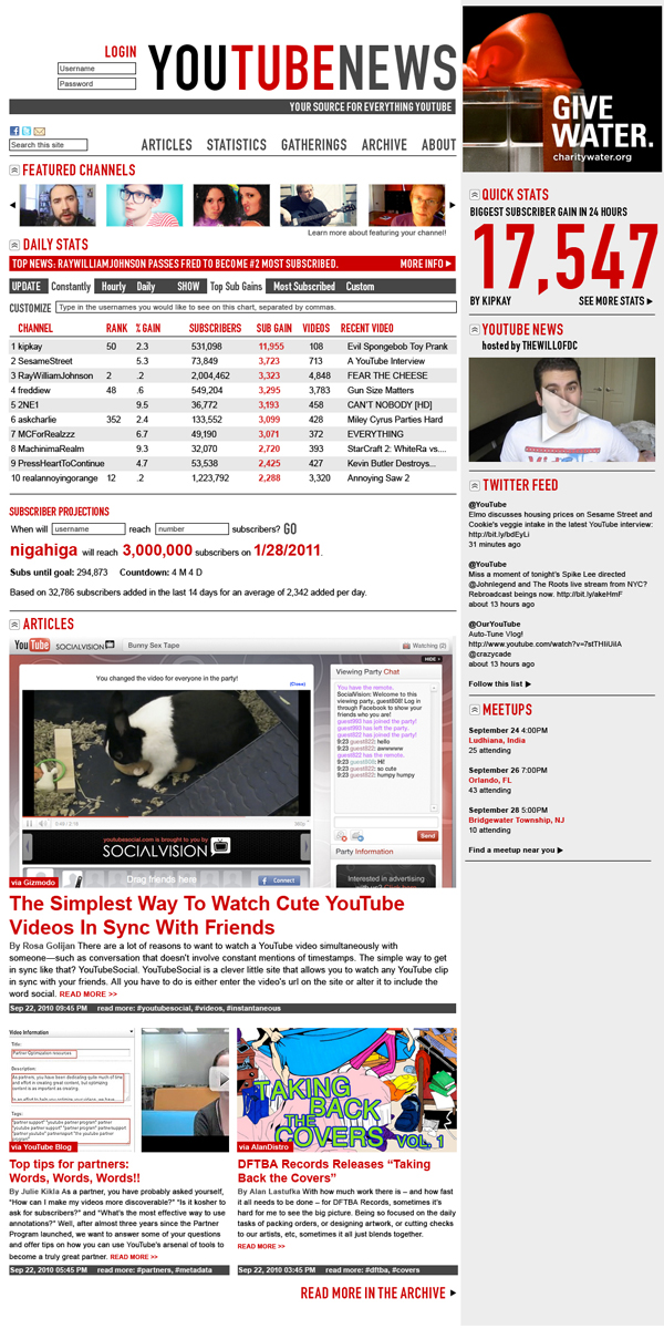
The three main sections of the website would be articles, statistics, and gatherings. Right on the front page would be featured channels, followed by daily statistics. You could very easily see the stats you care about for whichever channels you are most interested in. One of my favorite features of VidStatsX is the chart that shows you when you will hit a specific sub count, based on your daily average sub gains. So, I included a feature to track when any user would reach any number of subscribers.
Following that are the articles, which in theory would include both aggregated articles about YouTube from other tech blogs as well as original articles written specifically for this website. The design was inspired by Gizmodo, with a large photo to quickly show what the article is about.
On the sidebar we have quick statistics, which would be some impressive stat chosen by someone who runs the site, and would change every few hours. Then would be a link to TheWillofDC’s YouTube news show, and a twitter feed from the @YouTube account. Finally, upcoming meet-ups would also be displayed on the homepage. I also had the idea that in the same way as YouTube’s modules are movable and able to be hidden, the different modules on this site could be hidden or moved to the top, however each individual user would prefer.
As I was designing it, I spoke to Hank Green about the idea, and it turned out that he had come up with a similar idea independently about a month earlier. He gave me some suggestions of changes to make so it could be presented to YouTube themselves, to try to get funding so it could become a reality.
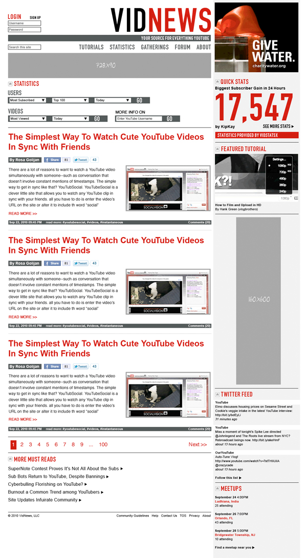
The first thing we changed was the title of the website to the simpler VidNews. We replaced articles with tutorials, which would be more unique to the site. We added a forum button to the navigation to provide a more interactive component. We got rid of the featured channels and simplified the statistics shown on the home page, so that there wouldn’t be quite as much information competing for your attention at once.
This is as far as the design got before we received word from YouTube that while they liked the idea for the site, they weren’t interested in funding it. So, unless somebody else would like to donate their money to helping it become a reality, these JPG images are as much of the site as will ever exist.
However, I did design more than the homepage. Read on for some of the features I thought up, that someone better then me at programming could hopefully have made actually work.
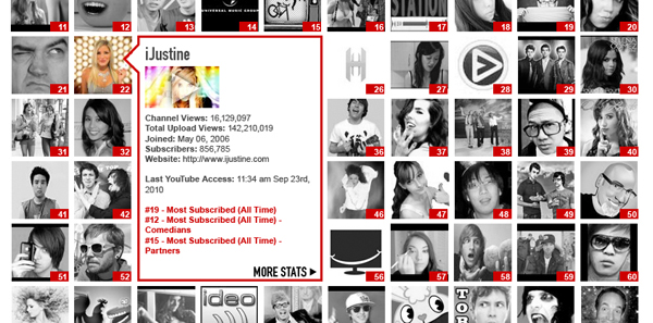
A dynamic feature of the site that I thought would be very useful is this roll-over pop-up bubble with further information about any YouTube channel. I’m not a programmer so I don’t quite know how exactly it would work, but in theory the website would recognize when text or an image should link to a username on any page of the site, and automatically pull this information from the relevant channel page on YouTube.
One of the most fun parts about the project was getting to come up with creative ways to redesign the statistics portion of the site. As useful as VidStatsX can be, the design is seriously lacking and could be a lot more visually pleasing.
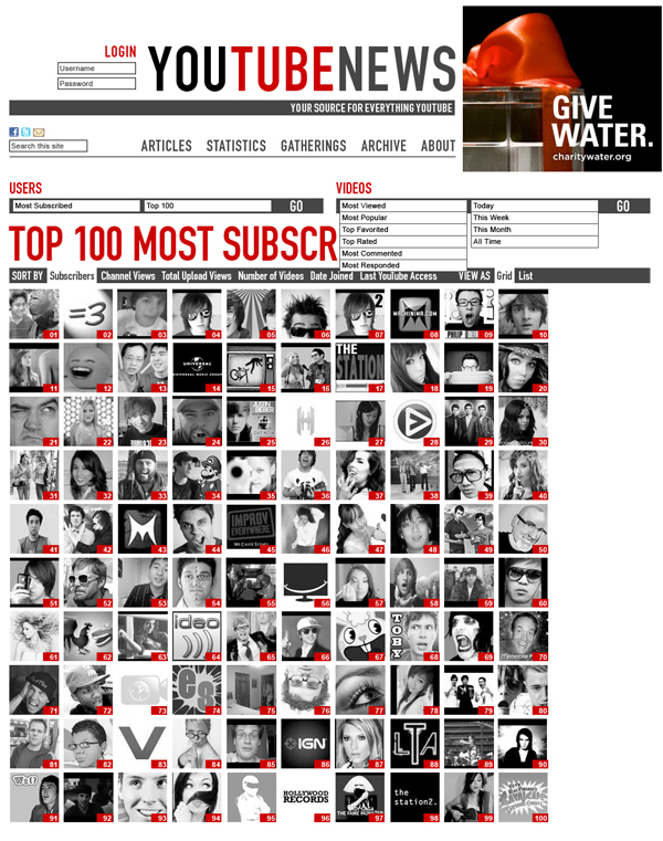
As you can see in the example above, I consolidated a lot of the viewing options into drop down menus that take up far less space. The layout would be very dynamic, allowing you to quickly view the Top 10, 50, 100 etc. users by subscriber count, total view count, number of videos, and other different options. You would also have the option to view it visually by icon, or as a list with all of the statistics written out.
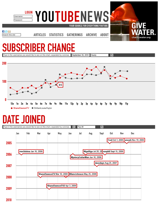
One of the other graphs that I came up with would track Subscriber Change for specific users over a set period of time. Another fun one would track when specific users joined YouTube in a grid-like calendar.
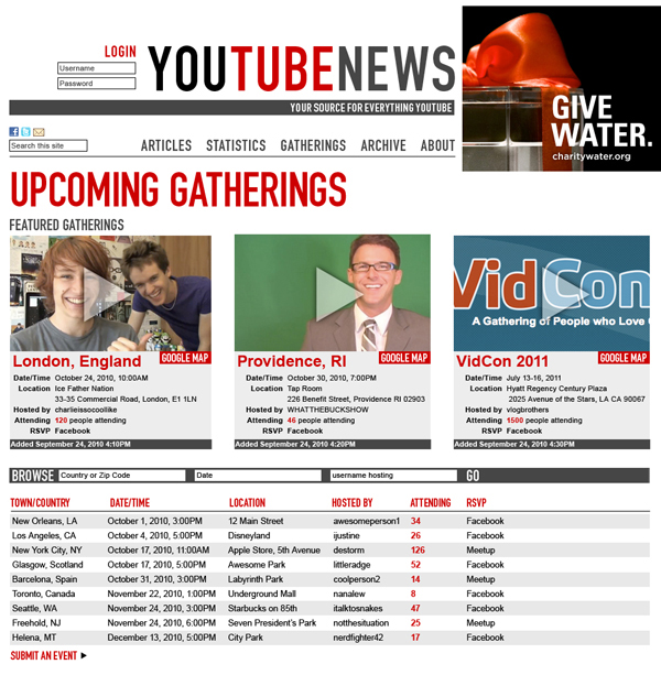
Another feature of the site would be a aggregation of large upcoming YouTube gatherings. There have been some attempts to do this before, but none have widestream popularity, an intuitive user interface, and integration with a site people already use regularly. One of the most important parts of this part of this feature is the ability to sort the gatherings by date and location, and linking to other sites like Facebook which have RSVP capabilities. Large gatherings that many people would be traveling to would be featured in order to draw an even larger crowd.
*None of these gatherings (besides VidCon 2011) are actually happening. Please don’t show up to any of them*
![]()
Thanks for reading all the way to the bottom of this (very) long blog post. Please email me or Hank Green with any questions you have about any of this. Even if the site never becomes a reality, it was still very fun to design, and I hope you enjoy looking at it!
