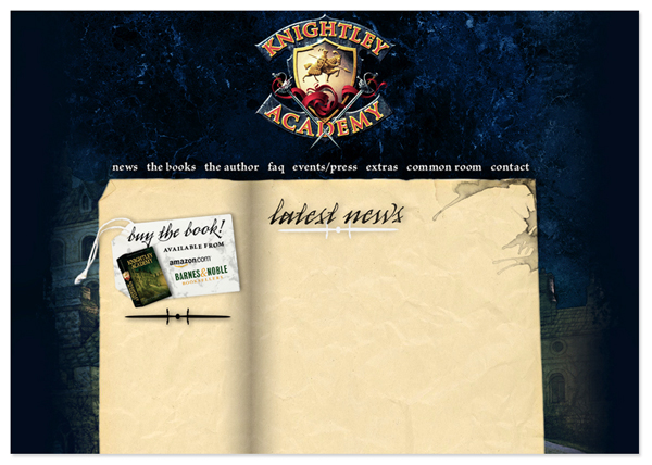
A few months ago (I know I know, I need to start blogging more often), Violet Haberdasher, author of the book Knightley Academy, asked me to redesign the official website for the book. The book deals with the adventures of Henry Grim, a young orphan who ends up at Knightley Academy, where he will train to be a knight. I was given the crest and cover illustration, and I set to work trying to make a Victorian design for the web.
I began by making the illustration a bit darker and giving it more of a blue hue, so that the parchment featuring all the content would really pop. I added a textured fade to black on the edges using some custom brushes in Photoshop. I introduced the typeface Arcana for the headers to give the site a more personal and handwritten feel, and added some ink splatters for visual interest and texture. A small graphic on the left hand column with links to buy the book was the final touch.
*Please note: once I designed the layout, I didn’t have any part in coding the website or designing the interior graphics*
