(Click the image to see it larger)
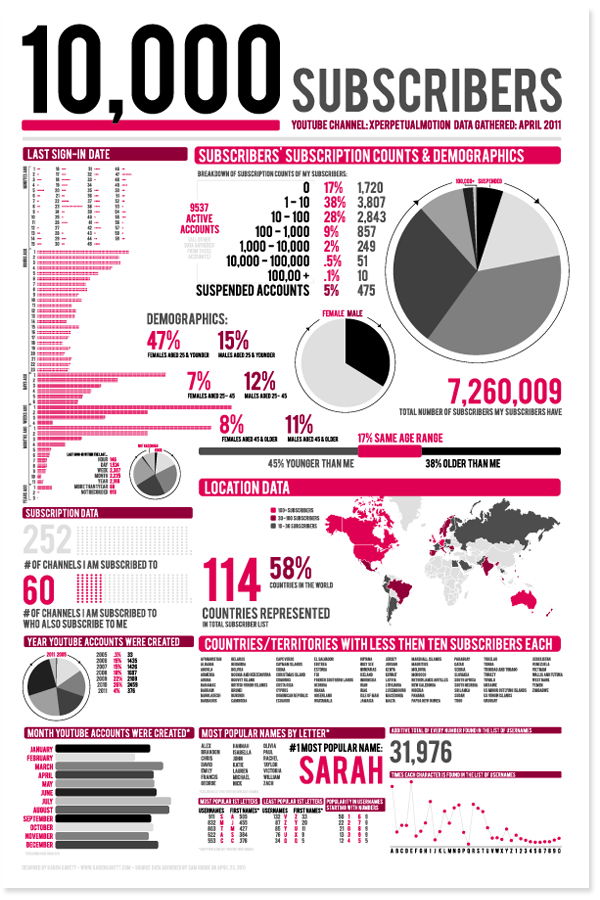
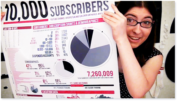
I designed this infographic poster as part of my RISD degree project. It depicts statistics about the 10,000 people subscribed to my YouTube channel xperpetualmotion, as of April 23, 2011.
When I began designing this poster, the idea was that it would be a statement on how obsessed people can get with their subscriber statistics on YouTube by presenting graphics of statistics so inane that they have no use for anybody, not even the owner of the channel. The type of information presented at the top of the poster is still rather interesting and useful for video creators to know; however, as you go farther down the poster, the statistics become increasingly convoluted and have no real meaning or use for anyone.
I have definitely been guilty of getting obsessed with subscription counts and video view counts, and by making this poster, I’m reminding myself as well as everyone else that there is much more to the YouTube community than numbers and graphs. I purposefully didn’t include any specific usernames of my subscribers in this poster, because I wanted it to feel very impersonal. Statistics can be fun to look at and important to know if you are trying to grow your channel, but data like this doesn’t even come close to representing the relationships and strong community that can be found on YouTube if you look hard enough.
Also, it was really fun to have the chance to design crazy graphics out of this pure, rich data.

I had the poster printed at 24″x 36″. There is something so interesting in my mind about taking data that only exists in this digital online world and putting it on a physical object. But again, the value of the poster comes nowhere near the value of the people and community that it represents.
I know that comments on this blog have been glitchy lately, but they should be working again now, so I’d love to know what you all think of the poster and the ideas behind it!
Many thanks to Sam Rudge for downloading all the data for me.
