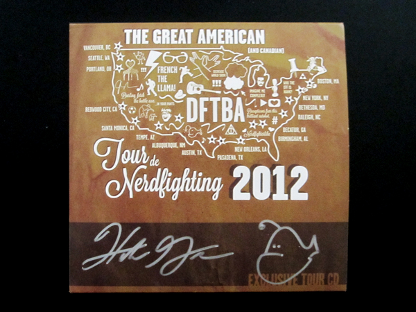
In December, John and Hank Green asked me to put together some designs for the 2012 Tour de Nerdfighting. I knew that I wanted the designs to reference the 2008 Tour de Nerdfighting map, which was one of the first things I designed for John and Hank. So first I got to work on the t-shirt design, which actually ended up being the cover of the exclusive tour CD.
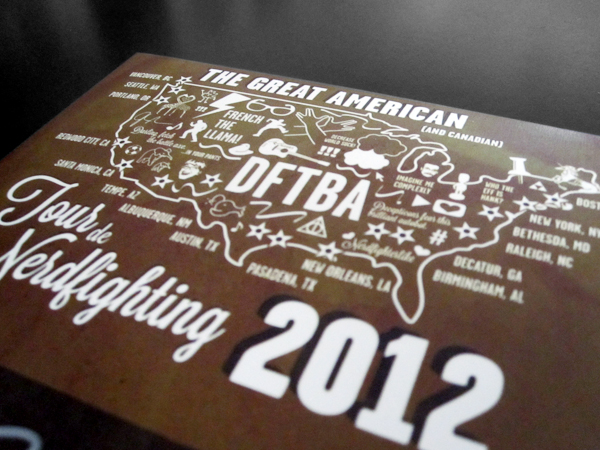
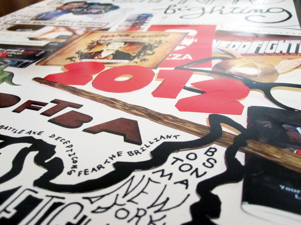
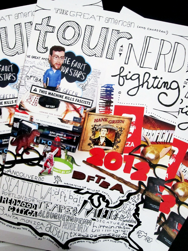
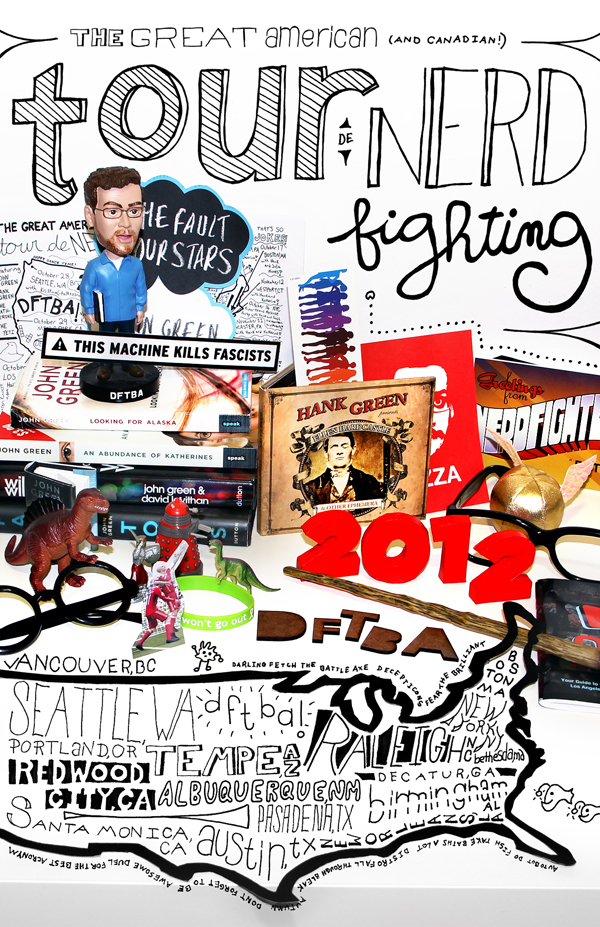
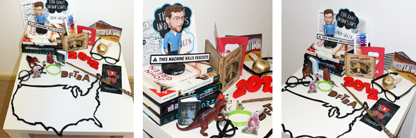
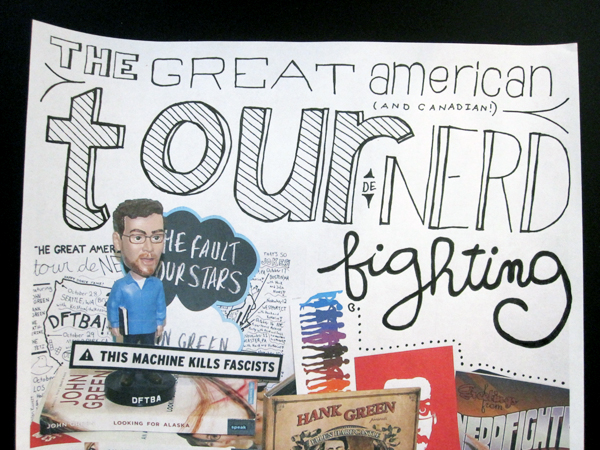
After the map was finished, I got to work on the poster. Right around that time, I had just read the book Sterographics: Graphics in New Dimensions, which inspired me to use photography and real world elements, rather than doing the whole thing digitally. I decided to gather up all the nerdfighter memorabilia I’ve collected over the years to make just a big colorful explosion of awesome. I cut the map outline out of a cereal box and painted black, while the red 2012 is made from paper which I then painted. You can see a behind the scenes look at the photoshoot in this video (starting at 1:40):
We took a ton of photos from all different angles. This was literally just set up on an IKEA table in my bedroom – design doesn’t have to be fancy and expensive!
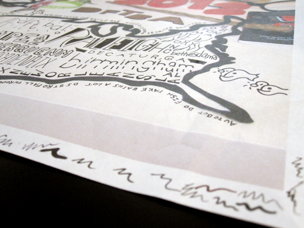
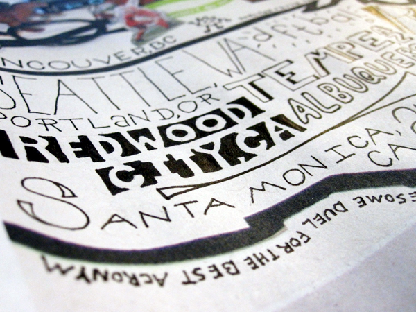
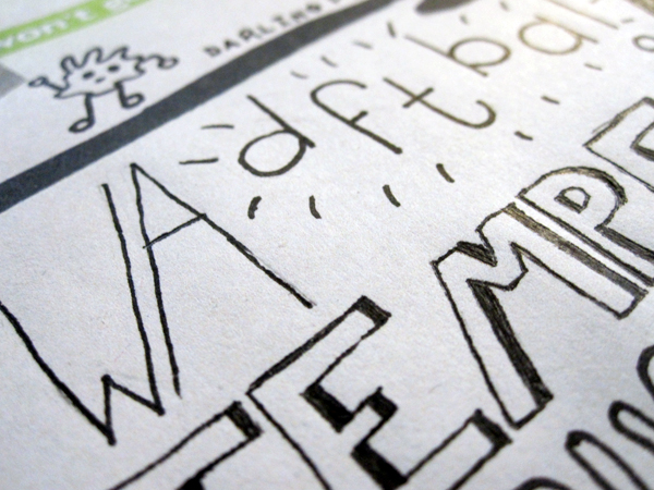
After I chose the photo I wanted, I printed it out at full size and penciled in all of the city names and the title (doing a test version first to make sure the concept wouldn’t look completely awful). After trying way too many types of black markers to find one that didn’t bleed on the paper, I inked the whole thing, scanned it in, and composited it in Photoshop. As you can see from the photo of the title, I ended up changing it around in Photoshop a bit, in order to make the poster feel cleaner and more balanced.
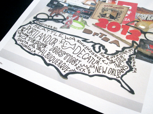
(Test drawing, done on a letter-size printout of the photo)
I hope you guys like the poster and CD, and managed to grab a copy from the merch table if you went to any of the tour stops. You can also check out my video from the Redwood City tour stop at the end of this post. It was a fantastic night and I’m so happy to be part of such an awesome community!
