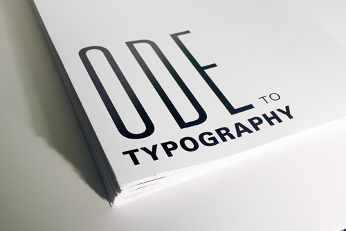
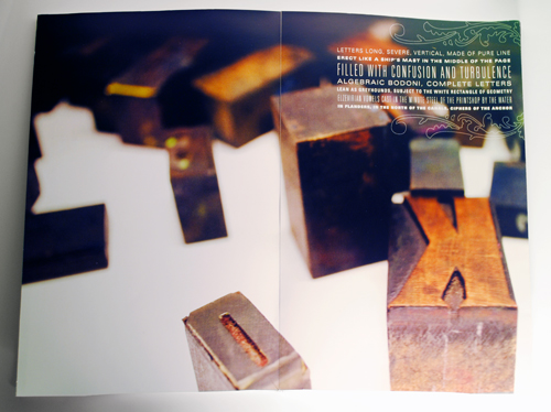
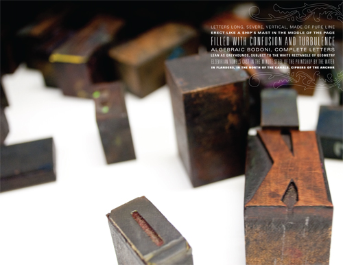
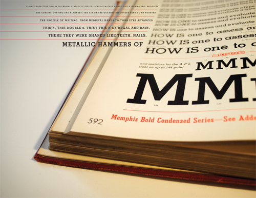
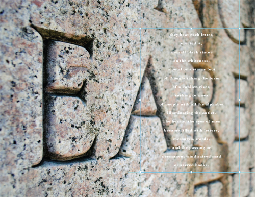
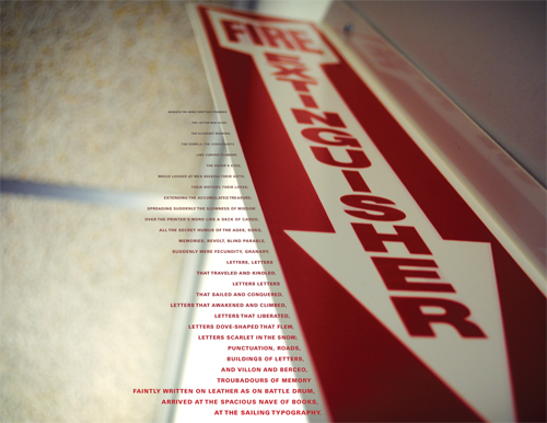
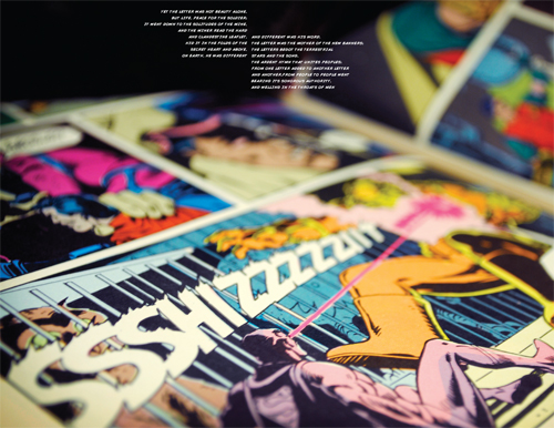
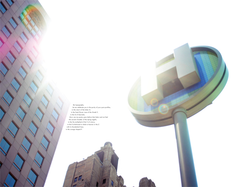
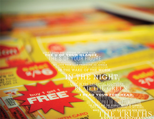
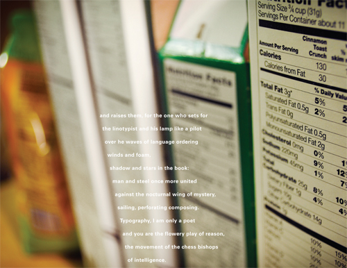
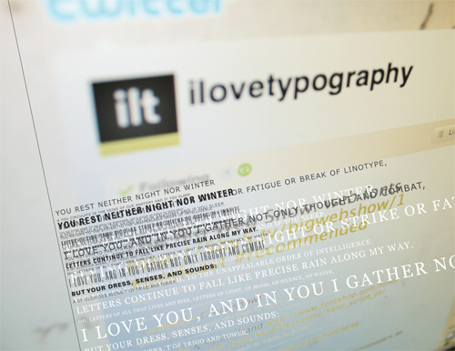
Today’s post is about my final project for Typography III, a book laying out the poem Ode to Typography by Pablo Neruda. We had to include the entire poem, and the book had to be tabloid size (11×17). With those parameters in mind, I read the poem several times to try to get a sense of what he was trying to say. Maybe I just don’t appreciate poetry, but I found it to be overly long and repetitive. While at the end of it I did feel very appreciative of letterforms and all that they accomplish, I really felt like it took way too long to get there. In the end, I decided to use my own photography in my book to show the uses typography has had through history up to modern times. It gave me a chance to explore many different styles and layouts, and, while I did have some trouble reining it in to make the whole book cohesive, I think many of the spreads ended up working very beautifully.
