After the success of the first episode of Graphic Design Without a Computer, I just had to make Part 2. This episode is all about layouts and compositions and hierarchy.
As you can see in the video, I tried not to get too specific about the different projects, since I’ve found that often it only takes most people a small spark of inspiration before they go off and create something completely unique, and I don’t want to stifle that by giving too many guidelines or instructions. But, you can check out my designs and examples below, and then try it out yourself!
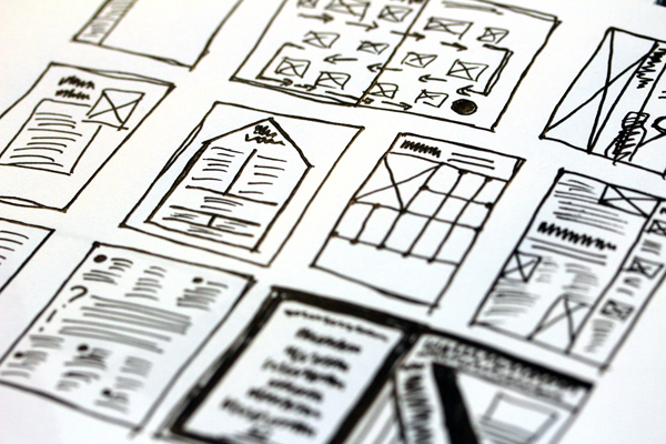
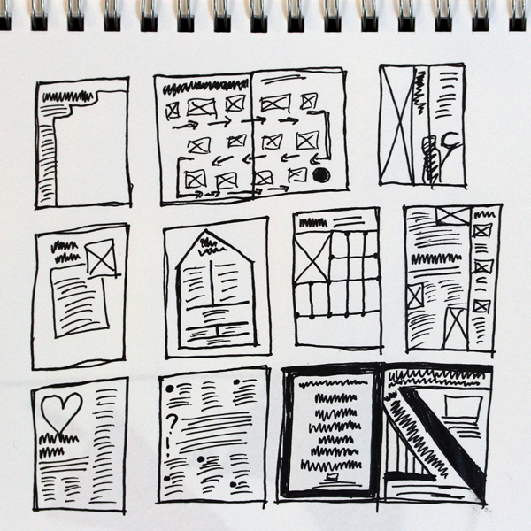
Some thumbnail sketches of magazine layouts. I want to start reading more magazines and draw pages and pages of these to refer back to.
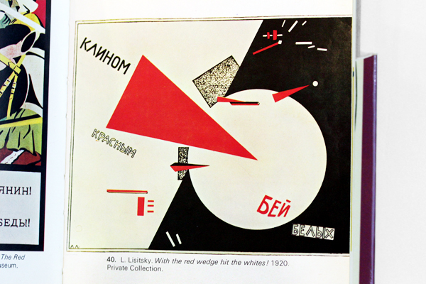
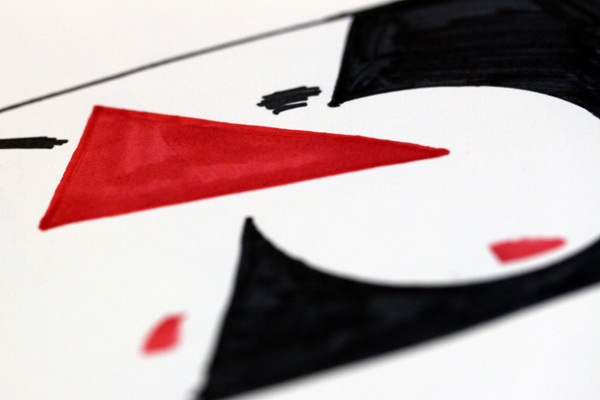
One of my favorite posters ever – With the red wedge hit the whites! by El Lissitzky.
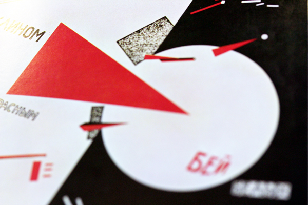
Karen Kavett: Photographing classic posters with shallow depths of field since 2012.
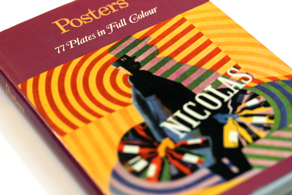
I found this print of the poster in the book Posters: 77 Plates in Full Color. I’m planning to do another blog post soon about some of the other gorgeous posters in this book!
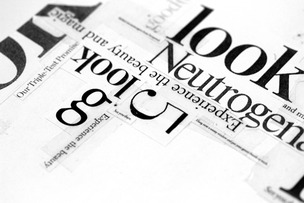
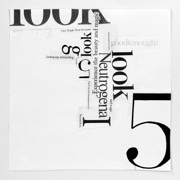
The original project I did sophomore year of college which inspired this video. I’m so glad I kept it!
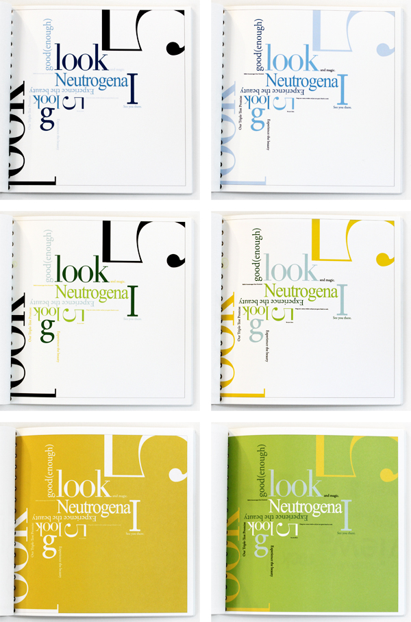
Experimenting with different color schemes to try to change the composition hierarchy.
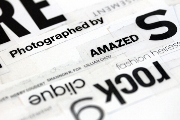
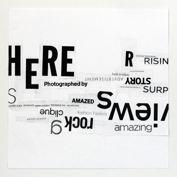
Another part of the sophomore year project. I only showed it in the video for a second, but I thought you loyal blog readers might want to see it!
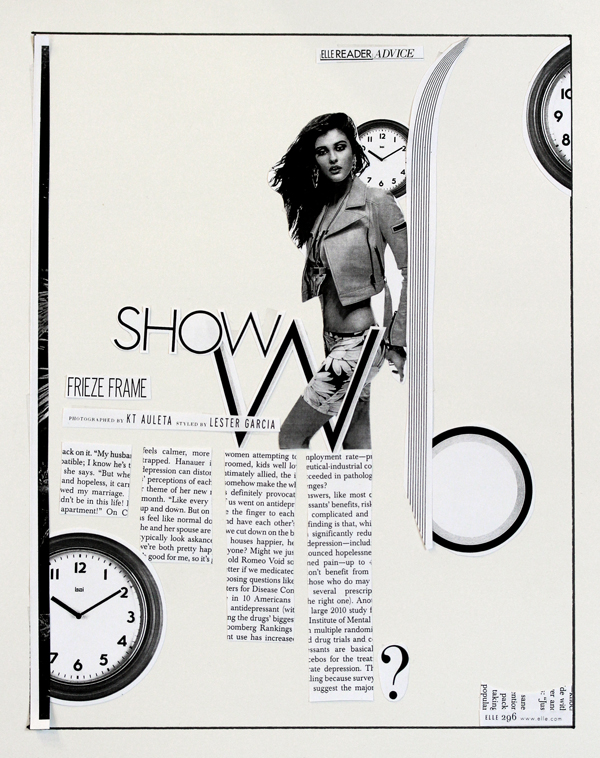
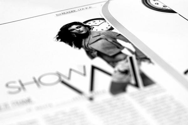
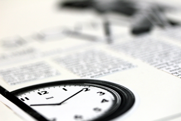
The example magazine layout I designed for the video, using Xeroxed pages out of Elle and HGTV Magazine. As I said in the video, don’t worry about making the text or images make sense – just concentrate on experimenting with different types of layouts!
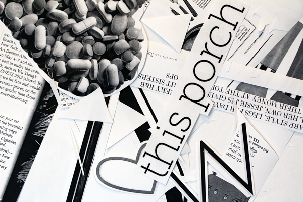
So much scrap paper! I suppose now that this is all online, I’d better get to cleaning.
Thanks so much for watching, and I hope you guys enjoy this episode as much as the first one! I’m so excited for the next episode, which will be really fun and get back to learning about typography. Look out for another supplemental blog post in just a few days!

