Last night YouTube launched their new channel designs for anyone who wants to opt in. The way to design the banner for these new layouts is a little different than it has been in the past, so I put together a video to explain how it works and share some good examples so far. Keep reading after the jump for a template I made for the new banner sizes!

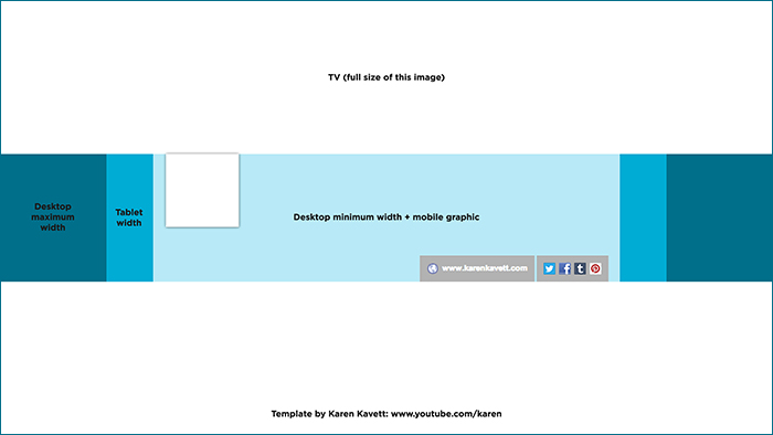
I put together this Photoshop template which shows where the image gets cropped on all devices. You can download it for free down below, so that you can just drop in your images and don’t have to worry about messing around with the pixel sizes yourself!
Download the PSD
Full size JPG

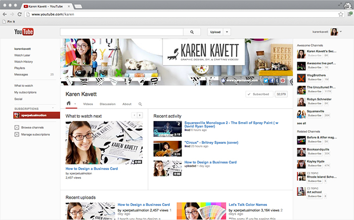
This is what my channel currently looks like. I’m not sure if I’m completely happy with it; I still need to do a bit more work on the banner so it doesn’t look quite so cluttered and the avatar doesn’t get so lost. Keep checking back on my channel to see what I decide to do with it in the future!
And I never put up a blog post about it, but I also made a video yesterday about how to design a business card! Only the latest in my series of how to design a logo and how to design a resume! I hope this has been helpful for you guys, and make sure to subscribe to my channel for more graphic design videos!

