Today I have a very exciting video that I’ve been working on for a while now, and I just love how this project came out. As you guys might know, I am just a little bit obsessed with the Penguin Drop Cap Collection, so when I got a comment asking if I could show you how to design your own custom covers based on the books, I thought that was a great idea. Keep reading to learn how to make your own custom Drop Cap book covers!
I have couple of links to share before we get into the nitty gritty of the project, so let’s get them all out of the way right here at the top:
Download the JPGs of my book covers
Download the PSD template of the book covers
See all the original covers and spines
Get the Drop Cap books on Amazon
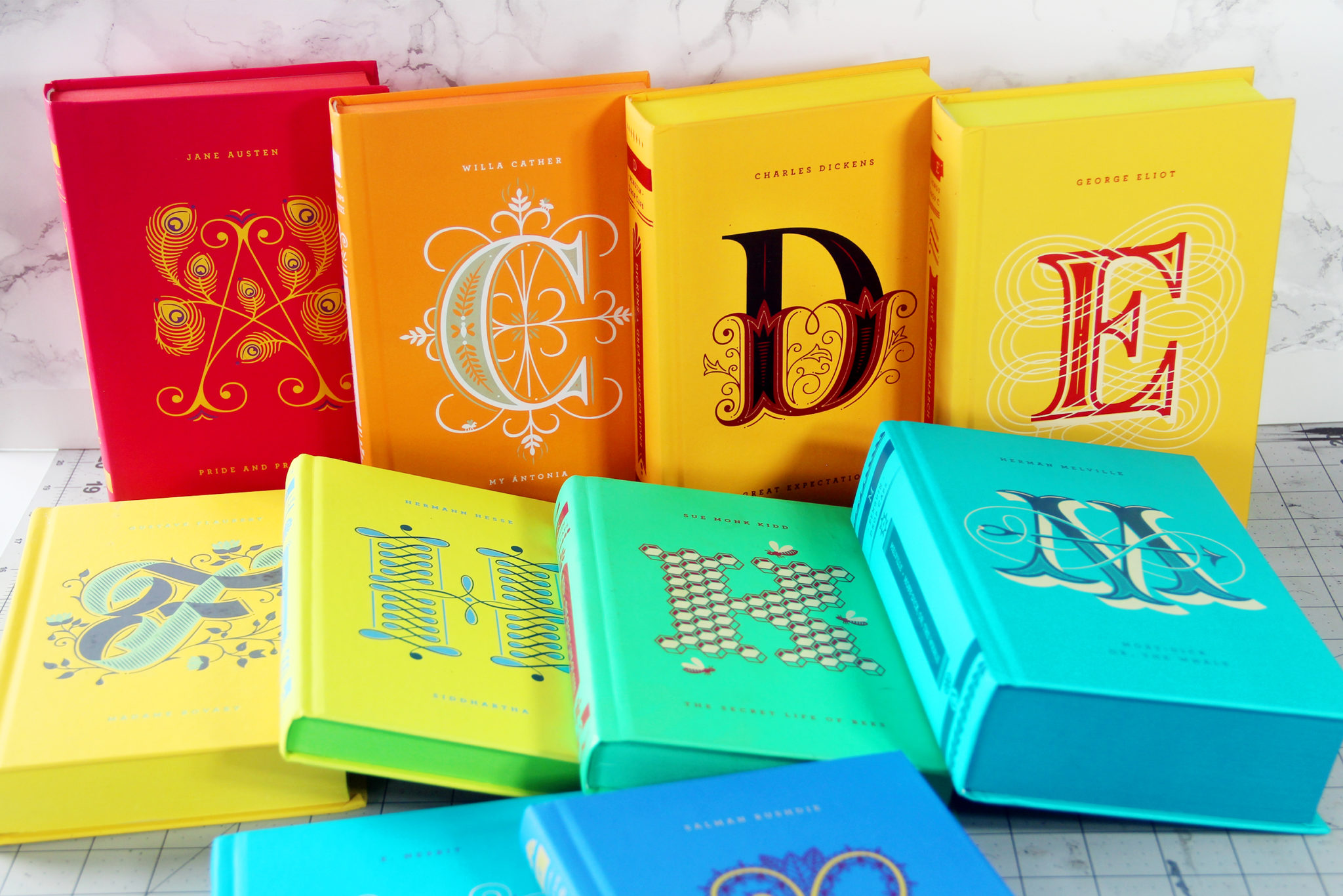
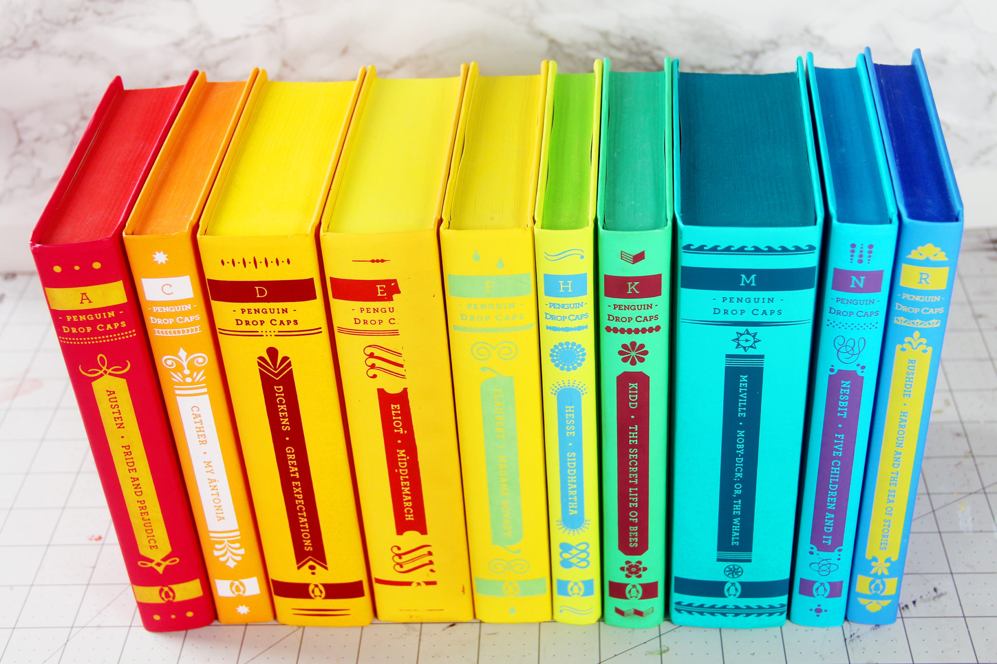
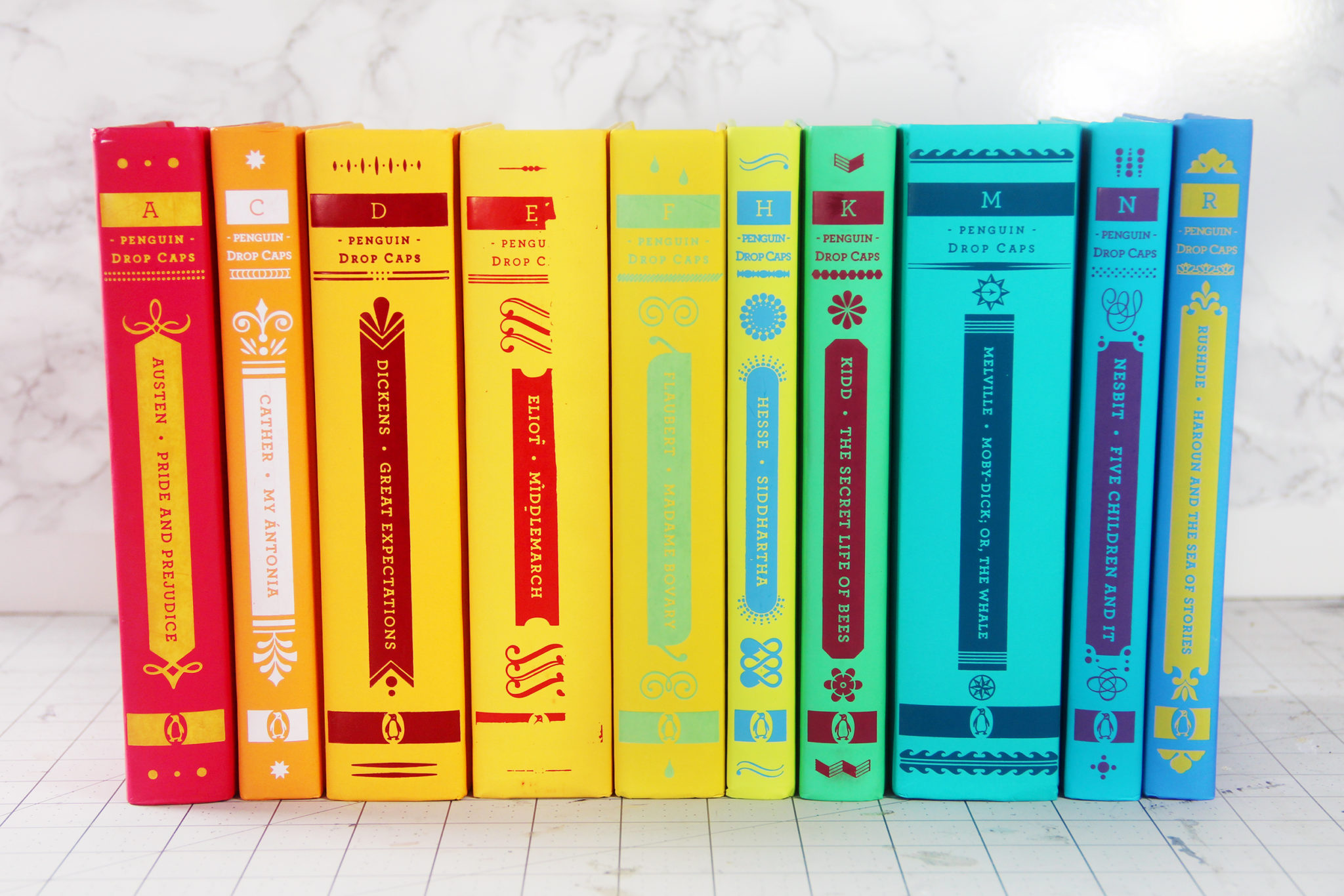
If you’re not familiar with the Drop Cap Collection, they’re a series of 26 classic novels, each with a drop cap designed by Jessica Hische on the cover. When you put them all together, they make a rainbow, and they’re just some of the most beautiful books I’ve ever seen.
The hardest part of this project is designing your own custom drop caps. Beyond that, recreating the rest of the book jacket design is pretty easy, especially if you use my templates which I linked above.
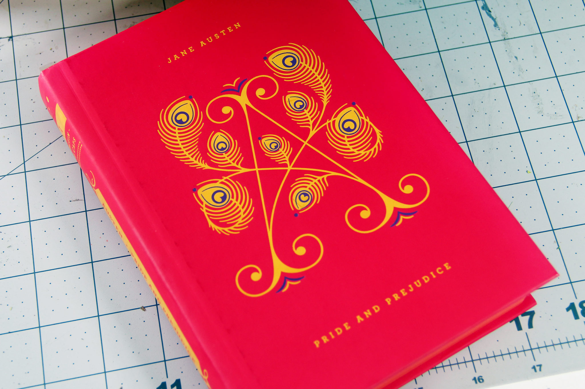
A few more book-porn shots of these beautiful specimens…
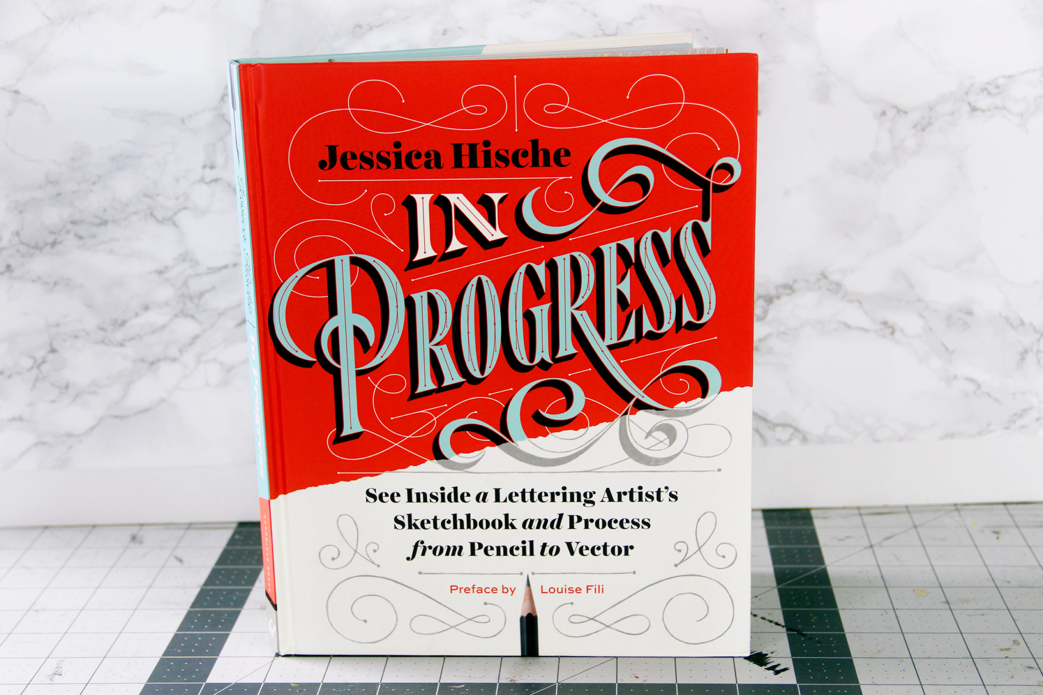
If you’re new to the world of lettering, I definitely recommend picking up Jessica Hische’s book In Progress.
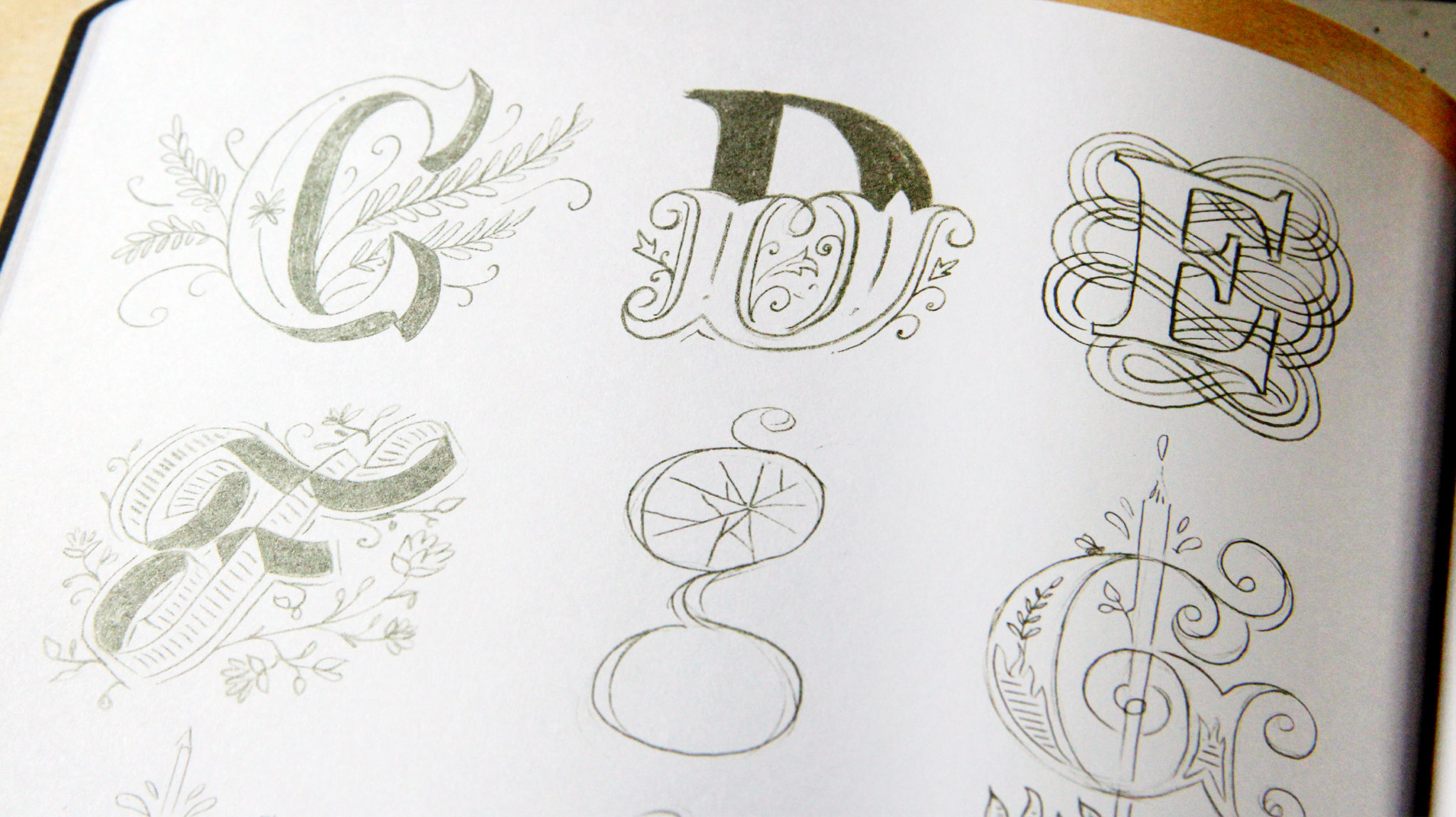
In the book she shows tons of her projects for inspiration as well as her sketches that help her get there.
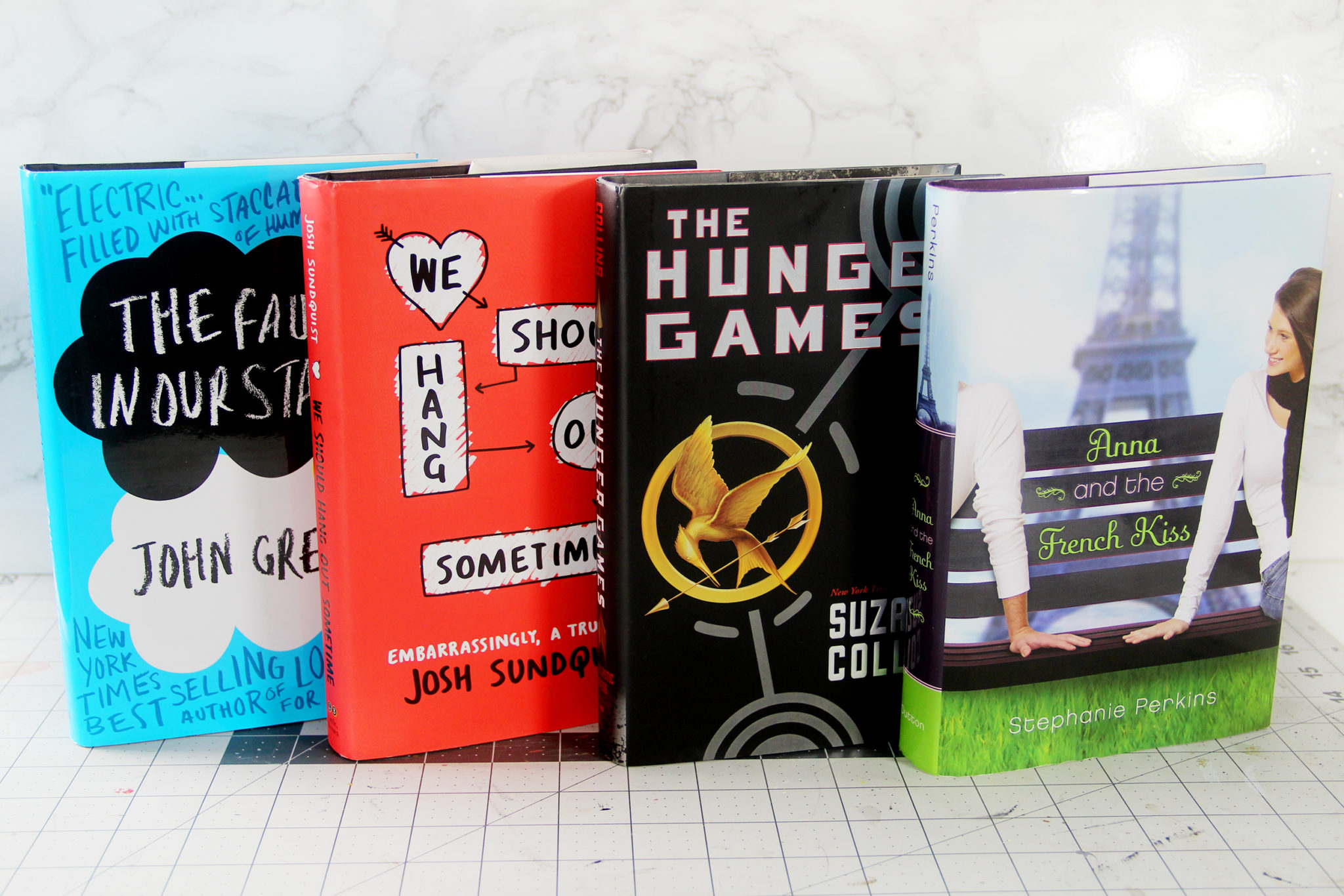
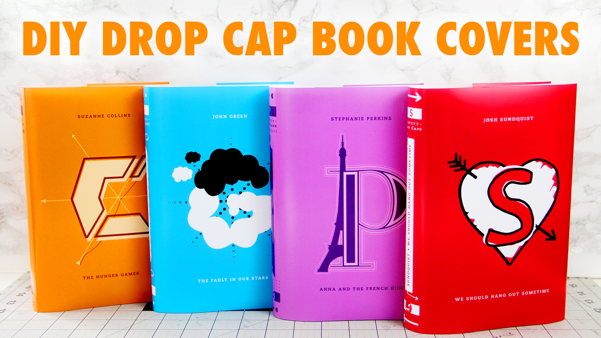
So the first thing to do in the project is to pick what books you want to work with. I chose The Fault in Our Stars by John Green, We Should Hang Out Sometime by Josh Sundquist, The Hunger Games by Suzanne Collins, and Anna and the French Kiss by Stephanie Perkins.
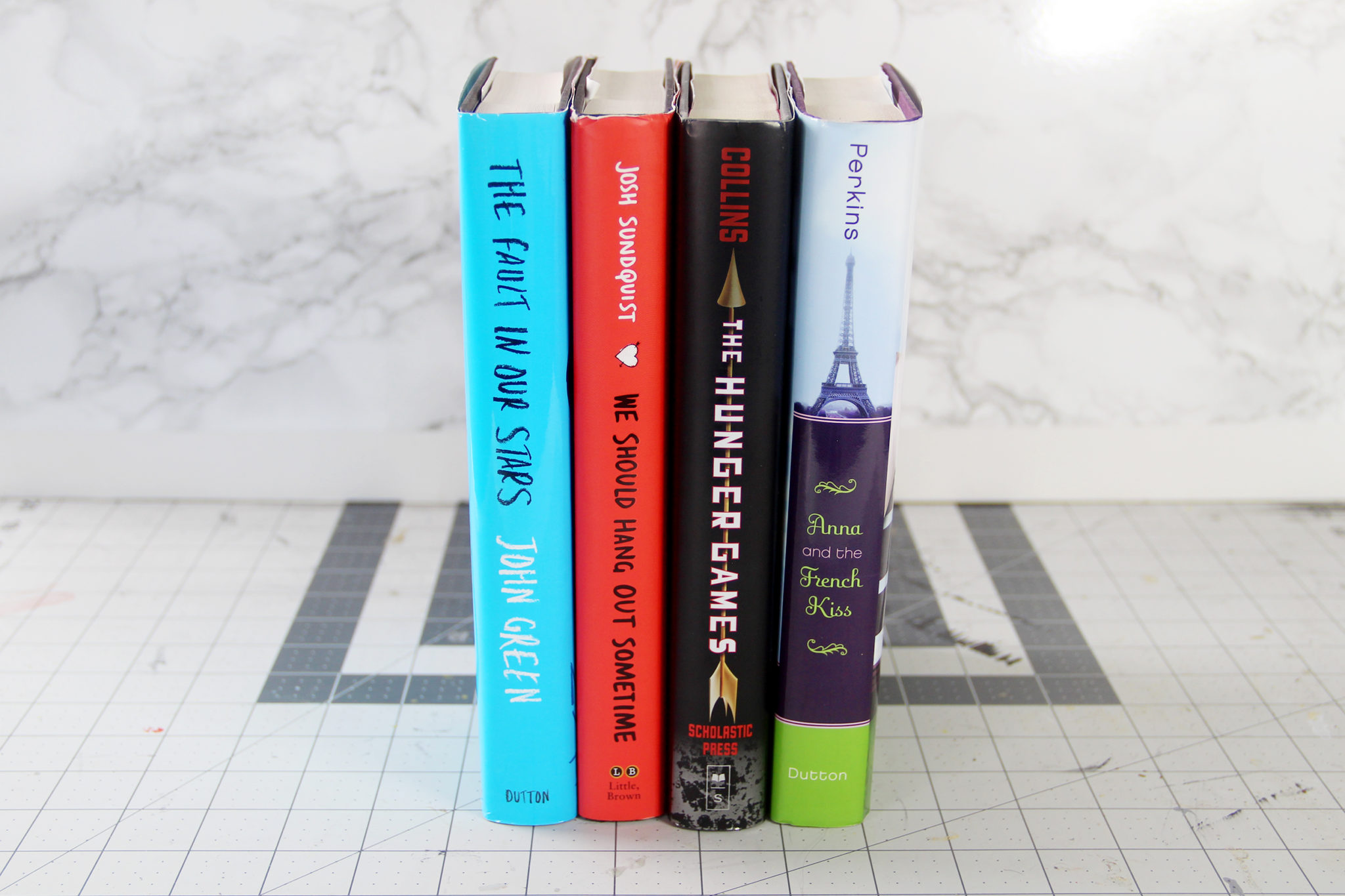
I chose these books because they’re all the same size, which meant I didn’t have to create multiple templates. But, if your books aren’t this size, just measure the book jacket and note where the folds are, and adjust the template accordingly.
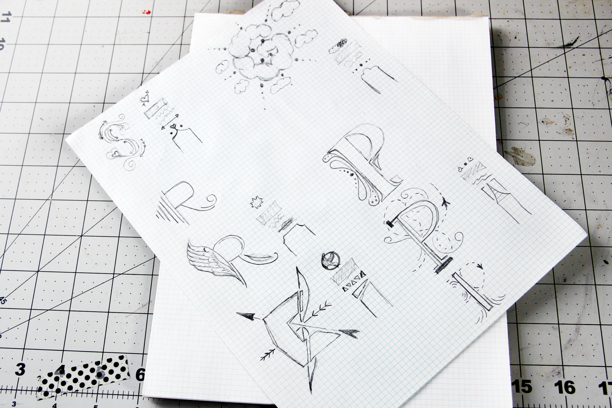
Once you have your books picked, just start drawing! Fun fact – the R is in there because originally I was going to make a fifth cover for Miss Peregrine’s Home for Peculiar Children by Ransom Riggs. In the end, I didn’t really like how the letter came out when it came time to trace it in Illustrator, so I just went with the other four.

For Anna and the French Kiss, I decided to use the font Didot for the letter, and then embellish it with outlines and the Eiffel Tower.

In We Should Hang Out Sometime, I grabbed the drawn heart from the original book cover and added the S on top of it. This is a great option if you’re not confident in your drawing skills and just want to adapt the original book cover.

I really like how The Hunger Games drop cap came out, since I think it still evokes the Russian Propaganda feel of the original book cover.

And finally for The Fault In Our Stars, I adapted the iconic black and white cloud book cover into the letter G.
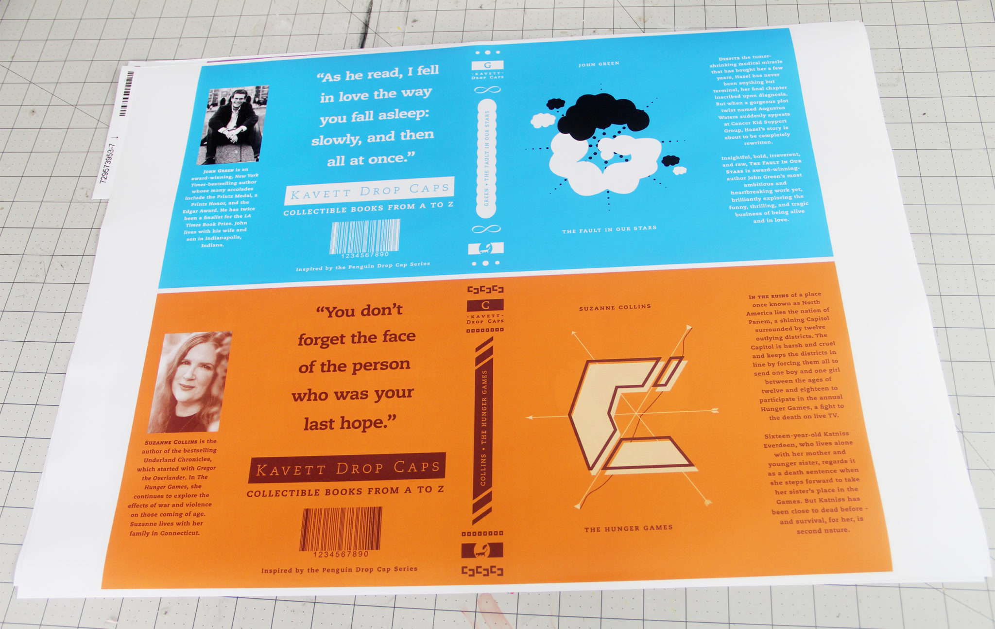
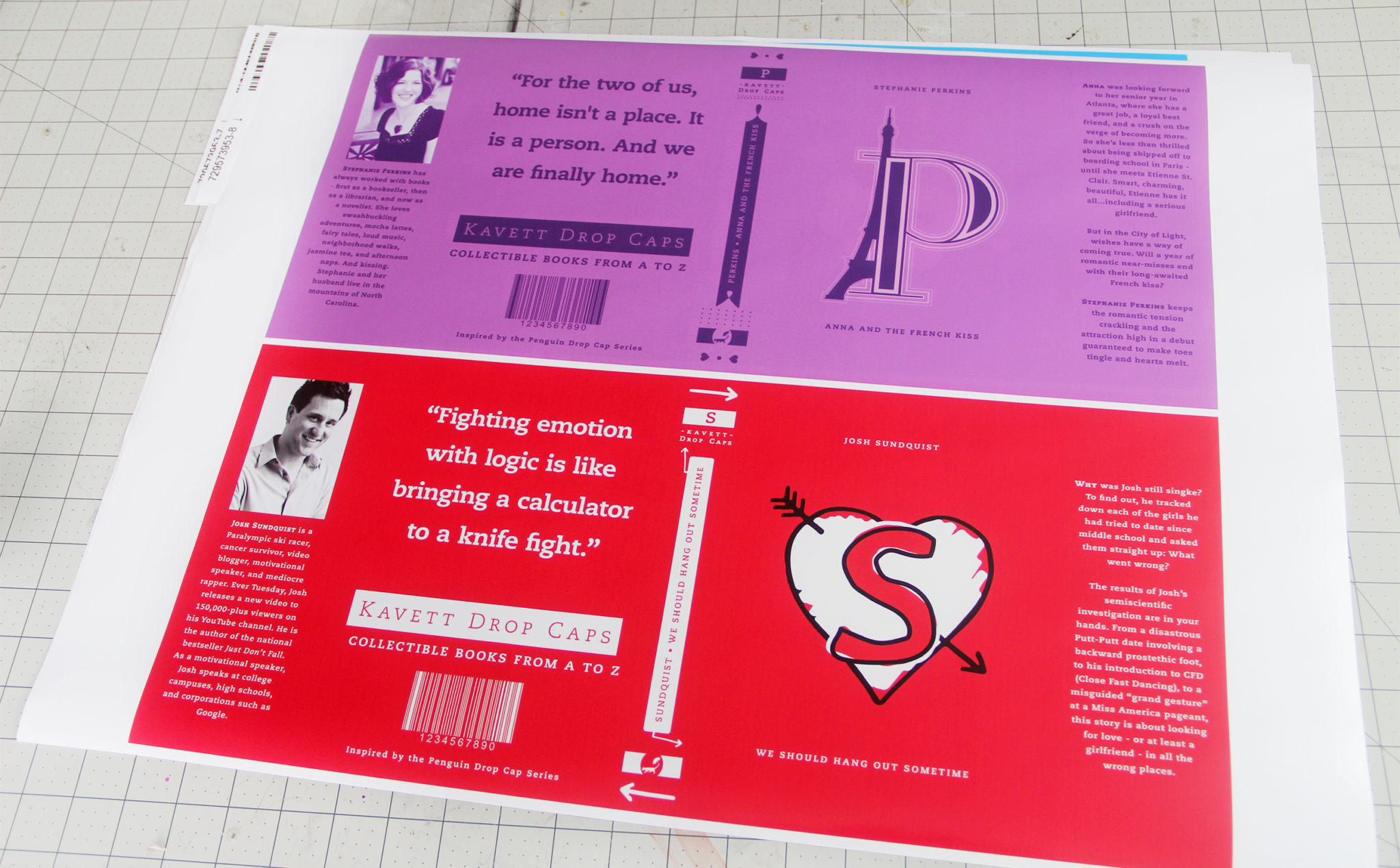
When it came time to print out the book jackets, I found it was most cost-effective to print them onto 18×24 posters from Vistaprint. I was afraid that if I tried it in my own home printer, I would go through several $100+ sets of ink cartridges, so sending them off was definitely the cheaper option.
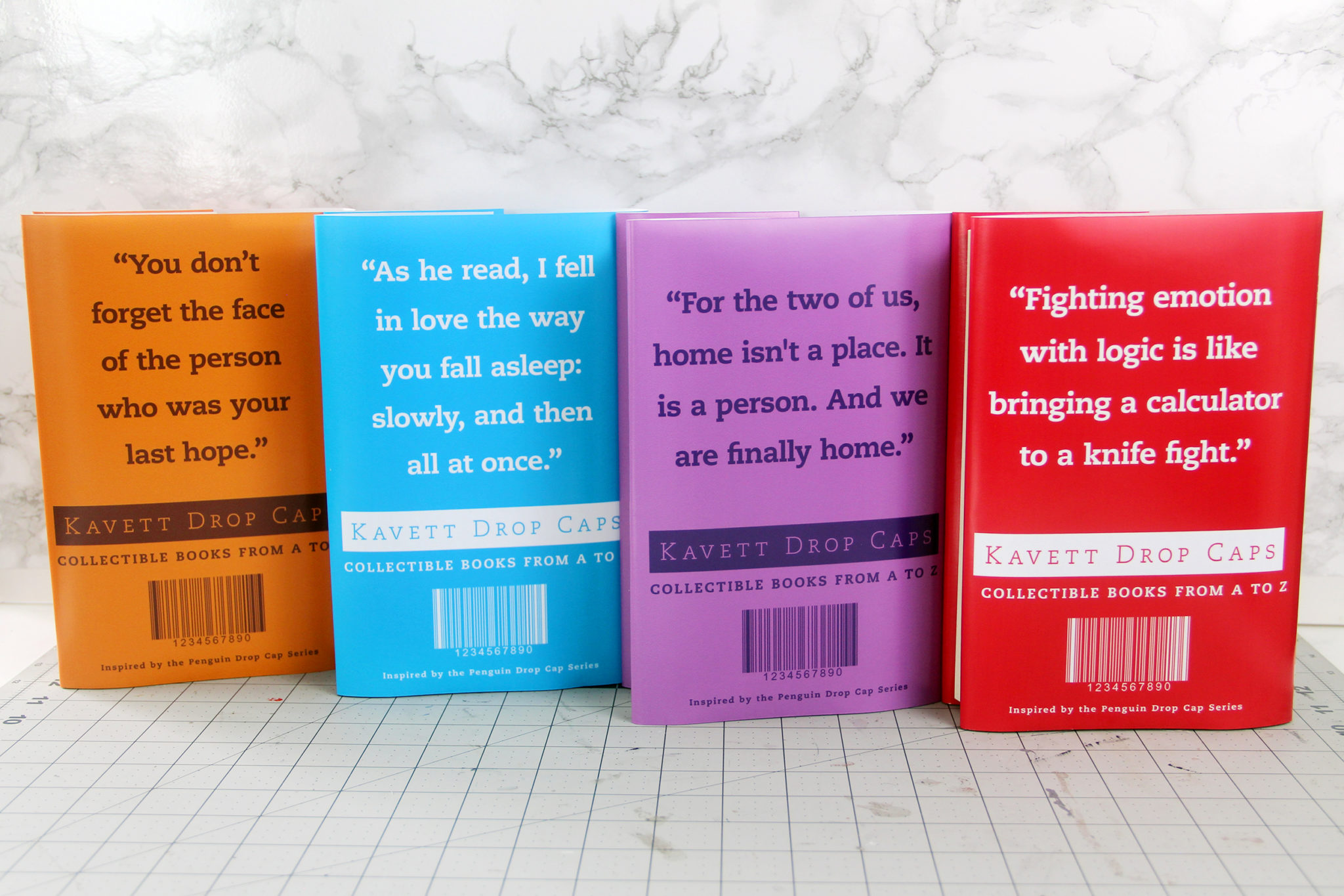
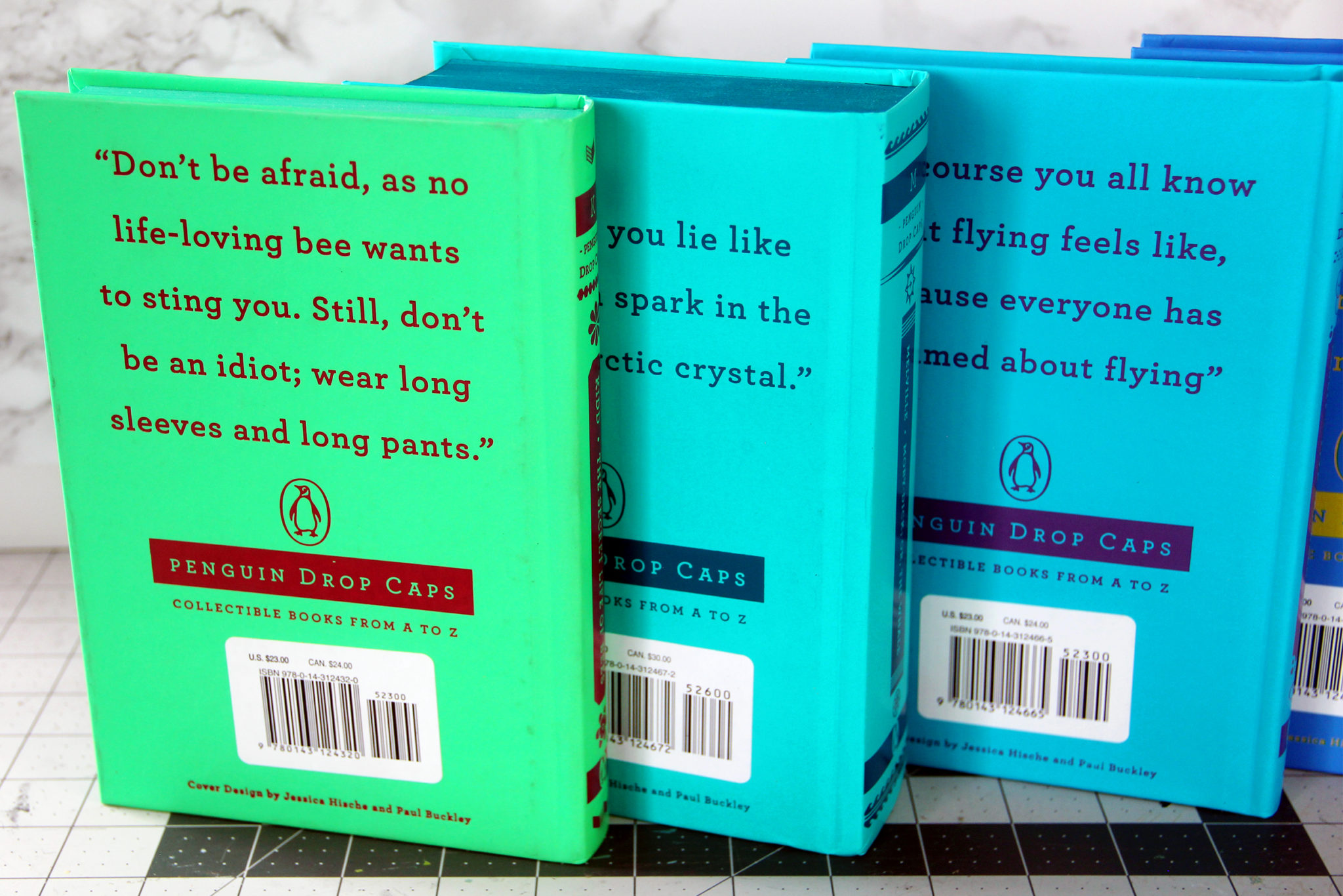
If you had just seen this image of the quotes on the back of the books, do you think you could guess what books they were?
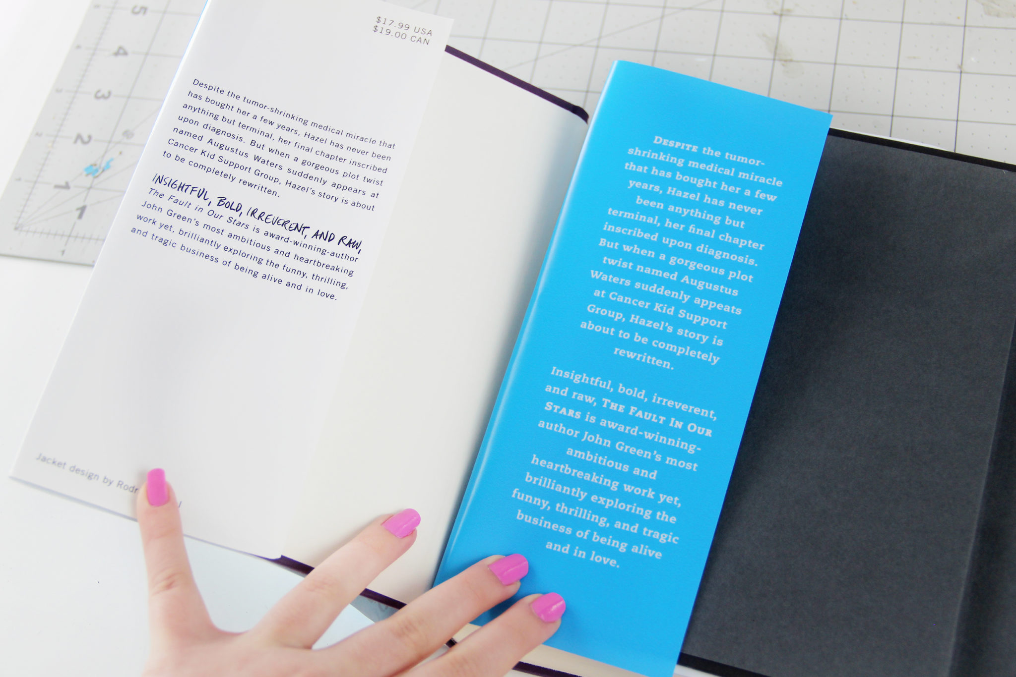
The original books don’t have book jackets, so I had to design the inside flaps myself. I kept them simple and just included the book summary on the front flap in the same font and color as the rest of the book jacket.
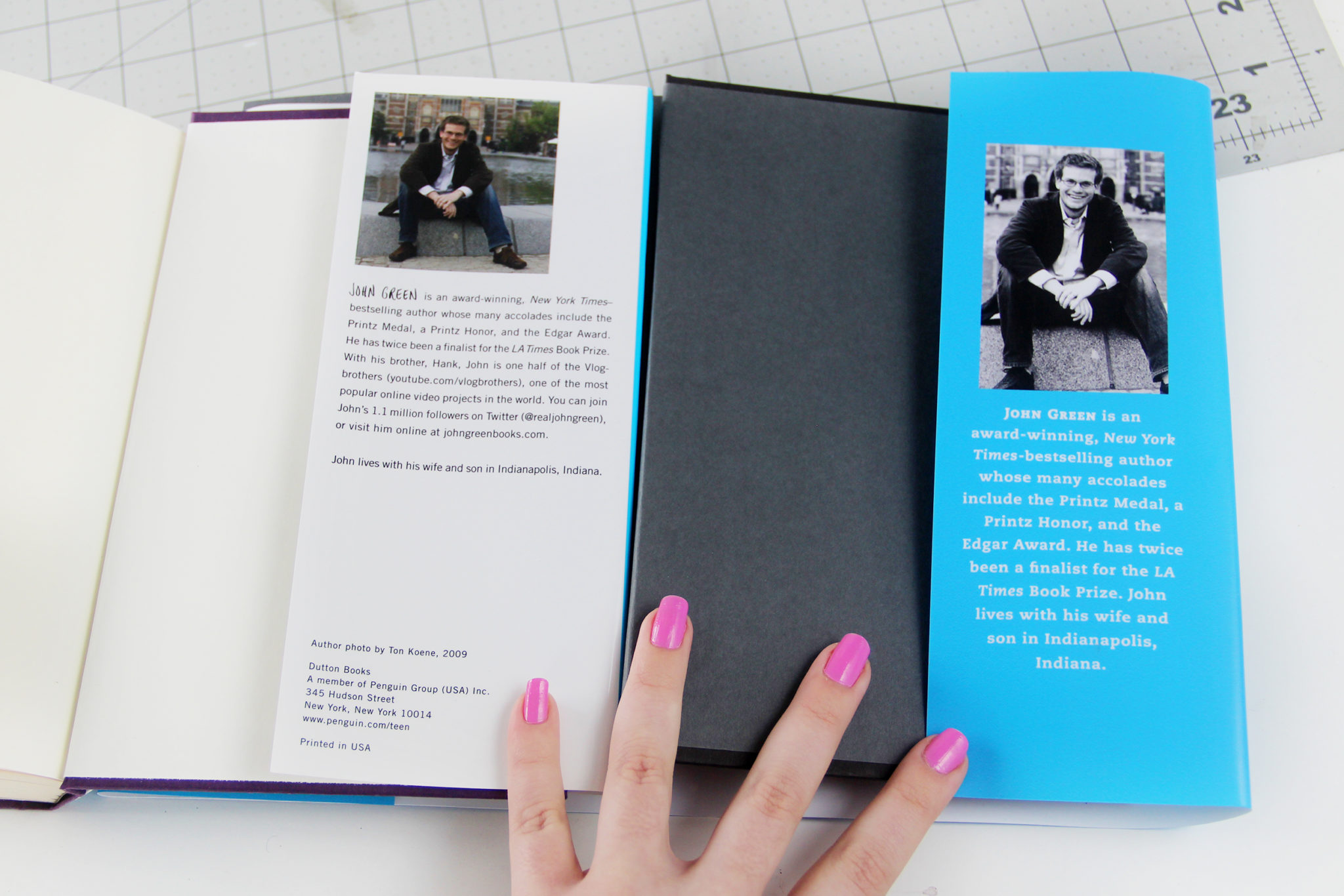
I did the same for the back flap with the author bio, but also added a Gradient Map to the author photos so they were monochrome and matched the rest of the book jacket.
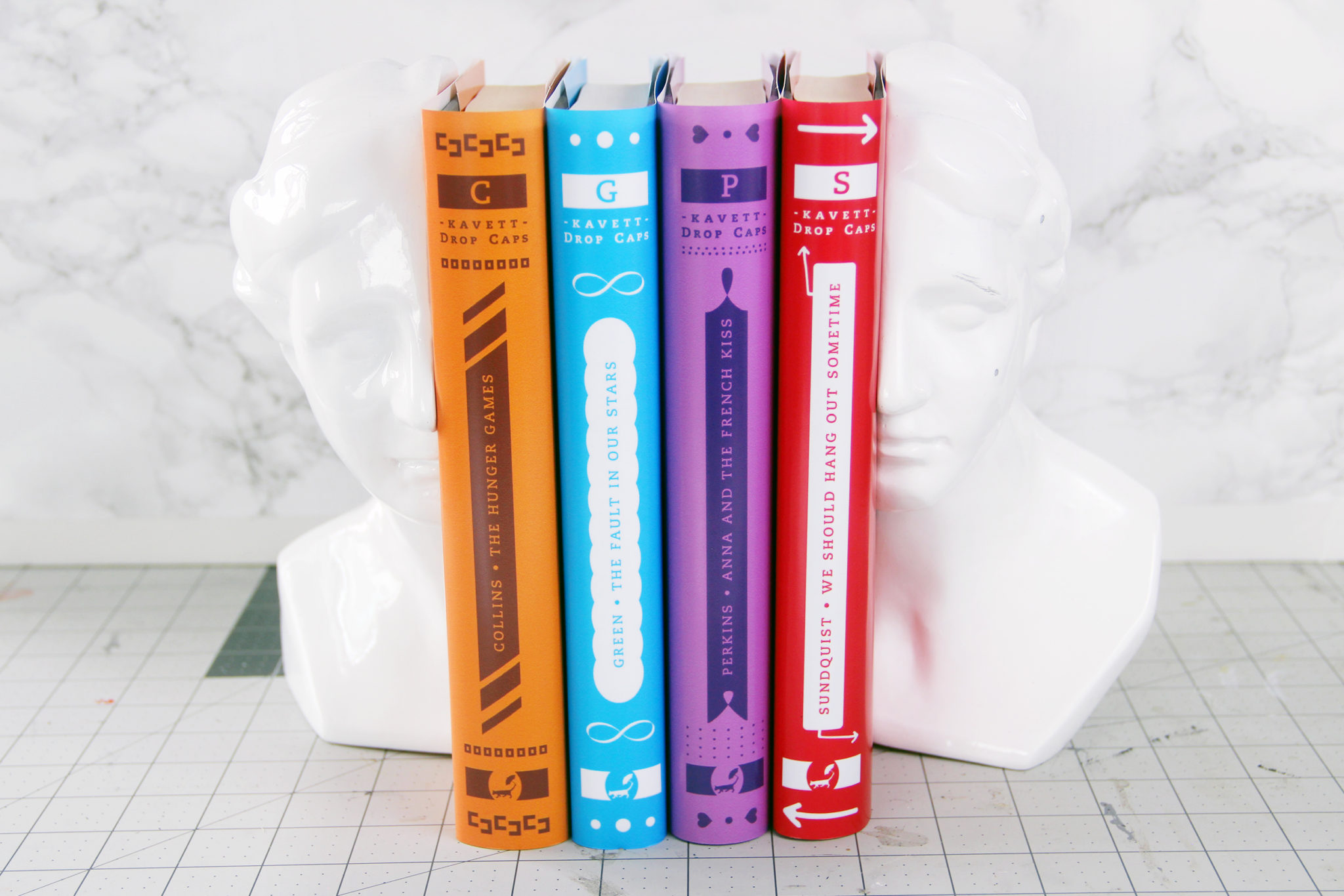
When it came to the colors of the books, I decided to use colors that were true to the original covers. If you want to stay a little closer to the original collection, you should stick with warm colors for the early letters in the alphabet down to cool colors for the end of the alphabet, so that they make a rainbow when put in alphabetical order.
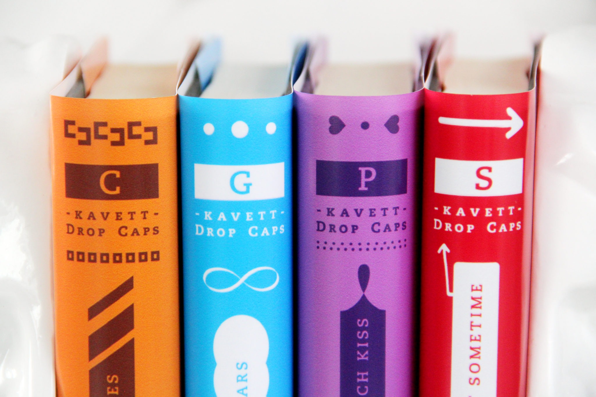
And when you’re drawing your drop caps, don’t forget to be thinking about the additional design elements on the spines. As you can see, they’re all slightly different.
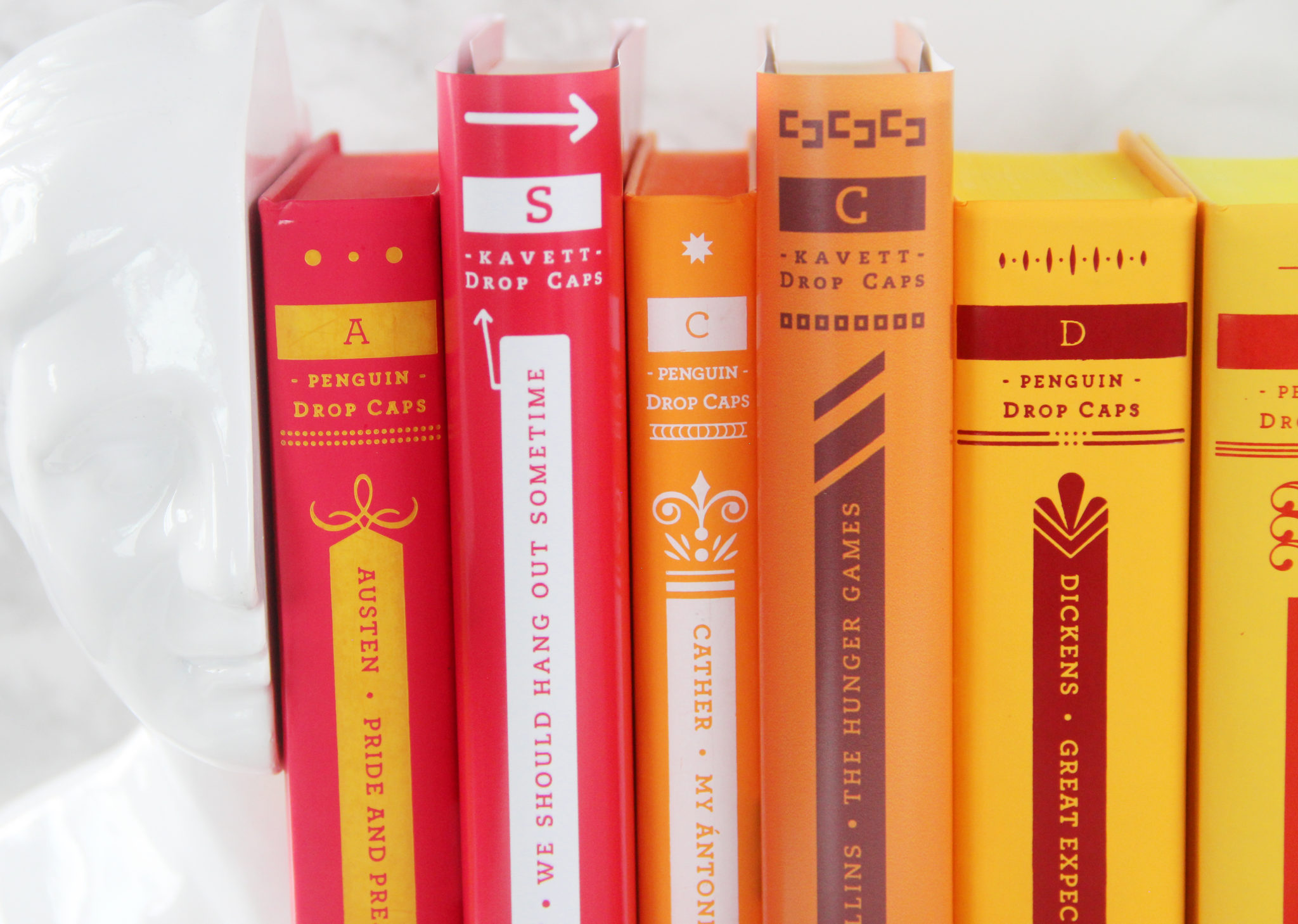
Did you catch the mistake I made on the spine? I accidentally put the title of the book facing the wrong way, which I didn’t realize until I had gotten them printed. I fixed it in the templates that you can download though!
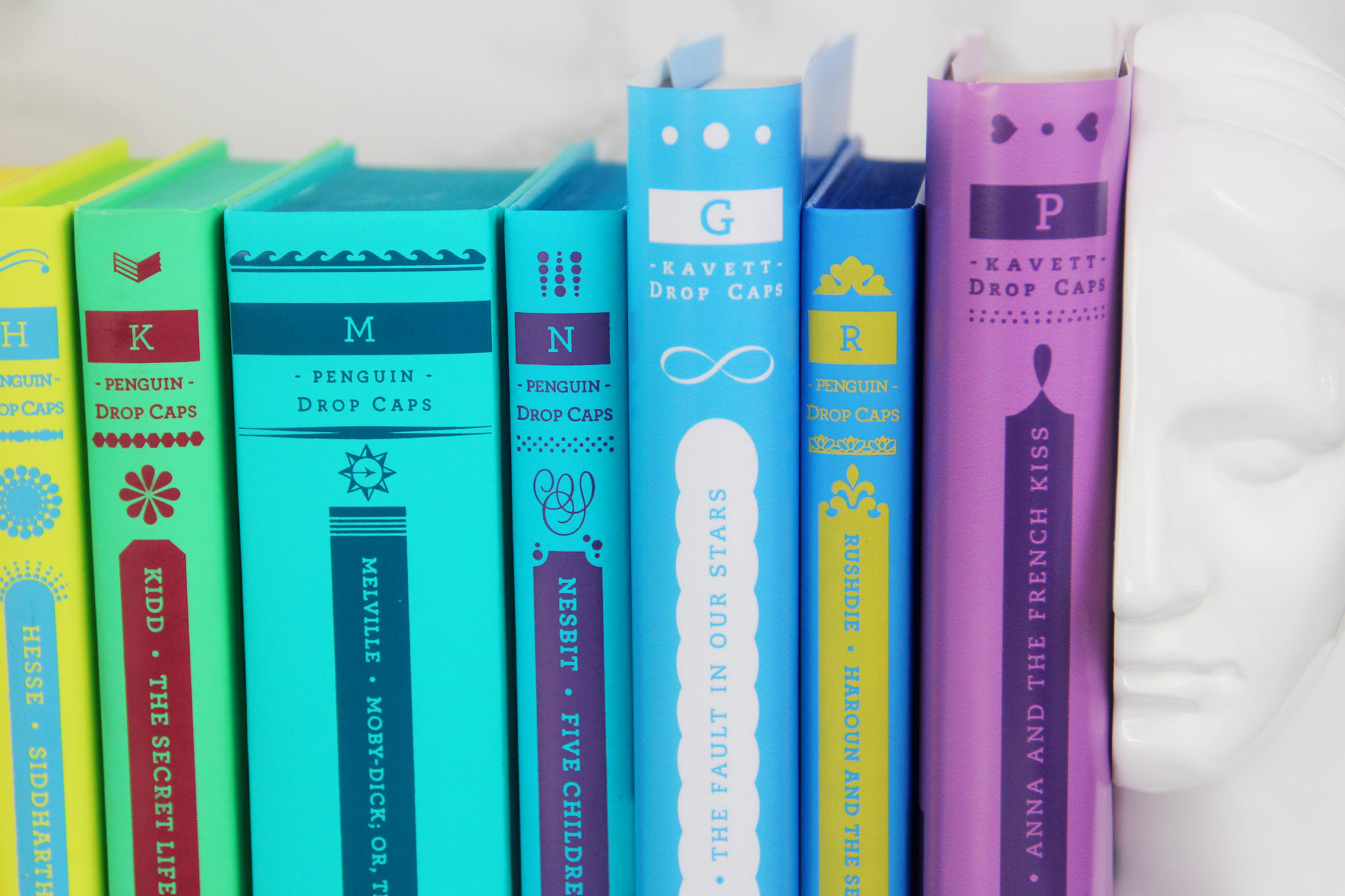
I hope you guys like this project and find the templates helpful! If you make your own custom drop cap books, I would love to see photos if you tag me on Instagram or Twitter. And if you want another book-themed DIY, check out my DIY Binder Covers based on YA Books!
Make sure to subscribe to my channel if you liked this project, and watch the step-by-step video if you scrolled past it earlier. Thank you so much for reading, and I hope you have a great weekend!


