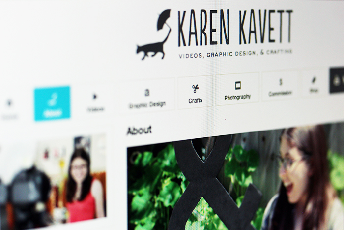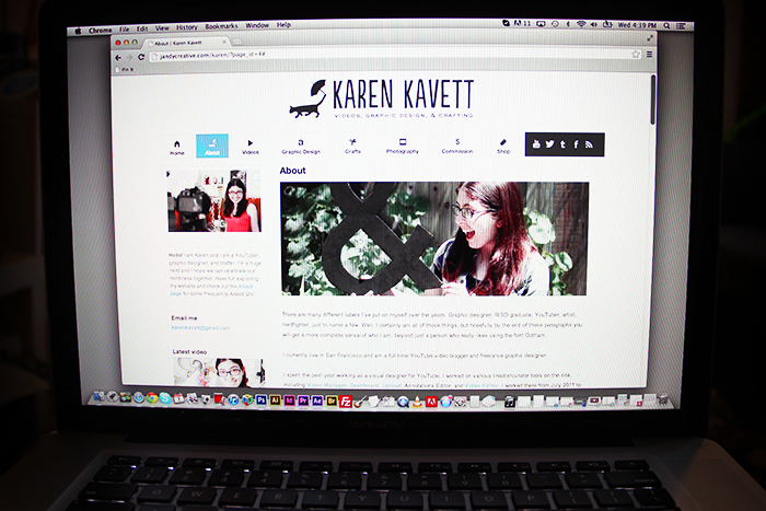
It’s finally here! You may notice that my website looks a bit different today, and that’s because I’ve finally launched the redesign that was long overdue. I’ve updated every single page of the site and added a new Crafting Portfolio page, which gathers all of my best craft projects in one spot.

For legacy’s sake, you can click here to see what the previous design looked like. I designed it back in September 2010, over two years ago, so it was definitely time for an update.

I gathered a lot of inspiration from three of my favorite blogs – Nubby Twiglet, Sea of Shoes, and Luxirare. The main thing I wanted to emulate from them was including bigger images with only one sidebar so they have more space to breathe – the images in the blog are now 700 pixels across rather than just 600. I’m also going to start hiding long image posts under a Read More button, so that you can easily see all of my latest blog posts without waiting a year for five million pictures to load.

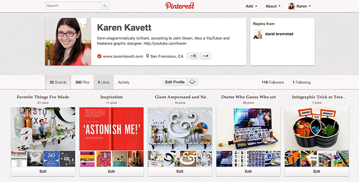
Along with redesigning this site, I’ve also started using Pinterest! Please feel free to head on over there and follow my boards if you want another place to keep up to date with all of my latest projects.
Many thanks to Andy Friel for coding this site. I’ll always be continually tweaking and perfecting it, so please let me know if you see any typos or broken links. Thanks so much for reading!

