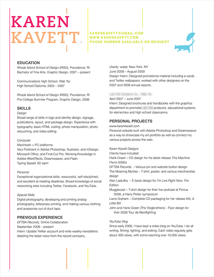
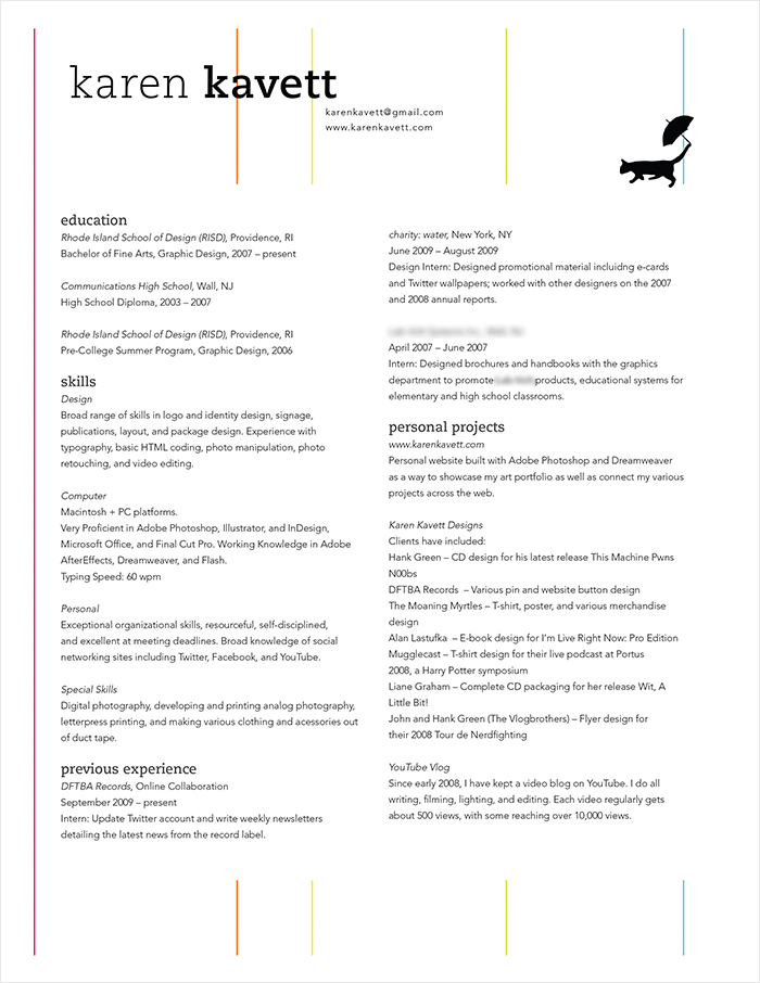
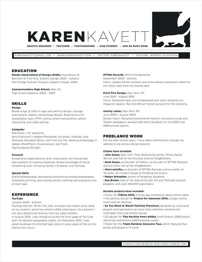
I’ve gotten a lot of questions lately about resumes, so I thought I’d make a video compiling all of my resume tips in one place. I talk about how to design your resume, some little tricks for making it look more professional, and some ideas for how to pad out a resume if you don’t have enough to write. Keep reading to see all of my resumes through the years, starting from high school up to today!
Obviously I’ve blurred out some personal information, since you don’t need to know about everything I was up to in high school. But you can still see the designs and compare how they changed over the years. And hopefully this will give you hope that even if your designs feel completely arbitrary now, if you keep working at it, eventually you’ll be able to pull together a strong visual identity for yourself.
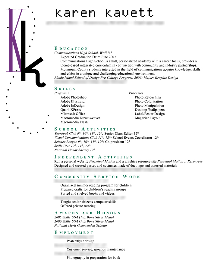
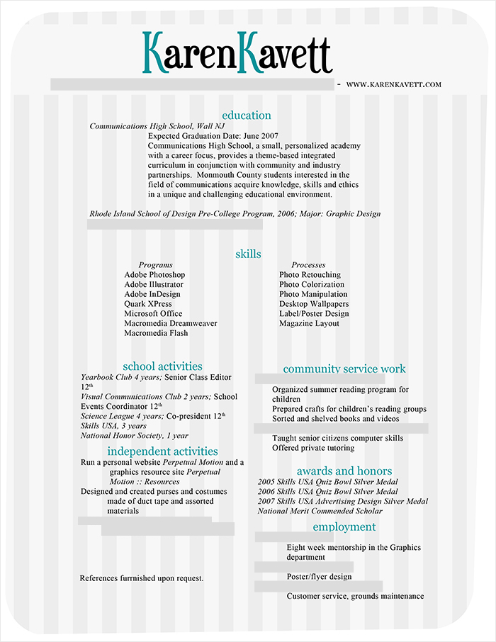
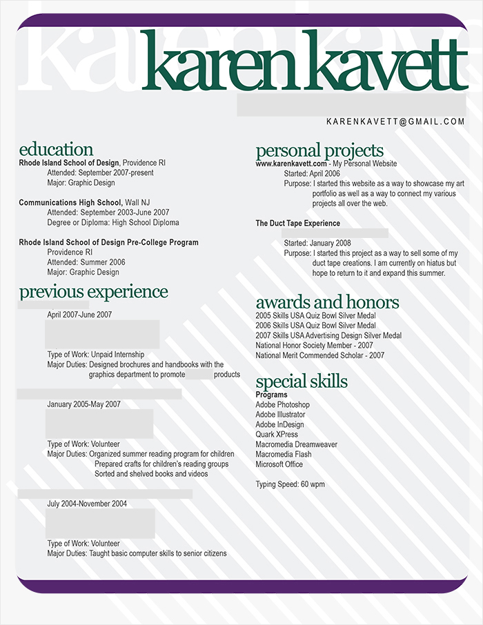
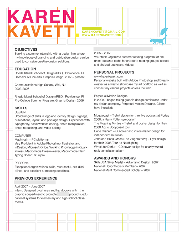
Click to see the PDF
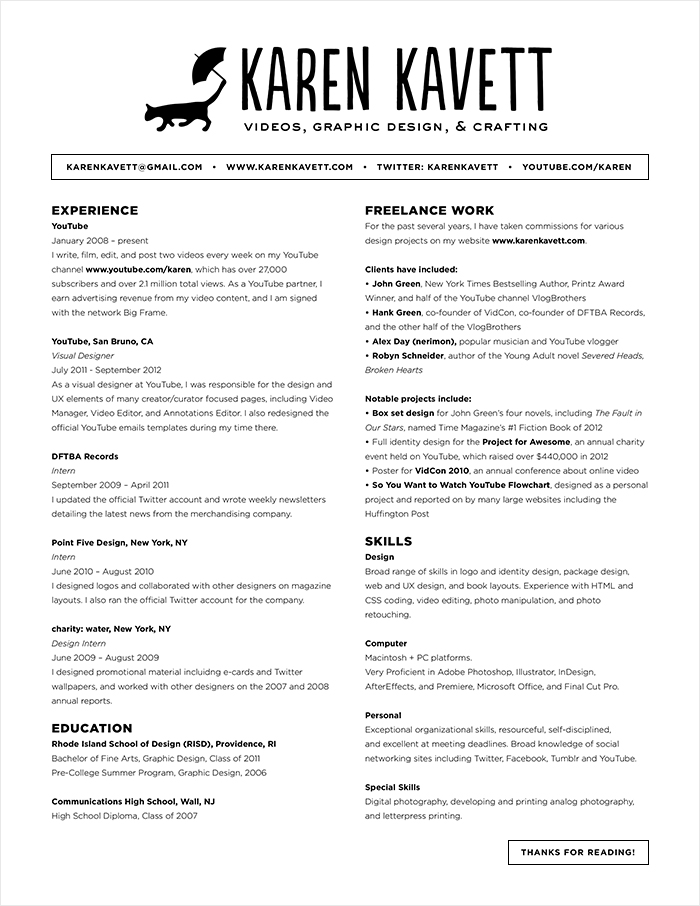
This is my current resume, which I actually only just made for this video since I’m not applying for jobs right now and don’t really need one. I think I could do more with it, maybe bringing it a bit of color or other personal touches, but it’ll do for now. I didn’t realize I had quite so much to say – I ended up having to bring the type down to 7.5 pt in order to fit everything in! And if I ever do start applying for jobs again, I’ll probably update and tweak it even more, since it’s always a work in progress.
I hope this video was helpful for you if you’re currently working on your own resume, and let me know on Twitter or Tumblr if you have any questions. If you want more of my graphic design videos, I have an entire playlist for you right here. Good luck, and thanks so much for reading!

