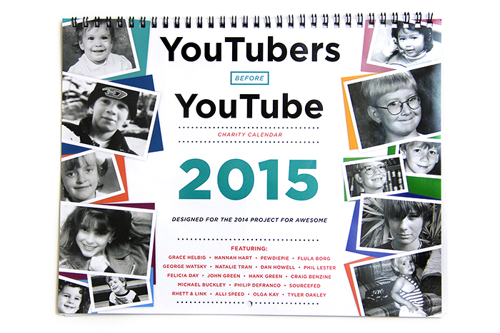
Today I’m finally going to write about a project I designed in November – the YouTubers Before YouTube 2015 Calendar! Every year one of the perks for the Project for Awesome is a calendar featuring YouTubers. In past years we released the Men of YouTube Calendar 2013, the Women of YouTube Calendar 2014, and the Men of YouTube Calendar 2014. But this year we wanted to do something different than just photos of popular YouTubers so we decided to make a calendar filled with baby pictures of YouTubers. Keep reading to learn more about how I designed it!
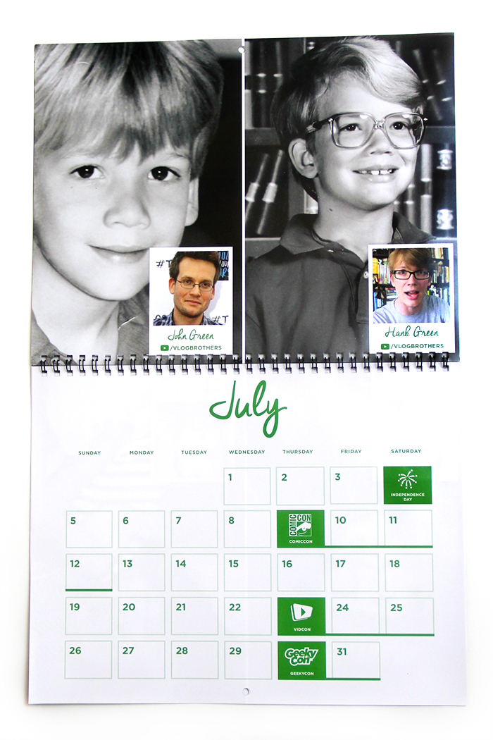
When designing this calendar, one of the trickiest parts was figuring out how to make everyone’s photos of varying qualities and color schemes look cohesive. So I decided to make all of the baby pictures black and white and fill the entire page (or half-page, if there were two people featured).
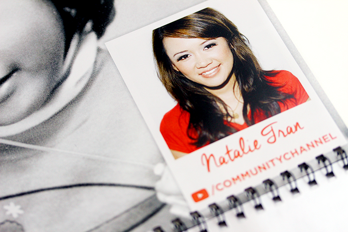
Then I designed a Polaroid-inspired graphic to put in the bottom right of each picture showing a current photo of the YouTuber as well as their channel name. We debated making the calendar a guessing game and just putting the answers of who was who at the back of the calendar, but I thought that once the novelty wore off, it would be a little weird to have a calendar on your wall with a photo of some random kid without any context of who they were.
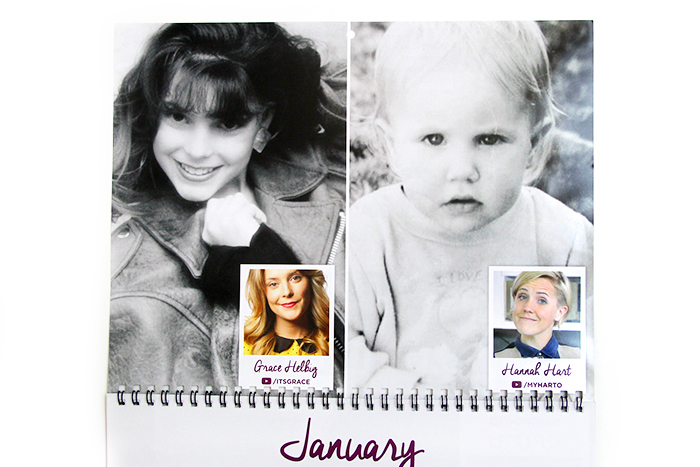
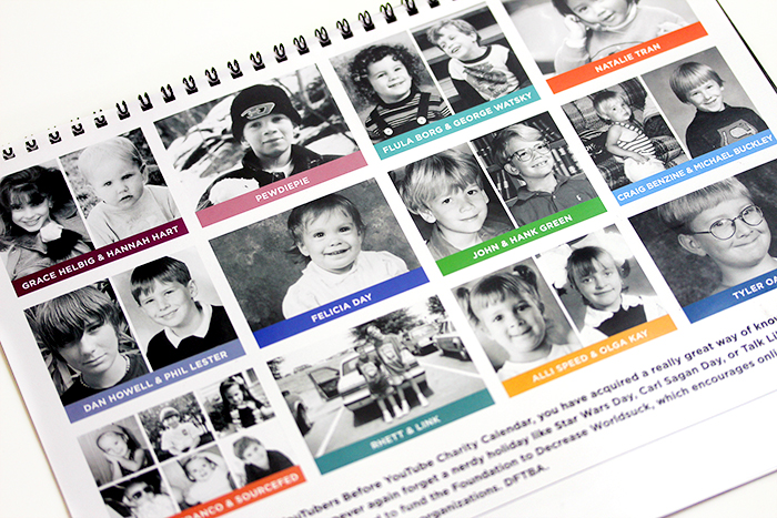
We ended up getting more than 12 YouTubers to send in baby photos, so I ended up splitting several pages in half, which ended up working out great since some of the photos worked much better as a vertical photo than they would have if they had to fill the space of a horizontal page. I also did one page with six people for the SourceFed crew since so many of them sent in photos. But in the image above, is tiny Grace Helbig’s headshot not the most precious thing ever?
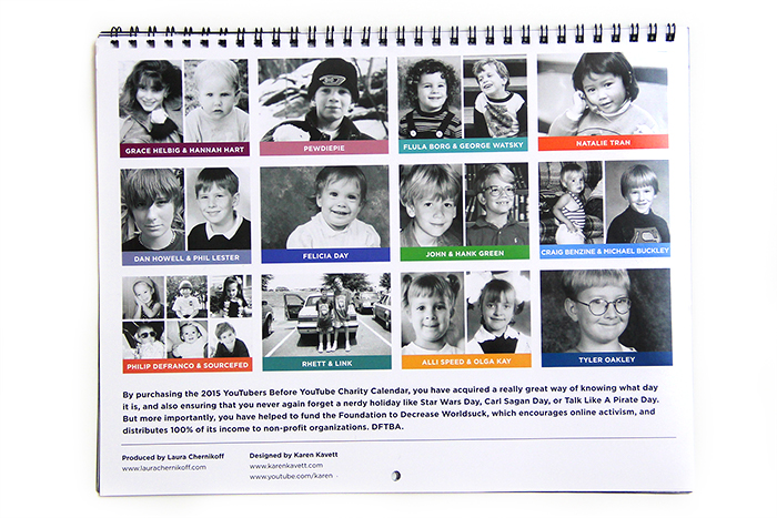
The back cover is pretty standard, though we ended up shuffling it around several times as we decided who would go on each month. Fun fact – I pulled each month’s color from the current photo I ended up using of each person.
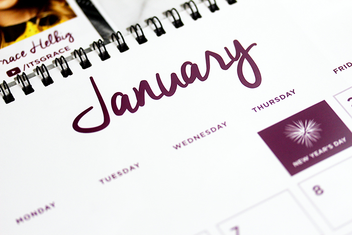
Moving on to the actual calendar pages, they ended up being fairly similar to last year except that I made the boxes white rather than colored in order to open up the page a bit more. I also introduced a new script font which I also used for the Project for Awesome logo on the site, in order to bring a little more visual interest than nonstop Gotham. The font is free, so it wasn’t kerned perfectly and I had to adjust some of the kerning in Illustrator, but it looks great now. It’s just one of the subtle touches probably nobody except me would ever notice, but I couldn’t let sloppy script go to print.
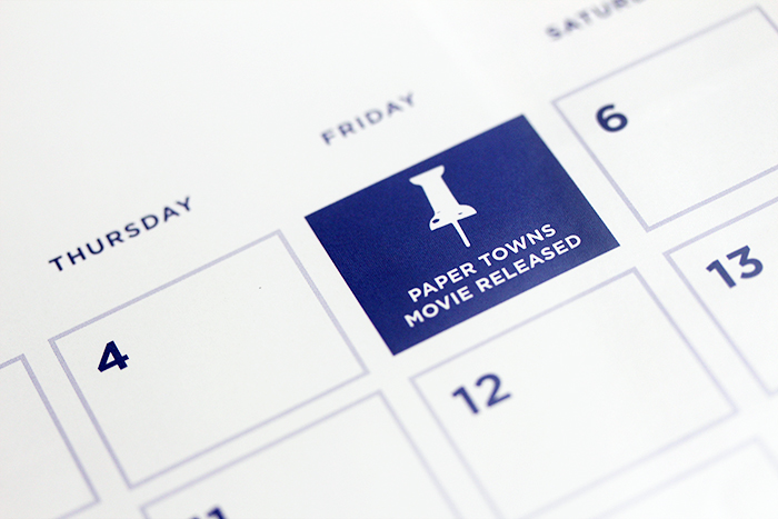
We included most of the same holidays as previous years, but I switched out some of the illustrations to make them bolder or less detailed or just generally better than last year. And of course, I switched out the TFioS movie release date with the Paper Towns movie release, a date I am crazy excited for.
In terms of the actual construction of the calendar, it’s wire-bound on glossy paper. I was not consulted when it came to deciding how to print it, and it came out a little flimsier than I would have liked. I think at the very least, we could have printed the cover and back cover onto a heavier weight of paper. But, it still does its job as a calendar, and I’m really happy with how the actual design work came out.
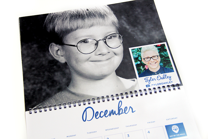
I had so much fun sorting through everyone’s baby photos and putting this together. If you have the calendar, let me know whose photo is your favorite (I think mine has to be Tyler Oakley’s). Or let me know if you have any ideas for future themes we could do for the annual YouTubers calendar. So if you don’t mind the first few months being out of date, you can still get the 2015 calendar for $15 on DFTBA. Or if you just want some high-quality printed photos of some awesome YouTubers, you can still get the 2013 calendar for $5.
Thank you so much to Laura Chernikoff for organizing the calendar and to all the YouTubers who sent in photos. And thank you to everyone who bought it during the Project for Awesome and contributed to the over one million dollars we ended up raising!
So if you want to see how the design of the calendar has evolved over the years, you can check out my blog posts about the 2013 and 2014 calendars, or you can check out the post about this year’s Don’t Break the Chain Calendar (I design a lot of calendars every winter). Thanks so much for reading, and I hope you all have a great day!

