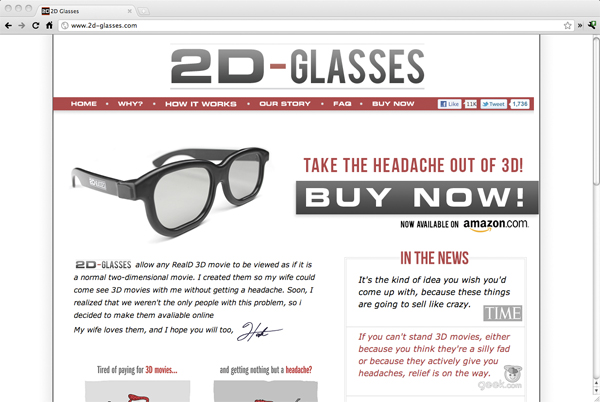
A couple of months ago Hank Green emailed me with an idea he had come up with for glasses which would reverse the 3D effect of 3D movies seen in movie theaters. Hank wanted to produce and sell the glasses, which would mostly be targeted to people who get headaches from 3D movies but don’t want to be left out when their friends go to see them. Hank asked me to design the logo and website for the glasses, so that they could easily be sold online.
While the various elements on the site have shifted slightly from my original design, the visual language of the website is still consistent with what I made. Since the glasses are meant to appeal to a large variety of demographics, we wanted to keep the site design fairly neutral, without seeming to target any one group of people. I tried to make the details on the site interesting, but it was important that the design not distract from the Buy Now button or the important information about what the glasses do.
While this isn’t my favorite design solution I’ve ever come up with, I’m so happy that the glasses have been as popular as they are. I do wish I had had more time to explore more symbolic versions of the logo rather than a straight typographic version, or experiment with more creative layouts in the site. However, it seems like the glasses have had a great reception from the internet community. They’ve been covered on dvice, Gizmodo, and NPR, among other sites. If you would like to buy the glasses, head on over to 2D-glasses.com or the new Amazon page!

